


I've been running macOS Tahoe since the day it dropped, and I thought I had explored every corner of it within the first week. New Liquid Glass design, revamped Control Center, and the usual feature tour that every tech blog publishes on launch day. I read those posts, nodded along, and assumed I was done.
I was not even close.
Over the past few months, I've stumbled into settings so buried and so poorly documented that I genuinely don't understand why Apple bothered building them if they weren't going to tell anyone they exist.
We're talking Terminal commands that fix visual annoyances Apple introduced and never gave you a toggle for, Spotlight tricks that have been sitting there since day one with zero UI indication, and automation capabilities that replace apps people pay $40 a year for.
These aren't the "turn on Dark Mode" kind of tips that show up in every macOS article. If you've seen even half of these before, I'll be impressed.
Quick aside before we get into the list. I've been writing about Apple on Medium for over six years now, and there's always been a gap between what I publish and what I use behind the scenes. The real setups, the real numbers, the automations I run daily but never turn into blog posts, the apps I quietly delete, and why.
The Useful Tech Club is where all of that lives. It's a private community with a searchable database of 100+ curated app recommendations, an exclusive Shortcuts library that gets monthly new drops, monthly transparency reports with earnings screenshots, and direct access to me for setup reviews and Q&A.
If you're the kind of person who reads posts like this and immediately tries every setting, this is built for you. First 50 members get Founding Member pricing locked in for life. Join The Useful Tech Club here.
#1 Kill those auto-added menu bar icons with a single Terminal command
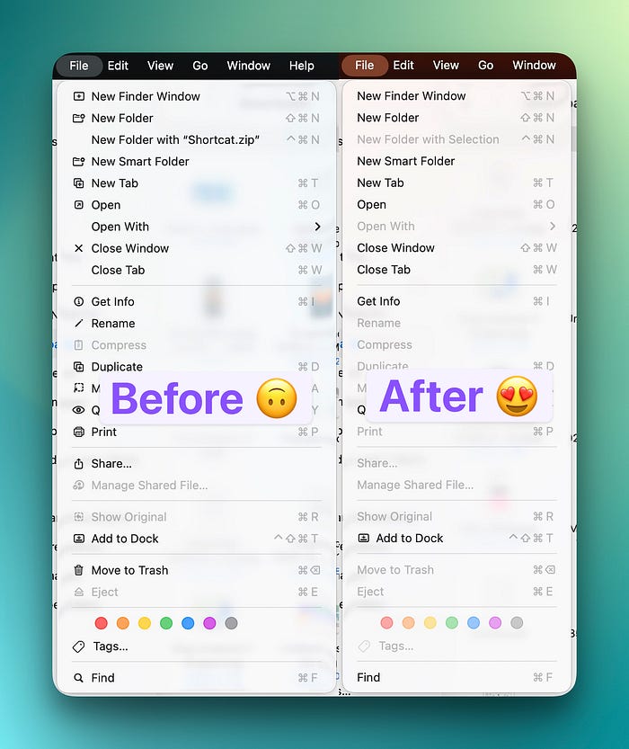
One of the first things I noticed after updating to Tahoe was that my app menus looked different.
Every standard action, like Cut, Copy, Paste, Select All, and a bunch of others, suddenly had little SF Symbol icons next to them. It wasn't a huge deal at first, but after a few days, it started bothering me because it made the menus feel cluttered and inconsistent (some items had icons, others didn't, and the whole thing looked like Apple couldn't decide on a direction).
The frustrating part is that there's no toggle for this anywhere in System Settings. Apple added these icons system-wide in macOS 26 and just assumed everyone would be fine with it. Most people probably are, but if you're someone who prefers clean, text-only menus like they've been for the last two decades, you're stuck. Or at least, you think you are.
Open Terminal and run this:
defaults write NSGlobalDomain NSMenuEnableActionImages -bool falseLog out and log back in, and every auto-assigned icon disappears. Your menus go back to being clean text. Icons that developers specifically chose to add in their apps stay untouched, so this only removes the ones Apple's system automatically inserts.
If you want to try it for just one app first, you can target it specifically:
defaults write com.apple.finder NSMenuEnableActionImages -bool NOAnd if you change your mind later:
defaults delete NSGlobalDomain NSMenuEnableActionImages
This was floating around in a MacRumors Forums thread for weeks before I found it. It's one of those defaults write commands that makes you wonder how many other hidden switches exist that Apple just never built a UI for.
#2 Apply any SF Symbol to any folder, not just the ones Apple shows you
You've probably seen that Tahoe lets you customize folder icons in Finder with SF Symbols. Right-click a folder, select 'Customize Folder,' pick an icon from the grid, done.
What you probably haven't realized is that the grid Apple shows you in the GUI is a tiny fraction of what's actually available.
There are thousands of SF Symbols in the system. Apple only surfaces maybe a hundred of them in that picker. The rest are perfectly functional but completely hidden from the interface. You can access all of them through Terminal, including some of Apple's private internal symbols that don't show up in the official SF Symbols app.
Here's how:
xattr -w 'com.apple.icon.folder#S' '{"sym":"camera.viewfinder"}' /path/to/folderReplace camera.viewfinder with any valid SF Symbol name. You can browse the full library in Apple's SF Symbols app (free download from developer.apple.com) and use any symbol name you find there.

It gets better. You can also use emoji:
xattr -w 'com.apple.icon.folder#S' '{"emoji":"🔍"}' /path/to/folderOr even arbitrary text:
xattr -w 'com.apple.icon.folder#S' '{"emoji":"WIP"}' /path/to/folderThat #S in the command stands for XATTR_FLAG_SYNCABLE, which means the custom icon syncs through iCloud Drive to your other Macs. So you set it once, and it shows up everywhere.
To remove a custom icon:
xattr -d 'com.apple.icon.folder#S' /path/to/folderI've been using this to create a much more specific folder system than the GUI allows. My writing projects folder has a different symbol than my research folder, which has a different symbol than my screenshots folder, and none of these symbols were available in the right-click picker. It's a small thing, but when you're scanning through dozens of folders in a sidebar, visual differentiation matters more than you'd think.

#3 Revert Liquid Glass tabs to how they used to look
I'll be honest, Liquid Glass is growing on me in most places. The translucent window chrome, the way it adapts to your wallpaper, and the overall vibe of it.
But the tabs? The tabs are a different story. In apps like Finder, Safari, and Terminal, the Liquid Glass tab styling makes it harder to tell which tab is active, especially when you have a lighter wallpaper behind the window. The translucency that looks beautiful on a title bar becomes a readability problem when you're trying to distinguish between eight open Finder tabs.
Apple developer Steve Troughton-Smith found an undocumented defaults key that reverts tabs specifically (and only tabs) to their pre-Tahoe appearance while leaving the rest of Liquid Glass intact. It's surgical, which is exactly what I wanted.
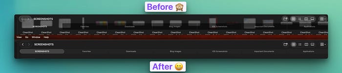
defaults write -g NSSolariumWindowTabs -bool NOThat's it. No logout required for most apps (though some may need a restart). Your window tabs go back to the solid, clearly distinguishable style from macOS Sequoia, while everything else stays Liquid Glass.
To go back:
defaults delete -g NSSolariumWindowTabsThe key name "Solarium" is Apple's internal codename for the Liquid Glass window tab system, which is a fun little detail that confirms this is a deliberate toggle they built and chose not to expose. Make of that what you will.
#4 Spotlight remembers every search you've ever done
This one genuinely surprised me because there's absolutely no visual indication that it exists.
Open Spotlight with Cmd+Space. Don't type anything. Now press the Up Arrow key.
Your previous searches start scrolling through the search field, one by one, exactly like command history in Terminal. Every query you've typed into Spotlight is stored and accessible with a single key press.

I don't know when this was added. I don't know why Apple never mentioned it. There's no "recent searches" label, no dropdown, and no visual hint of any kind that this feature exists. You either know about it or you don't, and based on the reactions I've seen online when people discover it, almost nobody knows.
This is incredibly useful if you're someone who searches for the same things repeatedly. I open the same project folders, the same apps, and the same System Settings panels multiple times a day. Instead of retyping "energy saver" or "bluetooth" every time, I just pop open Spotlight and tap Up Arrow until I find it.
It pairs especially well with the next setting on this list.
#5 Search inside apps and websites without ever opening them
This is arguably the most powerful Spotlight feature Apple has ever shipped, and I've barely seen anyone talk about it.
Type an app name or website in Spotlight, then press Tab. Spotlight shifts into a scoped search mode where your next query searches inside that app or website instead of searching your entire Mac.
So if you type "Photos" and press Tab, then type "beach vacation," Spotlight searches your Photos library for beach vacation pictures. Type "Amazon" and press Tab, then type "USB-C cable," and it searches Amazon directly. "Safari" then Tab lets you search your open tabs, bookmarks, and browsing history. "Messages" then Tab searches your conversations.

The Tab key is doing all the heavy lifting here. Without it, you're searching your Mac. With it, you're searching inside a specific context. And the whole thing happens in the Spotlight window, so you never have to open the app, wait for it to load, find its search bar, click into it, and then type your query. That five-step process becomes two steps.
I've been using this constantly for searching my Photos library and my Notes. Both of those apps take a noticeable moment to launch and load, and their internal search bars aren't always fast. Spotlight's scoped search is faster than opening the app would be, which sounds like it shouldn't be true but consistently is.
#6 Clipboard History is off by default, and the retention settings are hidden in a weird place
Everyone knows macOS Tahoe added clipboard history. What most people missed is that it ships turned off as a privacy measure, so unless you manually enabled it at some point, you don't actually have it.
To turn it on: System Settings > Spotlight > toggle on "Results from Clipboard." You can also just open Spotlight, press Cmd+4 to jump to the clipboard section, and it'll prompt you to enable it from there.
But here's the part that almost nobody knows about. When Apple pushed the macOS 26.1 update, they quietly added retention controls to that same Spotlight settings panel. You can now choose how long your clipboard history sticks around: 30 minutes, 8 hours (the default), or 7 days. There's also a manual "Clear Clipboard History" button.

This matters more than it sounds. Clipboard history captures everything you copy, including passwords, credit card numbers, verification codes, private messages, anything that passes through your clipboard.
If you're okay with the convenience, setting it to 8 hours or 7 days makes it genuinely useful for work sessions where you're copying and pasting between multiple documents. If you're more privacy-conscious, 30 minutes gives you the benefit without leaving a long trail.
For what it's worth, most dedicated clipboard manager apps like Paste or Maccy have built-in rules that automatically exclude password manager entries and sensitive fields. Apple's native version doesn't have that level of granularity yet, so it's worth being aware of what's being stored.
#7 You can create multiple Control Centers, each with its own icon
The new Control Center in Tahoe is already a big improvement over what we had before, but most people are using it as a single panel with everything crammed in. You don't have to.
There's a "+" button that appears when you enter edit mode that lets you create entirely separate Control Centers, each with its own custom icon in the menu bar and its own set of controls.
Here's how to set it up: Open Control Center, then click "Edit Controls" at the bottom. At the top of the menu bar, you'll see a "+" button. Click it, and a new Control Center icon appears. You can assign it any icon you want (a music note, a house, a gear, whatever makes sense) and then drag in only the controls that belong to that category.

I have two Control Centers right now. One has my audio controls, AirPlay, and Now Playing. The other has display brightness, Night Shift, Focus modes, and Do Not Disturb. Instead of scrolling through one long panel trying to find what I need, I click the relevant icon, and everything's right there.
It's the same idea as having multiple desktops or multiple browser profiles. Separation by context makes everything faster to find, and once you set it up, you wonder how you tolerated everything being in one pile.
#8 Lock Screen clock customization exists, but it's hidden under Wallpaper settings
If you wanted to customize the clock font on your Mac's Lock Screen, where would you look? Lock Screen settings, probably. Maybe Display settings. Possibly Appearance.
It's under Wallpaper.
System Settings > Wallpaper > Clock Appearance. From there, you get six font style options and a weight slider that controls the thickness of the clock text. You can also choose whether the customized clock appears only on the Lock Screen or on both the Lock Screen and the Screen Saver.
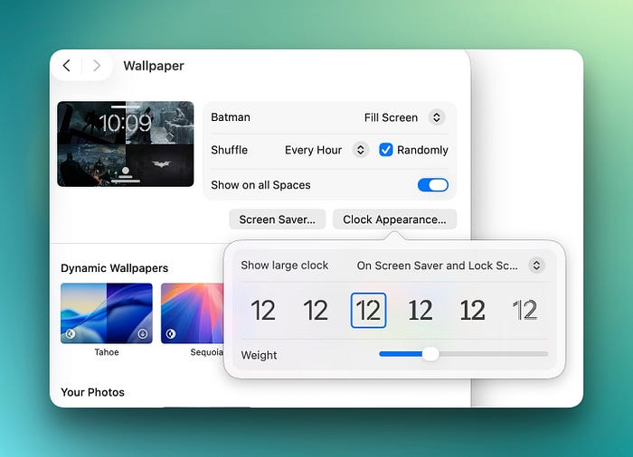
I have no idea why Apple buried this under Wallpaper instead of Lock Screen. The Lock Screen settings panel exists, it has other Lock Screen-related options, and the clock is literally the most prominent element on the Lock Screen. But the customization for it lives in an entirely different section of System Settings, which is why almost nobody has found it.
It's a small cosmetic thing, but if you're someone who cares about how your Mac looks (and if you're reading a post about hidden macOS settings, you probably are), it's worth the thirty seconds it takes to try each font style and pick the one that fits your wallpaper.
If you just spent five minutes trying every Lock Screen font option (no judgment, I did the same), you clearly care about how your devices look at different moments. I built something for iPhone that takes this idea much further.
The Daily Shift is a system of 36 wallpapers divided into six time-of-day phases, paired with an iOS Shortcut that automatically swaps your wallpaper as your day unfolds. Soft, cool tones at sunrise. Confident contrast at midday. Warm golden hour gradients in the evening. Deep blues at night. You set it up once in about five minutes and never think about wallpapers again. Your phone just quietly matches where you are in the day. 24 people have already grabbed it.
#9 Shortcuts can now watch folders and run automatically, which basically replaces Hazel
This is the one that genuinely changed how I use my Mac.
Shortcuts on Mac now supports automated triggers, and the most powerful one is folder watching. You can set up a Shortcut that runs automatically whenever a file is added to, removed from, or changed in a specific folder. No manual trigger, no clicking anything. It just runs.
To set it up: Open the Shortcuts app, go to the Automations tab, click "+", and choose your trigger type. For folder watching, select the folder you want to monitor, then choose the event (file added, removed, or modified).

Here are a few real examples that I'm actually using:
My Downloads folder has an automation that sorts files by type. When a new file appears, the Shortcut checks the extension and moves it to the right subfolder. PDFs go to Documents, images go to Screenshots, DMG files get mounted automatically, and the installer gets deleted after I'm done.
I also have one in my Screenshots folder that automatically converts every WEBP file to JPEG. If you take a lot of web screenshots or save images from the internet, you know how annoying it is when half your image files are in a format that not every app supports. This automation fixes it the moment the file lands.

Folder watching isn't the only trigger, either. You can set automations based on time of day, connecting an external display, battery level, joining a Wi-Fi network, activating a Focus mode, or receiving a calendar event. The external display trigger is particularly useful. I have one that enables my Work focus mode and switches to Dark Mode whenever I plug into my monitor at my desk.
If you've ever used Hazel (which costs $42), this is essentially the same concept built into macOS for free. It's not quite as powerful in terms of rule complexity, but for the most common folder automation tasks, it handles everything I need.
These are the settings I genuinely use on my own Mac. Not theoretical recommendations, not things I found on a feature list and thought sounded cool. Every single one of them either fixed something that was bugging me, replaced a third-party tool I was paying for, or made a daily workflow noticeably faster.
If you found even one thing here you didn't know about, do me a favour and share this with someone who'd appreciate it. And if you knew all nine already, honestly, tell me in the comments because I want to know what obscure settings you've found that I'm missing.