

SOC analyst burnout rarely starts with a lack of effort. It starts with friction.
During a single shift, analysts bounce between alerts, dashboards, ticketing systems, and raw logs while trying to answer three basic questions:
- What changed?
- What does it impact?
- What should I do next?
When those answers require 30 clicks, five tools, and a couple of side quests, stress becomes the default setting. Not because analysts are not skilled, but because the workflow is working against them.
AI can help reduce burnout. It can also make it worse.
The difference comes down to dashboard analyst experience, or dashboard AX.
Burnout shows up before AI ever enters the picture
Alert volume continues to rise for most organizations. At the same time, tool fragmentation slows investigations and increases context switching. That combination creates burnout long before a SOC ever evaluates AI tooling.
When dashboards are slow, disjointed, or built only for reporting, analysts spend their energy reconstructing stories instead of making decisions. Fatigue follows quickly.
AI does not fix that foundation. It amplifies it.
What dashboard AX actually means
Dashboard AX describes the day to day usability of dashboards for investigation work. It measures how quickly a Tier 1 analyst can move from a signal to a defensible triage decision using the dashboard workflow, not how polished the charts look.
Strong dashboard AX shares a few consistent traits:
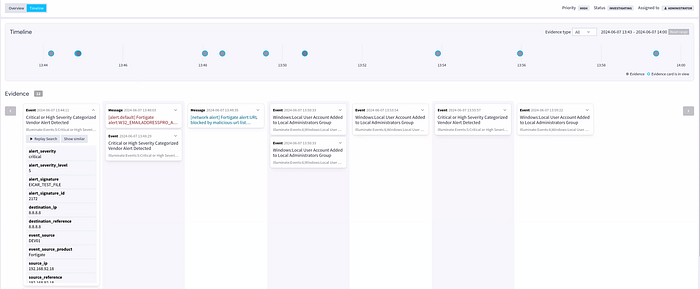
- Change is obvious The dashboard highlights what shifted, spiked, or drifted relative to baseline. Analysts do not have to hunt for the anomaly.
- Context travels with the signal Entity, asset, identity, and time context stay attached from summary to evidence.
- Drill downs are intentional Every widget has a clear path to supporting logs and timelines without rebuilding queries.
- Decisions are captured as work happens Notes, annotations, and case artifacts are created inline, not bolted on at the end.
Weak dashboard AX feels like a reporting wall. Lots of charts. No momentum. Tier 1 analysts end up rebuilding the narrative manually by copying indicators, validating mechanics, and second guessing conclusions. That cognitive load is exhausting, and it compounds over time.
A simple rule of thumb is that good dashboards shorten alert to context time and reduce cognitive load.
Where AI helps and where it hurts
AI summarization is only helpful when it compresses investigation time without cutting analysts off from evidence.
The healthiest pattern is dashboard native AI summarization that produces a structured narrative tied directly to underlying telemetry. SOC co-pilots can help triage alerts, predict priority, reduce false positives, and surface real threats, but humans still make the call.
A useful Tier 1 summary includes:
- What changed The specific delta, not a vague spike
- When it changed The time window plus sequence clues
- Who and what is involved Users, hosts, IPs, and services
- Why it was flagged Rule logic, threshold, or baseline deviation
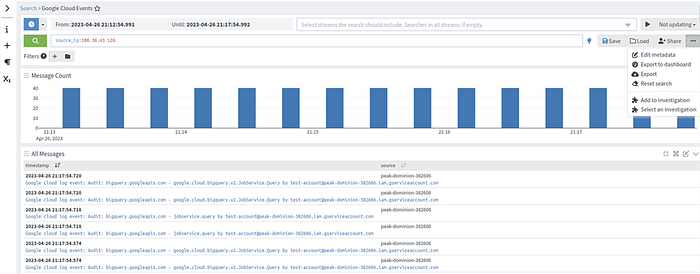
- Supporting evidence Direct links to logs, timelines, and enrichment
- Next checks A short checklist tuned to the detection type
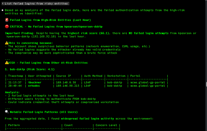
Explainability is the trust layer. Analysts need to see the inputs and reasoning trail, not just a score.
In practice, explainable AI shows:
- the contributing events and top fields
- the exact threshold condition that fired
- which enrichments were applied, such as threat intelligence, asset criticality, or identity posture
- the scope boundaries for entities and time
This matters because Tier 1 analysts should not have to defend an opaque number. They should be able to point to evidence and move on.
Thresholds decide whether alerts become work
Thresholds are the gatekeepers of analyst workload. Poor thresholds create constant escalations and constant doubt.
Effective thresholds are:
- Risk aware The same behavior means different things on a production domain controller than on a lab VM. Dashboards need to reflect that.
- Baseline aware Variance from normal patterns creates focus. Raw counts create noise.
- Transparent Analysts should see the trigger condition directly in the investigation flow. Hidden logic forces Tier 1 to validate the alert itself instead of the security event.
Alert fatigue is not just about volume. It is about how much unnecessary validation work reaches the analyst. Better thresholds reduce low value work before it ever hits the queue.
Annotations prevent rediscovering the same truth every shift
Annotations turn tribal knowledge into shared context on the same timeline as detections.
What belongs in annotations:
- scheduled patch windows
- planned deployments or configuration changes
- identity or access policy updates
- known vendor outages
- approved penetration testing or internal scanning activity
This prevents every shift from re solving the same mystery. It also improves handoffs. Tier 2 receives a labeled timeline, not a ticket that says "looks weird, please advise."
Over time, annotations help Tier 1 learn what expected weird looks like. Confidence goes up. Escalations driven by uncertainty go down.
Drill downs should preserve momentum, not reset it
Tier 1 triage works best as one continuous flow:
Signal → evidence → entity context → scope → decision → documentation
Dashboards improve AX when drill downs preserve that flow. A practical chain looks like:
- spike widget to filtered event list
- event list to entity timeline
- entity timeline to correlated sessions and entities
- correlated entities to enrichment and historical comparison
When drill downs are consistent, junior analysts stop wandering the tool maze. They follow a repeatable path and build muscle memory.
That visible progress matters. It reduces grind and keeps work sustainable.
Five dashboard mechanics that help Tier 1 triage with confidence
1. Build entity first panels by default Group activity by users, hosts, IPs, and workloads. Related alerts collapse into one working set instead of five separate investigations.
2. Treat thresholds as change detectors, not counters Use baselines and variance. Pair logic with business risk. Keep the trigger visible so analysts can validate it quickly.
3. Standardize annotations with light governance Make operational context part of the workflow, not a side document. Fewer repeat investigations and fewer known issue escalations.
4. Design drill downs that keep context attached Filters, time windows, and entity scope should persist. Predictable paths improve speed and confidence.
5. Use explainable AI summaries as case starters AI should draft the first pass of triage notes, with evidence links and logic included. Analysts own the final decision.
Why this speeds Tier 1 without lowering standards
Tier 1 analysts succeed when they can close the loop quickly and defensibly.
Better dashboard AX delivers:
- Faster classification Risk aware thresholds and baselines cut false positive validation time.
- Stronger confidence Explainable summaries tied to evidence reduce fear driven escalation.
- Cleaner handoffs Annotations and drill down paths preserve the investigation narrative for Tier 2.
Burnout follows workflow structure. When dashboards support continuous investigation flow, analysts see progress, build skill, and spend more time on meaningful work.
The practical takeaway is simple. AI should raise dashboard AX. When it does, Tier 1 triage becomes faster, calmer, and more consistent without lowering the bar for security decisions.
Graylog turns dashboards into decision tools, not burnout machines.
Follow Graylog on LinkedIn for practical guidance on fixing analyst workflows and cutting alert fatigue.