

The Psychology-Backed Formula for Landing Pages That Actually Convert
Let's get one thing straight: you don't need to be a design genius to build a high-converting landing page. You only need to understand how people think.
A landing page is a standalone web page created for a single, focused purpose: to convert visitors into leads or customers.
It's where someone "lands" after clicking a link in an ad, email, social post, or search result. Unlike a homepage with many links and navigation options, a landing page strips away distractions and zeroes in on one clear call to action (CTA).
Great landing pages aren't effective by accident. They're rooted in psychological principles that trigger trust, desire, and action.
Today, I'll break down six mental shortcuts and cognitive biases that drive conversions so that you can design smarter, not harder.
1. First Impressions: The Halo Effect in Action
A clean layout, clear headline, and strong visual hierarchy help you leverage the halo effect to signal trust and quality instantly. The halo effect is a psychological bias where our overall impression of someone or something influences how we feel and think about their specific traits.
Simply put, if something looks good, we assume it is good.
This means that when visitors land on a page that feels polished, modern, and professional, they're more likely to:
- Trust the product or service.
- Believe the offer is legit.
- Be open to taking the next step (converting).
Even if they haven't read a single word yet!
This impression forms in about 50 milliseconds—faster than a blink of the eye. So, visual design isn't just decoration; it's a trust-building tool. That split-second impression can make or break your conversion rate.
For example, when we see a clean, minimalist page design, we think, "This must be a premium product."
But when we see a messy, outdated design, we think, "This might be sketchy or amateur." Even if it's the exact same product.
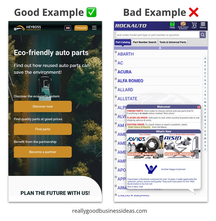
Pro Tip: Use one powerful image and a single, benefit-driven headline above the fold. Keep it distraction-free!
2. Clarity Beats Cleverness: Cognitive Fluency
We know you have less than a second to capture a potential customer's attention, so don't make them work for it.
Cognitive fluency is the brain's preference for things that are easy to think about, read, or understand. When something feels simple, our brains interpret that simplicity as a signal that it must be true, safe, or worth engaging with.
When your copy is too clever or complex, it creates friction and causes visitors to bounce. Clarity wins every time.
This concept is backed by research that shows that people rate statements as more truthful and easier to understand when they are written in clear, high-contrast fonts.
In other words, clarity makes your landing page feel more trustworthy, even if nothing else changes.
So why do so many marketers still try to be clever? Because clever feels creative.
But clever can also be confusing. If your headline makes people stop and think, you've already lost them. Confusion leads to friction. Friction leads to drop-offs. And drop-offs kill conversions.
When your copy is clear, people can immediately understand:
- What it is.
- Who it's for.
- Why they should care.
- What to do next.
That's what keeps them scrolling, or, better yet, clicking.
Here's a quick way to check the clarity of your landing page: Ask a friend or colleague with no context to read your page and explain it back to you in five seconds or less.
If they struggle or get it wrong? It's time to rewrite.
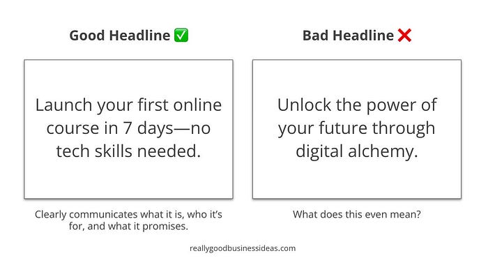
Pro Tip: Use short sentences and stick to everyday language. Focus on benefits, not buzzwords.
3. Social Proof: The Bandwagon Effect
Humans are social creatures. We look to others to guide our decisions, especially when we're uncertain.
This is where social proof, a concept first described in Robert Cialdini's Influence, comes in. It's a psychological principle rooted in the bandwagon effect, which says we're more likely to adopt a belief or behavior when we see others doing it too.
That means when a visitor sees that other people have trusted you, bought your product, or signed up for your newsletter, they're more likely to do the same.
Even subtle cues can trigger this:
- Testimonials with photos and names.
- Brand logos ("Trusted by X, Y, and Z").
- Subscriber or user counts ("Join 10,000+ happy customers").
- Media mentions or awards.
- Real-time notifications ("Sarah from Austin just signed up!").
These signals act like tiny nudges. They reduce uncertainty, increase trust, and create a sense of belonging. Visitors will think, "If others are finding value here, maybe I will too."
But here's the key: social proof has to feel authentic.
Fake testimonials, overly generic logos, or obviously inflated numbers can backfire. Today's consumers are sharp, and they'll sniff out BS in seconds.
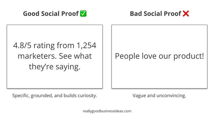
Pro Tip: Place social proof right next to your CTA. It will give potential customers that extra confidence boost at exactly the right moment.
4. Scarcity & Urgency: FOMO Done Right
People hate missing out. In fact, we're more motivated by what we might lose than by what we might gain.
This is called loss aversion. Research shows that the pain of losing something is psychologically twice as powerful as the pleasure of gaining something.
That's why urgency and scarcity are powerful landing page design tools. When used ethically, they can dramatically increase conversions by tapping into a very real human instinct: act now or miss your chance.
- Scarcity makes a product feel more valuable.
- Urgency shortens the decision window and encourages immediate action.
- Combined, they trigger a feeling of FOMO (fear of missing out), which can override hesitation.
Here are some examples of how FOMO shows up on high-converting landing pages:
- "Only 3 spots left for this month's cohort."
- "Early bird pricing ends Friday at midnight."
- "Join before 11:59 PM and get 2 bonus resources."
- Countdown timers (especially during launches or sales).
- Inventory indicators ("Just 5 left in stock.")
But just like social proof, it has to feel real.
People can spot fake urgency a mile away. A countdown timer that resets every time you reload the page? That breaks trust, not builds it. Once someone doubts the honesty of your offer, your entire page loses credibility.
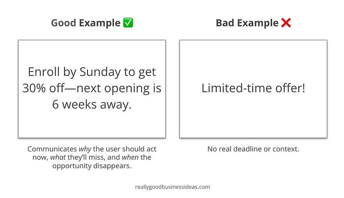
Pro Tip: Pair urgency with specificity. Let people know exactly what action they need to take and what they'll miss if they wait too long. Generic pressure tactics feel fake.
5. Visual Cues & CTA Psychology
Your CTA button isn't just a button. It's the moment of truth.
Every element on your landing page should work together to drive one thing: the click. That's why visual cues and CTA design are so crucial. They guide the eye, reduce hesitation, and nudge the user toward action at just the right time.
Humans are visual decision-makers. Our brains constantly scan for signals that tell us where to look and what to do. Research shows that people automatically follow the gaze of others, which is why images of people looking at a CTA can boost conversion.
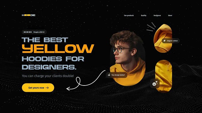
Smart landing pages use:
- Arrows or directional lines pointing at the CTA.
- Photos of people looking toward the button.
- Contrasting colors that make the CTA pop.
- Blank space to isolate the CTA and draw attention.
These cues reduce cognitive load. People don't have to think about what to do next. It's obvious. And that's a good thing.
It's not just where the button is. It's what the button says, how it feels, and how safe it seems to click.
- Use first-person copy ("Yes, I want this" performs better than "Submit").
- Remove uncertainty ("No credit card required" or "Instant download")
- Minimize pressure ("Try free for 14 days" instead of "Buy now").
These tiny tweaks tap into a powerful principle: commitment feels easier when the risk feels lower.
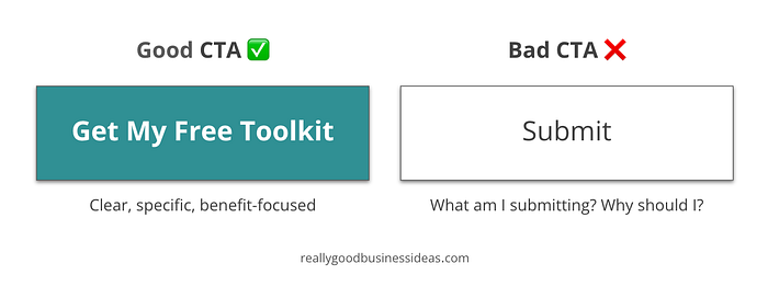
Pro Tip: Treat your CTA like a headline. Test different versions, tweak the wording, and make sure it speaks directly to the value of what happens next.
6. The Trust Factor: Reduce Risk, Build Confidence
People don't convert when they're uncertain.
That hesitation? It's not about your product; it's about risk. If the user thinks there's even a slight chance your offer won't deliver, they'll bounce. Fast.
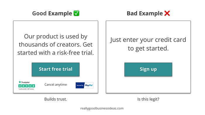
This is where trust signals come into play. They quietly reassure visitors that your business is credible, your offer is legit, and the action you're asking them to take is safe.
Why Trust Matters
Humans are naturally risk-averse, especially online. Behavioral economics research supports this behavior. One study found that users are more likely to engage with ecommerce platforms when they feel culturally and contextually assured of their legitimacy.
Every unknown adds friction:
- What if this is a scam?
- Will I be charged immediately?
- Will I be spammed?
- Can I get a refund?
Your job? Answer those questions before they're even asked.
Simple Ways to Build Trust on a Landing Page
- Satisfaction guarantees ("30-day money-back guarantee").
- Security badges or payment logos (Visa, Stripe, PayPal).
- Transparent pricing (no hidden fees or upsells).
- Clear privacy language ("We'll never share your email").
- Testimonials and logos (doubles as social proof).
- Photos of real people (team, customers, or founders).
- Trust marks (Trustpilot rating, SSL certificates, industry recognition).
None of these require flashy design. Just real, visible cues that signal: You can trust us.
Anticipate Objections Before They Arise
One of the most underrated conversion boosts? A short FAQ section or a "You might be wondering…" block that tackles common objections head-on.
"You might be wondering…
- Do I need to enter my credit card? Nope. The trial is 100% free — no payment required.
- Can I cancel anytime? Absolutely. One click and you're out."
These are friction killers. And they build confidence in you as a creator or brand.
Pro Tip: You don't need to "sell" trust. You need to earn it. Start by removing doubt, reducing risk, and being transparent. The conversion will follow.
Psychology Is the Shortcut to Conversions
Want to boost your landing page performance? Forget chasing design trends and start tapping into how people actually think. When you align your landing page with human psychology, small changes can lead to massive wins.
Originally published at https://www.reallygoodbusinessideas.com.
Want more marketing tips and tricks? Subscribe to the Better Marketing newsletter The Marketing Memo here.