

After designing 4 SaaS products now, I am sharing my experience with you by writing about the most common SaaS design patterns I have encountered, not just that
I will also be sharing examples of each pattern.
But before we start, let's ensure we're all on the same page.
What exactly is SaaS?
SaaS stands for "Software as a Service".
And that's a wrap…
Wait what…..!!!
You must be thinking this guy just told us the full form,
Jokes apart but…,
SaaS is (according to Salesforce)
"Software as a service (or SaaS) is a way of delivering applications over the Internet — as a service. Instead of installing and maintaining software, you simply access it via the Internet, freeing yourself from complex software and hardware management."
In simple terms, it's like having your favorite applications available at your fingertips, accessible via the internet. No more hassle with installations or maintenance.
Examples of popular SaaS products that we use on a day-to-day basis:
- Google Workspace
- Salesforce
- Trello
- Zoom
- DocuSign
- Slack
- Adobe Creative Cloud
- Mailchimp
- Netflix
- Spotify
- Slack
- Etc Etc
You might be surprised, but SaaS is everywhere!!!!
But, I won't bore you with a deep dive into the intricacies of SaaS — after all, the internet is there if you're eager to learn more.
Now that we're on the same page about SaaS, let's dive into the design patterns that make these applications user-friendly and effective!
List of common SaaS Design Patterns:
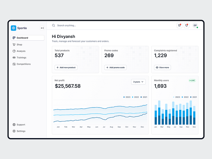
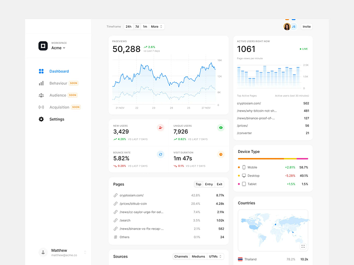
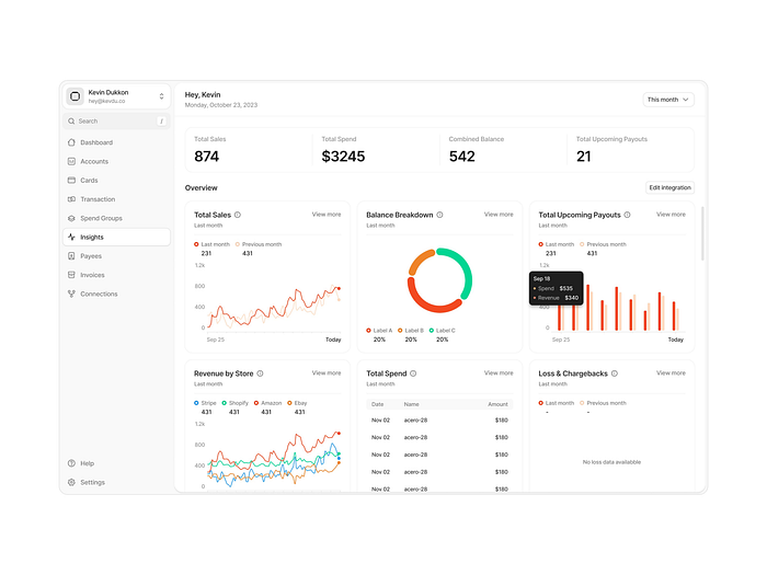
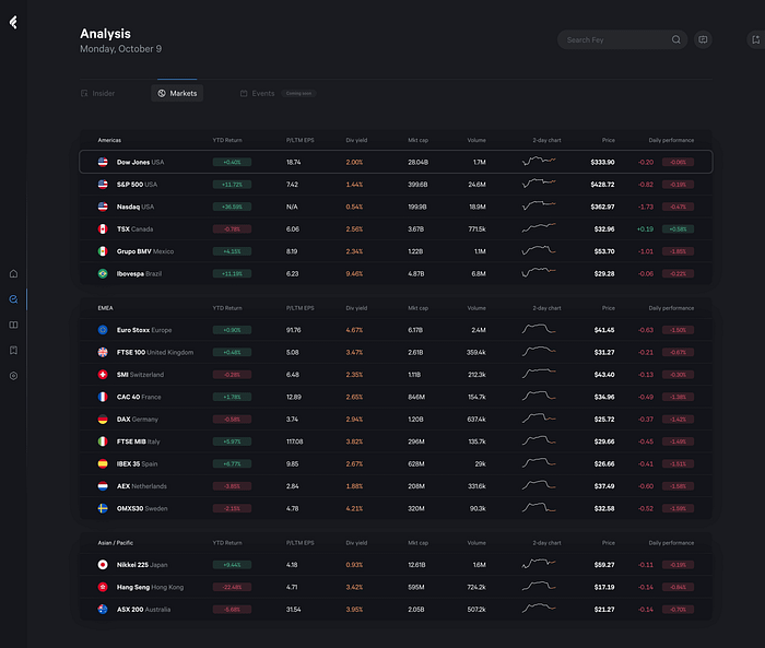
1. Dashboards
Whether for a personal project or a client's needs, crafting a user-friendly dashboard is a skill every designer should hone.
But Dashboard isn't only about graphs/charts,
It's about showcasing important information in a well-organized way. The best SaaS dashboards offer actionable insights. They highlight key metrics and trends but allow users to drill down into details, filter data, and interact with the information.
Some beautifully designed dashboard examples:
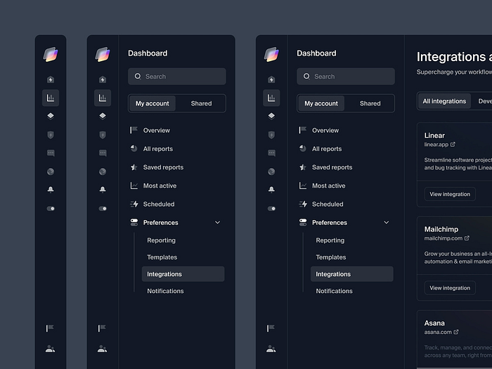
2. Navigation
Effective navigation in SaaS design is all about intuitive exploration. It should be clear, and consistent, and cater to the user's mental model.
We don't want users to have to think too hard about where to find things in the product.
Instead, we want the navigation to guide them easily through the application, helping them complete tasks and access features efficiently.
Some beautifully designed navigation examples:

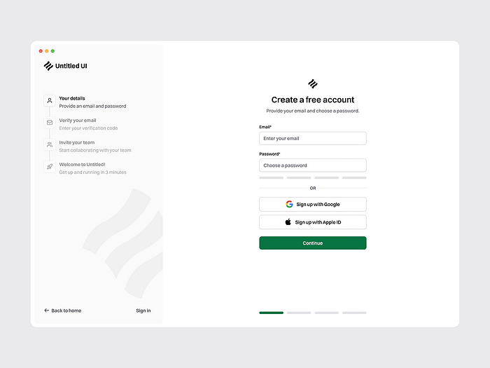
3. Wizards
Wizards are a multi-step form in a SaaS user interface that leads a user through a sequence of small steps.
With the help of wizards, we can break down any setup process into smaller chunks, ensuring a smooth and efficient introduction to the core functionalities to the user.
Some beautifully designed wizards examples:
4. Data Tables and Filtering
In the world of SaaS, data tables are the backbone of data visualization, offering users a structured view of information that's both comprehensive and easy to digest.
They display information in a grid-like format of rows and columns.
But here's the catch: a table is only as good as its filters. Sure, rows and columns are great, but without the ability to refine and sift through the data, it's like searching for a needle in a haystack.
I mean what's the point of seeing lots of rows and columns when you can't find what you're looking for easily?
That's where filters come to help
A beautifully designed table is so satisfying, sharing some examples:
5. Logic Builders (aka form builders)
These are the unsung heroes of SaaS design.
These technologies allow users to easily create complicated forms and workflows, using logic to speed data collecting and processing.
Imagine you're creating a survey for your SaaS platform. With a Logic Builder, you can develop dynamic forms that adapt to prior responses, resulting in a more personalized and efficient UX.
These builders allow you to precisely design sophisticated workflows, whether using conditional visibility, computed fields, or branching logic.
6. WYSIWYG Editors or Rich Text Editors
In the world of SaaS, content is king, and WYSIWYG Editors are the tools of choice for text editing and formatting.
These editors offer a familiar interface that imitates the final product, allowing users to see exactly how their content will appear to viewers.
Users can easily and precisely fine-tune their projects by formatting text, incorporating multimedia elements, or changing styling.
And that's a wrap……
Thank you for taking the time to read this article. I appreciate it.
Do you have any feedback? The comment section is yours ;)
P.S. This article focused on a selection of patterns, and there are definitely more to discover!
See you next time,
Sayonara 👋
Images: From the internet (mostly from Dribbble)