
Overview
InsuranceDekho is an online platform that lets you compare insurance quotes from top-rated insurance companies. Here we'll be discussing Car Insurance.
To improve the quote selection percentage & overall experience of the Car Insurance journey flow, we need to revamp the quote page.
Team
- 1 Product manager
- 1 Product designers ( I was responsible for leading the project)
- Senior designers & other stakeholders for review and approval.
Tools
- Hand drawn sketches.
- Figma
Problems
- We were facing a major drop in the motor insurance quote page. There can be many factors due to which this was happening; factors like accessibility, price, complexity, visual design.
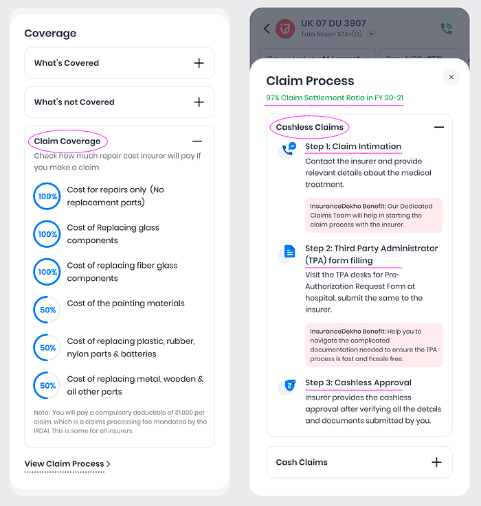
- As per our discussion with Call Center team, customers cannot see useful information like, how to claim, how much cover they will get in case of claim, and few details about the policy.
- Lack of insurance knowledge
Proposed Solutions/Goal
- Help user to buy most valued motor insurance plan for the user.
- Create a refreshed user interface with our newly built design system, and create an accessible and informative layout, which will lead to an increase in average sales and reducing bounce rate.
Research
We started with digging data and numbers from Google Analytics and Browsee platforms for the last quarter. We also talked to our call center team to listen to call recordings and recognize pain points for users.
Our key findings
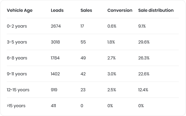
- Conversion distribution as per vehicle age — The data below says that we've major sales numbers for 3 to 8 years old cars and sales numbers were not justifying the total leads.
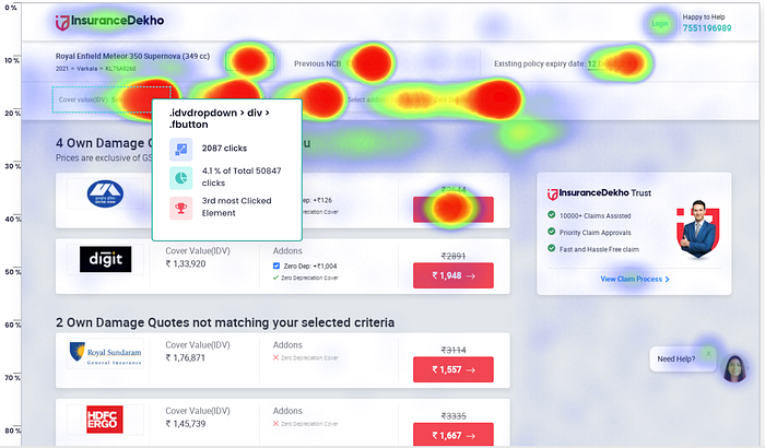
2. Heat Map of the website — Heat map shows that we have major clicks on IDV value (cover) and then other add-ons.

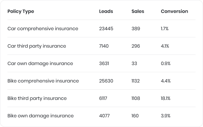
3. Leads as per type of insurance policy — Below data says, we have large number of comprehensive insurance buyers with only 1.7% conversion and very little number for own damage. So we had a better chance to improve our conversion for the this type of buyers.
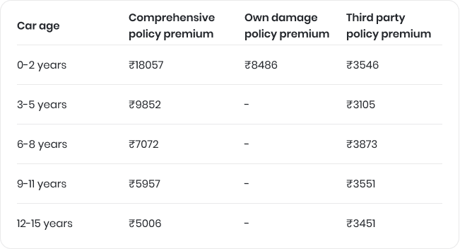
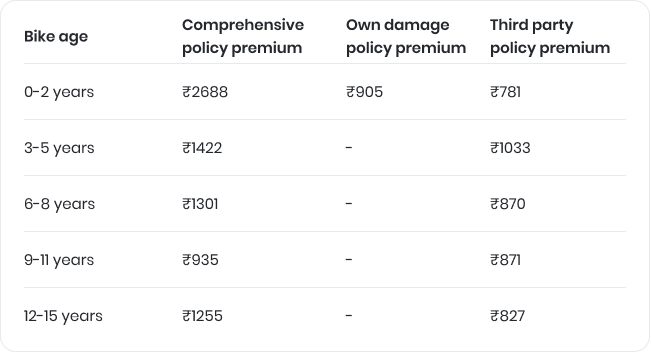
4. Average premium age wise — The below data shows that new car buyers pay the most expensive premium for their insurance; obviously we get a massive commission for those policies. People who buy new cars, they also get up to 5 years of bundle policy (OD + TP). 3–5 years old car owners usually buy comprehensive policies.
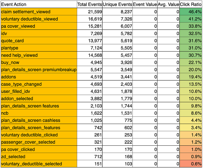
5. Click through ratio on the quote page — As per the below data, we can see the click actions for some events made by users in decreasing order. It gives an idea of what people are looking for while scanning the quote page.
Key finding from call center call recordings and call center executives
- People are not aware of add-ons and their functions.
- They ask basic questions about insurance like how much cover we'll get if they will claim for their insurance.
- Customers find it difficult to find the most valued plan for themselves.
- People were preferring cheaper premium plans for bike insurance
Key Quotes directly from customers:
"How much I'll get if I claim."
"I'm interested, but why is the price difference b/w two insurers."
"How can I claim"
"My insurance is expire, am I eligible for insurance?"
"What is NCB and how can I find it"
"Is there any cheap plan for my requirements."
Ideation + Validation
As per our research, we have got below ideas to get it done.
- We should think of multiple layouts of quotes based on the car age. In our case we should make layouts for 3 layouts for respectively 1–3 years, 3–7 years, and 7+ years.
- We need to improve our plan details page. Where we can answer all the basic information about the policy, which people were asking call center people.
- Plan details button should be visible prominently unlike before
- We should use different quote page layout for bike
- All UI elements should be refreshed and readable
- We should think of giving a switch button to show price with GST in quote page. A lot of competitors were not showing plans with GST, because without GST prices might look cheaper. If we go with this, premiums look pricer than others and customer will drop. So at least showing a switch can solve this problem.
- Showing a "most valued" can help customer to finalize a plan for him
- Selling mandatory covers to customers and how they are giving benefit to customers.
Design Phase
Sketches generate as many ideas as you can, helping you think more clearly about the problem that you're solving. Without showing how I created wireframes, I will jump directly into designs and will show you how I created those designs.
While designing my goal was to make designs simple, usable, seamless and easy to use.
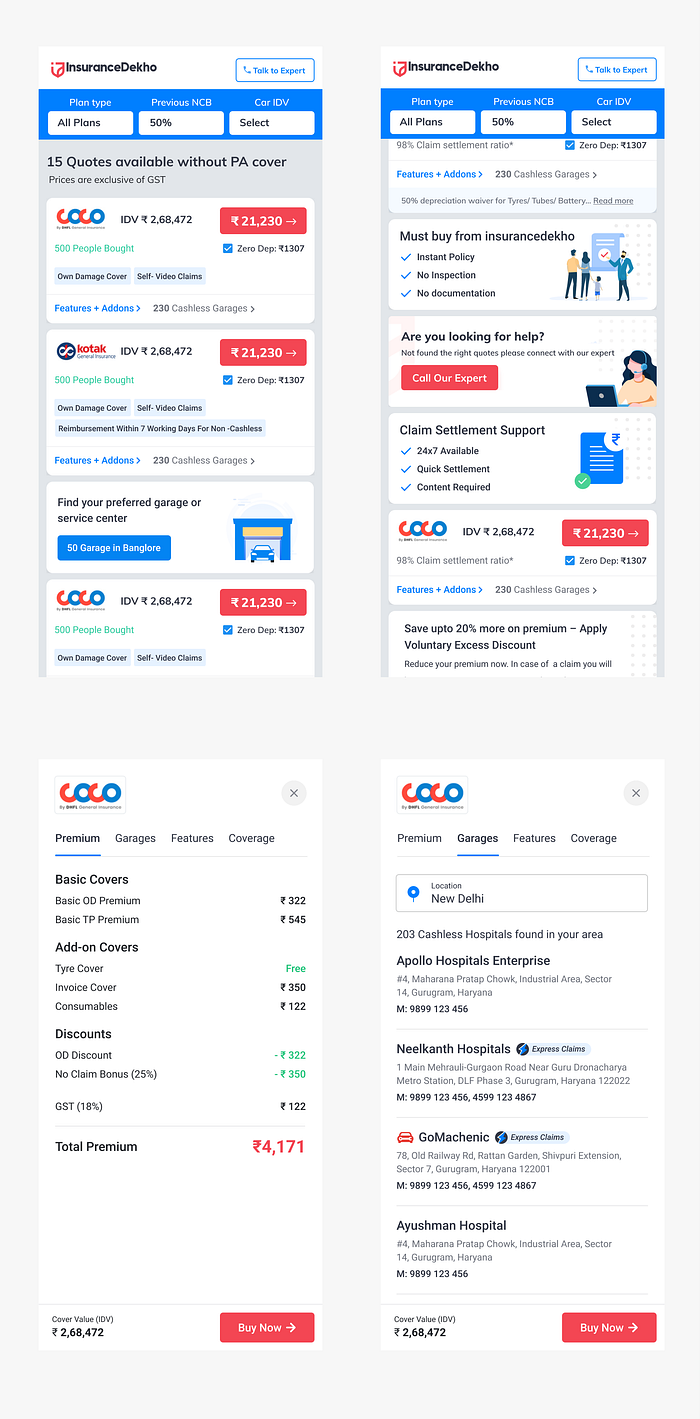
To make the human interaction more immersive with the page, we experimented with the layout of the quote page. Instead of the old shadowed card layout, we decided to have a new flat card layout which gave a cleaner transition to the sections and better visibility to the content.
Key Highlights
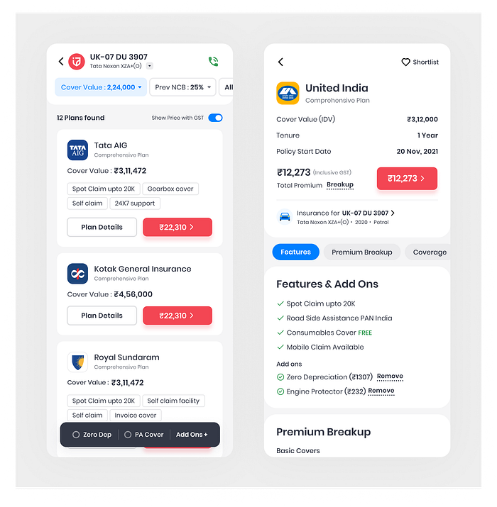
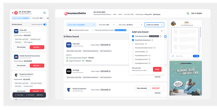
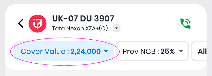
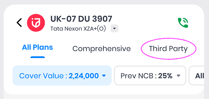
- Showing vehicle details at the top for which customer is looking for insurance plans. User have to click on the down arrow icon to see all the details like, model, fuel type, registration year, etc.
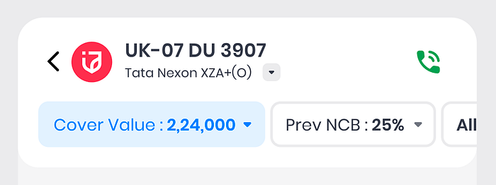
2. Better visibility and accessibility of cover, prev. NCB and plan type filters compared to previous design
3. Addition of "show price with GST" switch for the people who want to see the final price in quote screen.

4. Optimized appearance of Brand logos instead of old rectangular logos, which helped us to have more space for other elements
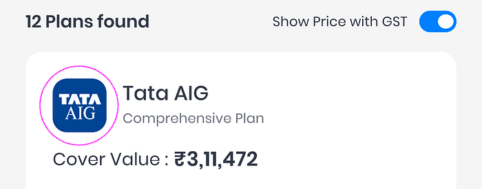
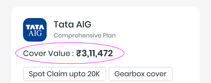
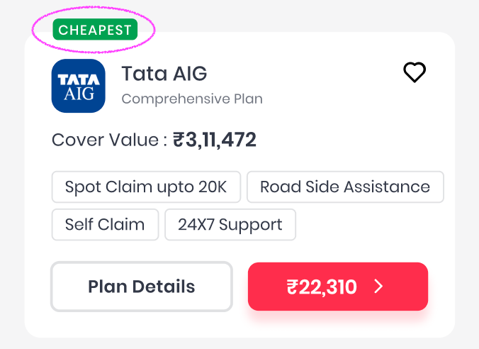
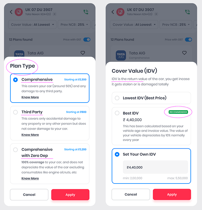
5. Based on our research, "IDV" term was not that easy to understand to every user. So we simplified it with the new term "cover value"
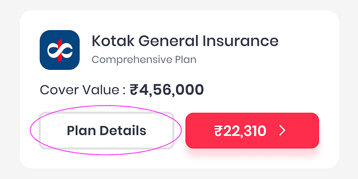
6. Addition of more prominent "view plan details" button in the card helps user to get more details about a particular plan.
7. Addition of most frequent used covers at the most accessible area on the device
8. We've seen in our data that customers with average age of vehicle(5–10 years) look for cheaper plans compared to new car owners. So we've added "cheapest" or "most relevant"tag on the top of the card to get attention on the card.
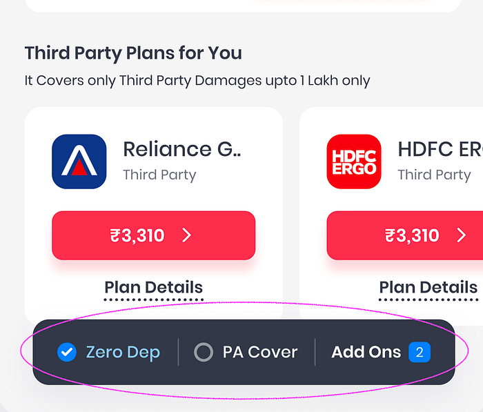
9. We've noticed in the data that most (average 60–70% of the total sales) of the 7+ years old vehicle owner tends to look for Third Party policy. So we thought, why don't we add the tabs for the plan type for 7+ yr old cars to get more accessibility.
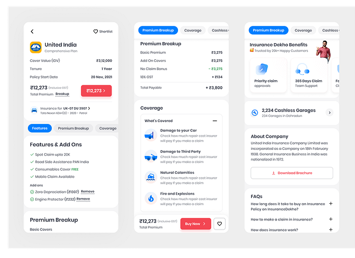
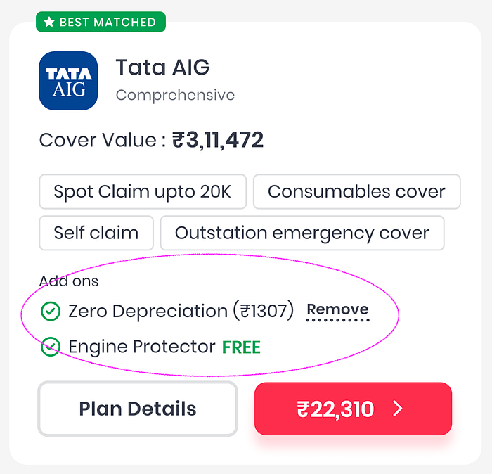
10. In previous versions we didn't have the provision to show the recent added features in a particular plan. We've solved that problem in this version by adding a separate section which doesn't conflict with already-have features.
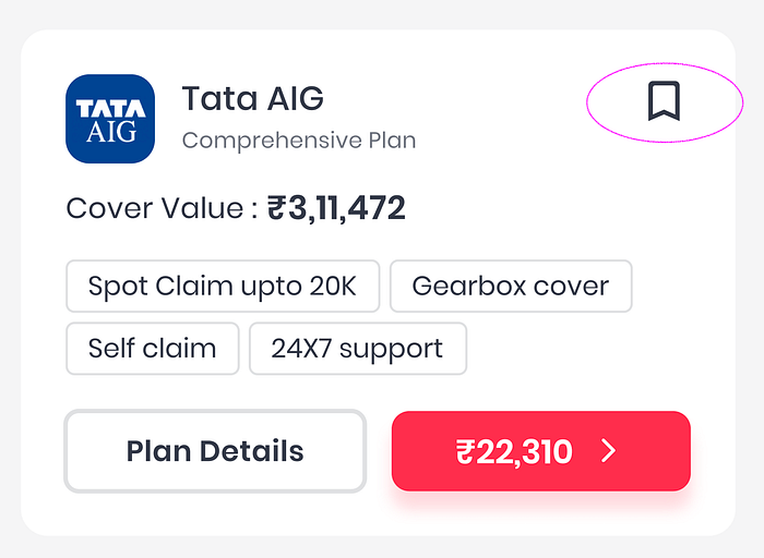
11. Simply put, "favouriting" is a method by which you allow the user to add or save a plan to a list of favorites, which they can access later when they return to our platform or when they make up their mind to buy the plan.
12. As per our conversation with the call center team, we found that people usually ask about plan types and their benefits. Another question was how much cover they should have for their vehicle. In the new version we've tried to solve this problem by adding a small description about the different plan types and adding a recommended cover value in the cover value popup.
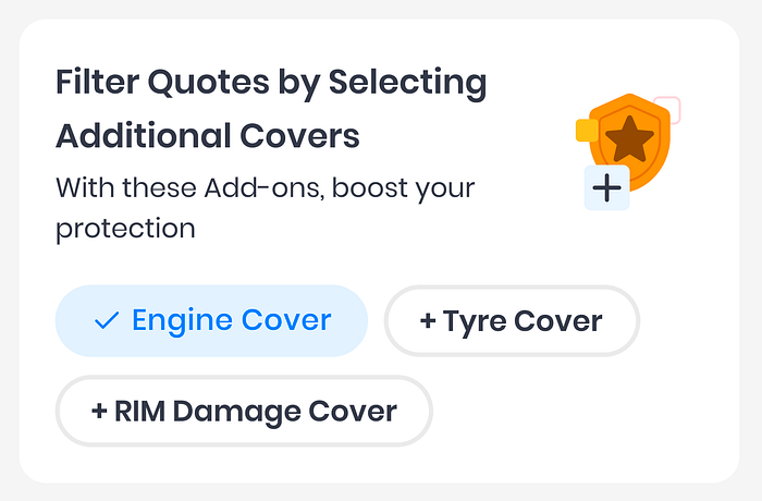
12. Addition of widget to filter the list by addons. This will help user to apply filter while scrolling through the plans.
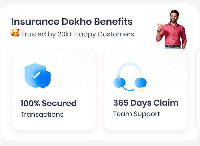
13. Addition of our brand benefits in details page will help us to increase trust factor. It shows that we give end to end support post purchasing the policy, secured transaction etc.
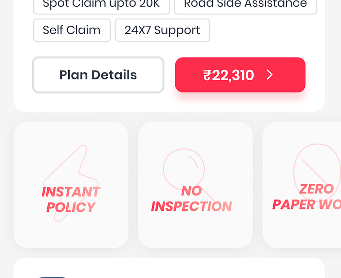
14. Two wheeler owners questions were like "my previous policy is expired, is there any inspection required" "how early I can get the policy copy" "is there any paper work required" etc. We solved it by adding those perks in between the page.
14. We also have to answer the most asked questions in our design which were "Sir, how to claim the insurance" and "how much cover I will get if I make a claim"
Internal Testing
This phase starts after the high-fidelity design is ready, since testing with high-fidelity designs provides more valuable feedback from end-users. Remember that testing and validating your design with people who represent your target audience is very important.
Learnings
- Understanding business objectives with feature requirements is also important. Always ask why we need this feature, and what we aim to achieve with it, instead of casually following what other platforms are doing.
- Looking at previous months data analysis before starting the design process would give a lot of sense.
- Constraints are crucial, but that shouldn't hold us from experimentation.
- Create workflows as you want them to be explained to you.
- Working closely with product managers gives a whole different perspective to the problem we are trying to solve.
Final rollout of designs
We released the final quote page with new details page design. After analyzing it for a couple of months and sales conversion increased by 4.4%. We also found a massive drop in Quote to proposal page and a massive jump in quote to plan details. It means that customer wanted to consume the details of a plan instead of directly buying any plan from quote page.
Future scope of improvement
- Designing of the pre quote flow.
- Improve the proposal details view of the flow. Currently it was according to the old design guidelines.
- Creating a recommendation system for better quote selection.