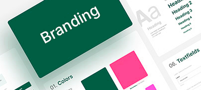

"Branding is the bridge between strategy and the good design"
Throughout my career, I've encountered various types of projects. While some projects have well-defined branding guidelines, others lack them altogether.
Benefits of having a "Branding Guideline"
- Professionalism A strong brand identity represents the face of the organization. Branding guidelines will be used in marketing materials, culture, and any products. Having well-defined branding guidelines eliminates doubtful decisions and inconsistency. Professionalism is a crucial element in establishing a business as an authority in the industry.
- Consistency The primary rule in establishing guidelines is to ensure consistency. All channels, such as marketing and the technical team, will adhere to the same set of guidelines. This consistency helps users identify and recognize the product. Moreover, consistency builds trust and fosters a deeper connection with customers.
- Efficiency Branding guidelines are a key element that can enhance team efficiency. When everyone works under the same set of guidelines, decision-making and processes become seamless. This approach allows team members to focus on high-priority tasks rather than wasting time on low-priority ones. Additionally, it saves unwanted and indirect costs for the organization.
- Cost Saving Businesses and products are in a constant state of evolution, often requiring the integration of new features or ideas. Establishing a comprehensive branding guideline can prove invaluable for organizations, as it helps streamline processes and mitigate unnecessary expenses.
Key Components of a Guideline from the Perspective of UX:
Logo This component is a cornerstone of the branding guideline, serving as the primary visual element that enables the audience to recognize the product or business.
Guidelines for Logo Usage:
- How your logo should and shouldn't be used. Prevent any alterations, distortions, or manipulations to the logo.
- Size and Proportions. Set specific minimum and maximum dimensions for the logo to guarantee readability and visual prominence across different platforms and mediums.
- Requirements regarding exclusion zones (clear space around the logo). Specify a designated clear space around the logo, referred to as the exclusion zone, to uphold its visibility and prominence.
- Color ways, online and offline. Offer instructions for utilizing the logo in both online and offline environments.
Color palette Each brand ought to establish a selected color palette when crafting its visual identity.
- Every color palette should consist of primary, secondary, and, if necessary, accent (tertiary) colors.
- Colors should be checked in both RGB and CMYK color models.
- Ensure to verify the colors on both digital and physical materials.
Typography Fonts are pivotal within the branding guidelines. It's important to determine whether a single font family will be utilized consistently across all guidelines or if different font families will be employed for online and offline media.
Make sure to have following items in the guideline.
- What font family gonna use. Online and offline fonts.
- Font hierarchy. Hero, H1, H2, H3, Body Text, Sub Text, Caption, Foot Note
- Text alignment. Left, Center, Right
- Spacing and Line height. Gap between letters, Gap between lines.
- Styling Bold, Italic, Link [Underline]
Visual style Visual branding represents a critical aspect of your marketing strategy.
Communication pattern The communication pattern significantly influences how customers associate and connect with your brand.
How to integrate brand guideline to an application
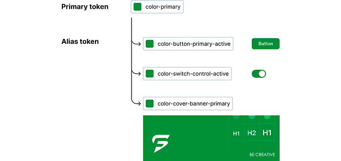
Design tokens or variables play a crucial role in integrating the brand guidelines into applications. They serve as representations of recurring design elements, ensuring consistency across different products and platforms.
Design token categories Color, Typography, Space (dimensions, padding, margins, etc), Shape Elevation, Iconography and Illustrations, Animation, Sound, Haptics
Token usage example
More about tokens
https://prototypr.io/post/design-tokens-cheatsheet
How to maintain the brand guideline
- Explanation of the usage. Always ensure to maintain a documentation repository where you can store the background, ideas, and usage details of decisions made.
- Build only which is needed. - Avoid designing elements that lack usability or functionality. - Implement both light and dark themes for user interface options.
- Proper naming convention structure. Token names adhere to a strict naming convention designed to convey when and where the token is intended to be used, eliminating the need to inspect its underlying value.
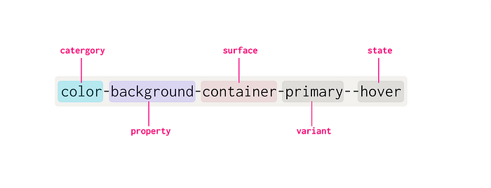
The mentioned token is complex, yet it narrates a story. Without referencing the documentation or the value, both designers and developers can discern that it's a color token intended for backgrounds of containers such as cards or sections. Moreover, it suggests the presence of various variants denoting hierarchy and targeting a specific state of that surface.