

Introduction: The Evolution of UI Layouts
The landscape of user interface (UI) design has witnessed a remarkable evolution over the years. From the rigid, static grids of early web design to the dynamic, adaptive layouts of today, designers have continually sought innovative ways to engage users and improve their experiences. One of the most exciting developments in this journey is the rise of Bento Grids, a modular design approach that's transforming how we think about layouts.
The Shift from Traditional to Modular Design
In the early days of web design, traditional grid systems were the foundation for organizing content. These grids, often symmetrical and predictable, provided structure and balance but lacked the versatility to adapt to complex, modern user needs. While functional, they often felt restrictive, especially in today's era of personalized and interactive digital experiences.
Enter modular design, a concept rooted in flexibility and creativity. Instead of uniform grid systems, modular layouts break free by allowing content blocks of varying sizes to coexist harmoniously. Think of it as a mosaic, where each piece serves a purpose but collectively creates a stunning visual and functional experience. This shift has paved the way for Bento Grids, which take modularity to the next level.
Key takeaway: Modular design doesn't just organize content; it tells a story and prioritizes usability.
Why Bento Grids Are Gaining Popularity
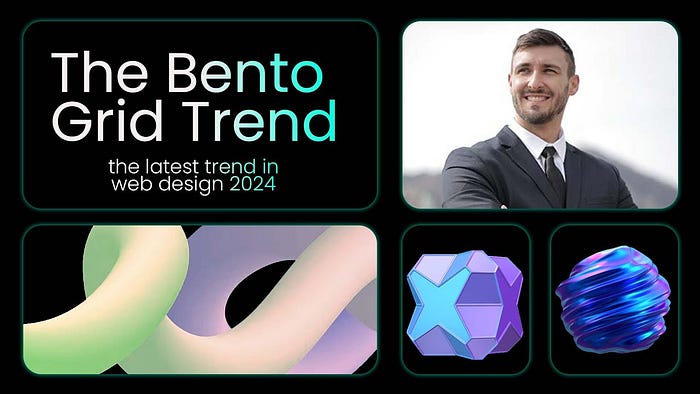
The term Bento Grid derives from the Japanese concept of a bento box, where various compartments house different foods in an aesthetically pleasing and efficient way. Applied to UI design, Bento Grids replicate this approach by arranging content into distinct, modular sections that are visually appealing and highly functional.
- User-Centric Focus: Bento Grids are designed to cater to diverse user needs, offering a blend of functionality and aesthetics.
- Flexibility: These grids are adaptable across devices, making them ideal for responsive design.
- Visual Appeal: With their mix of sizes and styles, Bento Grids create layouts that are both engaging and intuitive, breaking the monotony of traditional designs.
For example, platforms like Pinterest and Notion have championed this approach, using Bento Grids to present content in ways that feel both personal and organized. This balance between visual hierarchy and user engagement is why Bento Grids are rapidly becoming a preferred choice for designers worldwide.
Pro Tip: Incorporating Bento Grids into your design workflow can elevate your layouts by making them more engaging and adaptive.
In an era where users demand both efficiency and beauty, Bento Grids strike the perfect balance, redefining how content is displayed and consumed. Whether you're designing a portfolio, an e-commerce site, or a productivity tool, Bento Grids offer the creative freedom and user-centric approach that modern interfaces require.
2. What Are Bento Grids?
Bento Grids have become a buzzword in the world of UI/UX design, but what exactly are they? Let's dive into their origins, defining characteristics, and how they're being used in real-world applications to transform digital experiences.
Origins of the Bento Grid Concept
The idea of Bento Grids draws inspiration from the Japanese bento box, a neatly compartmentalized meal where every item has its dedicated space yet contributes to the overall harmony of the presentation. This balanced organization aligns with the core principles of UI design: clarity, functionality, and aesthetics.
In digital design, the Bento Grid concept took off as designers began to seek layouts that could combine versatility with visual appeal, especially for platforms needing to display a wide variety of content types — think dashboards, portfolios, or content-heavy homepages.
Highlight: The Bento Grid transforms the grid system into something more dynamic and expressive, mirroring real-world objects like a bento box for intuitive understanding.
Characteristics of Bento Grids: Flexibility, Aesthetics, and Functionality
Bento Grids stand out because they prioritize usability and aesthetics in equal measure. Here are the defining features that set them apart:
- Flexibility Bento Grids are inherently modular, allowing for asymmetry in design while maintaining a structured layout. Content blocks can vary in size and shape, making it easy to feature different types of information.
- Aesthetics The visually engaging nature of Bento Grids allows for creative storytelling. By mixing image-heavy blocks, text, and multimedia, designers can create a layout that feels alive and dynamic.
- Functionality Unlike rigid traditional grids, Bento Grids are highly user-centric. They guide the user's attention naturally, making complex information digestible and accessible.
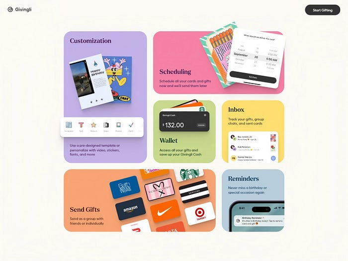
Example: Think of a productivity app where your tasks, calendar, and notes each occupy their space yet feel interconnected. This functionality is at the heart of Bento Grids.
Real-World Examples of Bento Grids in Action
Pinterest: The platform uses a Bento Grid-inspired layout to showcase images and videos of varying sizes, creating an immersive browsing experience.
Notion: By combining modular blocks for notes, tasks, and databases, Notion allows users to create their custom Bento Grid layouts, blending productivity with personalization.
Spotify: On the app's home screen, albums, playlists, and recommendations are arranged in a Bento-style grid, making content exploration intuitive and engaging.
Key Insight: The appeal of Bento Grids lies in their ability to balance organization with creativity, offering users an experience that is both functional and visually satisfying.
From their origins to their widespread adoption, Bento Grids have proven themselves as a powerful tool in modern UI design. Their adaptability, aesthetic appeal, and functionality make them an indispensable part of the designer's toolkit.
3. The Appeal of Bento Grids in UI/UX
Bento Grids have gained immense traction in UI/UX design for their ability to blend form and function seamlessly. Their unique appeal lies in how they prioritize user-centric experiences, establish visual hierarchy, and offer unparalleled adaptability for responsive design. Let's explore these facets in depth.
User-Centric Design: Meeting the Needs of Diverse Audiences
In a world where users have varied preferences and interact with digital platforms differently, Bento Grids shine as a layout that caters to diverse needs.
- Personalization: Bento Grids can house multiple content types — images, videos, text, or interactive elements — in a layout that feels both intuitive and personalized.
- Ease of Navigation: Modular design ensures that users can easily find what they're looking for, reducing cognitive load and frustration.
- Accessibility: By allowing for flexibility in size and placement, Bento Grids can improve accessibility for users across devices and assistive technologies.
Highlight: A user-first approach is what makes Bento Grids a favorite among designers aiming to create inclusive, accessible, and engaging experiences.
Visual Hierarchy: Guiding Attention Through Modular Layouts
One of the standout features of Bento Grids is their ability to direct user attention effectively.
- Asymmetric Layouts: Bento Grids use size and placement to establish a clear visual hierarchy, emphasizing important elements without overwhelming users.
- Intuitive Flow: Users naturally gravitate towards larger or more prominently placed blocks, creating a smooth and predictable navigation path.
- Engagement: The dynamic mix of content sizes keeps the layout visually stimulating, encouraging users to explore further.
Example: On a dashboard, a Bento Grid layout might showcase critical data like deadlines or alerts in larger blocks, while supplementary information takes up smaller spaces.
Key Insight: Visual hierarchy in Bento Grids is not just about aesthetics — it's a functional tool for improving usability and engagement.
Adaptability: How Bento Grids Enhance Responsive Design
In an era dominated by multi-device usage, adaptability is critical. Bento Grids excel in creating layouts that scale effortlessly across screen sizes and orientations.
- Responsive Framework: By design, Bento Grids can adjust their modular elements to fit different devices, from widescreen desktops to mobile phones.
- Consistency: Users enjoy a cohesive experience regardless of the device they're on, thanks to the grid's inherent flexibility.
- Efficiency: Bento Grids reduce the need for entirely separate designs for desktop and mobile, saving time while ensuring functionality.
Highlight: Bento Grids are the perfect answer to the challenge of designing for an increasingly fragmented device ecosystem.
The allure of Bento Grids lies in their ability to provide structure without sacrificing creativity. They empower designers to deliver user-friendly experiences, establish clear visual priorities, and ensure seamless adaptability in today's multi-device world. For designers looking to elevate their UI/UX game, Bento Grids represent a harmonious blend of form, function, and flexibility.
4. Designing with Bento Grids
Designing with Bento Grids is an art and science that revolves around achieving balance, proportion, and harmony. To create an effective Bento Grid layout, designers must follow foundational principles, leverage the right tools, and steer clear of common pitfalls. Let's break it down.
Principles to Follow: Balance, Proportion, and Harmony
A well-designed Bento Grid is more than just an arrangement of blocks — it's a symphony of visual elements working in harmony.
- Balance: Ensure that the distribution of content feels even across the layout. While some blocks may be larger than others, the overall design should avoid looking top-heavy or cluttered.
- Proportion: The size of each block should correlate with its importance. Use larger blocks for key information or visuals and smaller ones for supporting elements.
- Harmony: Maintain a consistent visual style across all blocks by aligning typography, color schemes, and spacing. This creates a unified look that enhances usability.
Tip: A good Bento Grid layout is visually engaging but doesn't overwhelm the user. Think of it as creating a conversation between content and layout.
Tools and Techniques for Creating Bento Grids
Modern UI/UX tools offer robust features to help designers craft beautiful Bento Grids.
Tools:
- Figma and Adobe XD: Both provide grid systems and plugins that simplify modular design.
- Webflow: Ideal for translating Bento Grids into responsive web layouts without coding.
- Grid Generator Tools: Platforms like CSS Grid Generator help in developing precise grid-based layouts for websites.
Techniques:
- Start with a Wireframe: Begin with a low-fidelity wireframe to experiment with block placement and sizing.
- Define a Grid System: Use frameworks like 8-point grids to ensure consistency in spacing and alignment.
- Test on Multiple Devices: Always preview your layout on different screens to ensure the grid adapts well across resolutions.
Highlight: The right tools and techniques ensure that the design process is efficient and adaptable.
Common Mistakes to Avoid
Even with their flexibility, Bento Grids can present challenges if not implemented thoughtfully.
- Overcrowding Blocks: Packing too much content into a single grid block can lead to clutter and overwhelm users.
- Neglecting Visual Hierarchy: Without proper scaling, users might miss key information or get confused by the layout.
- Ignoring Accessibility: Failing to use contrast or clear labeling can alienate users with visual impairments.
- Poor Responsiveness: A layout that doesn't adapt to different devices defeats the purpose of using Bento Grids in the first place.
Key Insight: Avoid these pitfalls by regularly testing your grid layouts with real users and devices.
Designing with Bento Grids is about finding the perfect balance between creativity and functionality. By adhering to design principles, utilizing modern tools, and avoiding common errors, you can craft layouts that are not only visually stunning but also intuitive and user-focused.
5. Bento Grids vs. Traditional Grid Layouts
When comparing Bento Grids to traditional grid layouts, the distinction lies in their structure, flexibility, and use cases. Both approaches have their merits, but understanding when to use each is essential for creating designs that resonate with users and fulfill project goals.
A Comparative Analysis: When to Use Each Approach
Traditional Grid Layouts rely on a structured framework, typically with evenly spaced rows and columns. This method is perfect for designs that prioritize order, consistency, and simplicity.
Best Suited For:
- Corporate websites with formal aesthetics.
- Text-heavy designs where readability is key (e.g., blogs or news platforms).
- Applications requiring strict alignment, like data dashboards.
Bento Grids, on the other hand, offer a modular, dynamic layout inspired by Bento boxes. Their versatility allows designers to mix content sizes while maintaining visual balance.
Best Suited For:
- Portfolio websites showcasing diverse content.
- E-commerce platforms needing dynamic product displays.
- Landing pages with varied call-to-action elements.
Key Insight: Traditional grids are about structure; Bento Grids emphasize flexibility and creativity.
The Pros and Cons of Bento Grids in Modern Design
Advantages of Bento Grids:
- Visual Appeal: Their asymmetry and variety make them stand out, offering a fresh, engaging look.
- Flexibility: Bento Grids adapt seamlessly to different content types, from images to videos and text.
- User Experience: By visually prioritizing elements, they guide users through content intuitively.
- Responsiveness: Bento Grids shine in responsive design, as their modular nature translates well to various screen sizes.
Drawbacks of Bento Grids:
- Complexity in Implementation: Designing a Bento Grid requires more thought and effort compared to traditional grids.
- Risk of Overdesign: Without careful planning, Bento Grids can appear chaotic or lack cohesion.
- Accessibility Challenges: Uneven layouts may sometimes confuse users relying on assistive technologies.
When to Choose Bento Grids Over Traditional Layouts
- If the project demands creativity and storytelling, Bento Grids are a better fit. For example, a fashion brand's website showcasing its latest collection.
- If the focus is on content clarity and hierarchy, traditional grids are the safer choice, such as for an online publication.
Highlight: Bento Grids bring a sense of playfulness and individuality, while traditional grids uphold discipline and order.
In conclusion, Bento Grids and traditional layouts serve different purposes, and the decision depends on the brand identity, target audience, and project goals. By understanding their unique strengths and weaknesses, designers can make informed choices that elevate the user experience.
6. The Role of Bento Grids in Future UI Trends
As the digital design landscape evolves, Bento Grids are positioned to play a significant role in shaping the future of UI/UX. Their flexibility, aesthetic appeal, and user-centric nature make them a powerful tool for adapting to emerging trends.
Integrating Animation and Interactivity
Bento Grids aren't just static layouts; their modular structure lends itself beautifully to dynamic elements. Animations and interactivity can elevate the user experience by adding depth and engagement.
- Hover Effects: Individual grid modules can react to user interaction, revealing hidden content or changing colors.
- Micro-Animations: Subtle animations, like sliding transitions or scaling effects, make Bento Grids feel alive without overwhelming the user.
- Interactive Layers: Bento Grids allow for progressive disclosure, where users can click or tap on grid elements to dive deeper into content.
Example in Action: Think of a food delivery app where a Bento Grid layout dynamically highlights popular dishes with subtle animations, enticing users to explore more.
Bento Grids in the Context of AI-Driven Design
The rise of AI-powered tools is transforming the way designers approach layouts, and Bento Grids stand to benefit immensely.
- Content Prioritization: AI can analyze user behavior and adjust grid layouts dynamically, placing the most relevant content at the forefront.
- Automated Design Suggestions: Platforms like Adobe Sensei or Figma AI can suggest optimized Bento Grid structures tailored to the target audience.
- Personalized Layouts: With AI, Bento Grids can offer individualized experiences, reshaping themselves based on user preferences and habits.
Highlight: Imagine a news app where the Bento Grid adapts to your reading preferences, prioritizing articles or multimedia content you're likely to engage with.
Predictions for the Continued Evolution of UI Layouts
- Enhanced Responsiveness: Bento Grids will push the boundaries of responsive design, offering seamless transitions across devices, from smartwatches to ultra-wide screens.
- Integration with Immersive Technologies: As AR/VR interfaces become mainstream, Bento Grids could serve as a foundational framework for modular and immersive spatial designs.
- Hybrid Layouts: The future may see the blending of Bento Grids with other layout styles, creating hybrid designs that balance structure and creativity.
- Sustainability in Design: Bento Grids' modularity aligns with the growing focus on sustainable design practices, allowing for efficient content reuse and minimal redesign efforts.
The Bento Grid is not just a trend but a catalyst for innovation in UI design. Its ability to integrate interactivity, adapt to AI-driven insights, and evolve with technology ensures it remains a vital part of the UI/UX toolbox. As the boundaries of design continue to expand, Bento Grids will serve as a bridge between creativity and functionality, paving the way for more engaging and future-proof user experiences.
7. Conclusion: Embracing Bento Grids in Your Design Workflow
Bento Grids are more than just a design trend — they are a transformative approach to crafting modern, user-centric, and visually engaging layouts. Their modularity and flexibility allow designers to break free from rigid structures, offering users a dynamic and intuitive experience. Whether it's enhancing visual hierarchy, improving responsiveness, or integrating seamlessly with emerging technologies like AI and AR/VR, Bento Grids are reshaping the landscape of UI/UX design.
The Impact of Bento Grids on Modern UI/UX
The adoption of Bento Grids has already begun to influence how designers structure content and how users interact with digital interfaces. Their ability to cater to both aesthetic and functional demands makes them a cornerstone of future-proof design. From e-commerce platforms to portfolio websites, Bento Grids have demonstrated their versatility and effectiveness across industries.
Key Takeaway: Bento Grids allow for a balance between creativity and usability, empowering designers to deliver tailored user experiences without compromising on visual appeal.
Encouragement to Explore and Experiment
For designers seeking to elevate their craft, experimenting with Bento Grids can be a game-changer. Start small by incorporating modular layouts into your next project and gradually explore their advanced applications, like interactivity and AI-driven customization. With tools like Figma, Adobe XD, and Webflow, creating Bento Grids has never been easier.
Pro Tip: Test Bento Grids across different devices and screen sizes to ensure they deliver a seamless, responsive experience. Use user feedback to refine your layouts for maximum impact.
"Have you used Bento Grids in your designs? What challenges or successes have you encountered? Share your thoughts and experiences in the comments below."
Your insights could inspire other designers and contribute to the growing community of creatives embracing this innovative approach. Let's learn and grow together!