For this part of my design systems series, I'm focusing on Creating a Design System. Unlike previous material, Roadmaps provided a 7-hour YouTube video for this segment instead of the usual articles. Since the video covers a wide range of topics — Colors, Typography, Components, Iconography, and more — I've decided to break it down into smaller, more digestible sections. The whole point is to avoid overwhelming you with too much information at once. This way, I can dive into each aspect of the system, going into more detail on what it means to me and how it's practically applied.
The video starts by introducing Material Design as our guide for the system. The Material Design website is a pretty good reference point; it showcases how a design system should be structured, whether for personal projects or for a team collaboration. It covers literally everything from colors to typography to components, giving us a clear visualization of what a cohesive system looks like. One of the things I liked the most is that it doesn't feel overwhelming, despite the many, many parts that make up a design system.
The video also explains how to arrange these various parts in Figma, starting with the core elements: iconography, typography, colors, and navigation. From there, we move on to creating components like app bars (both top and bottom), tooltips, and other interactive elements.
Color System
The first section I tackled is the Color System, which involves setting up and organizing color styles in Figma. This is where things really start coming together. I found that using slashes ("/") in naming conventions for color styles helps create a more organized, detailed labelling system for different color variations. For example, you can create a parent style like "Primary" and then have sub-variations like "Primary/Light" or "Primary/Dark." This helps keep your color library organized and easy to navigate, especially as it grows.
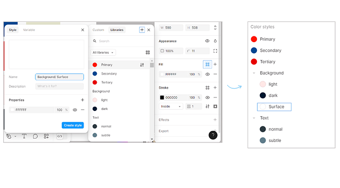
Another important feature I explored was Figma's Global Styles. Global Styles allow you to create a shared library of design elements like colors, typography, and effects that can be applied consistently across multiple projects. It ensures consistency, saves a whole lot of time, and allows for easy updates across all instances of a style.
How to Use It:
- Creating a Global Style: Once you've finalized a color, select it and click on "Create Style." From there, name it appropriately (using slashes for detailed organization, like "Primary/Light").
- Publishing Your Styles: Once you've created all your styles (colors, typography, etc.), you can publish them as a library by going to the Assets panel, selecting "Publish Styles," and sharing them with your team or across projects.
- Updating a Global Style: If you ever need to tweak a color or font style, simply edit the style in your Global library, and the updates will automatically apply to every place that style is used
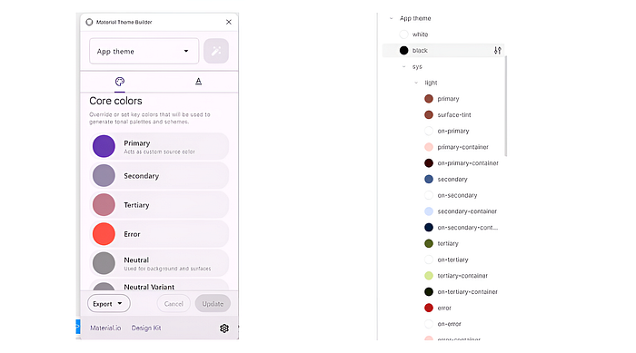
But I think the coolest feature of all was the Material Theme Builder. I discovered it while exploring the Material Design website, and let me tell you this is one heck of a helpful tool. It is available as a Figma plugin and helps you quickly create a cohesive, branded theme based on Material Design principles. I wonder how I've never come across it before, makes me feel like I'm really behind the times with Figma and other design tools.
How It Works:
The Material Theme Builder lets you define your primary and secondary colors, and it automatically generates a full color palette for your design system, which you can still customize. The plugin creates light and dark mode themes, ensuring your designs are optimized for different settings. My favorite part is that it also provides preset typography and elevation styles, which saves a ton of time when setting up a new project from scratch. Plus you can change/update it as much as you want, whenever you want
Why It's Useful:
- Speed & Efficiency: The Material Theme Builder rapidly creates a consistent theme with just a few inputs, which is perfect if you're working on tight deadlines.
- Customization: You can easily tweak the generated theme to better fit your brand's specific needs.
- Integrated Best Practices: Since it follows Material Design guidelines, the themes are not only cohesive but also well grounded in UX/UI best practices.
- Light & Dark Mode: The plugin automatically builds both light and dark theme options, giving you the flexibility to design for both environments effortlessly.
How to Use It:
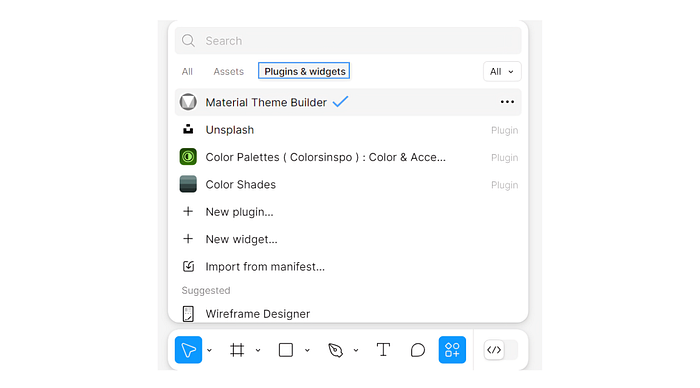
- Install the Material Theme Builder plugin from Figma's community.
- Choose your base colors, and the plugin will generate a complete color palette, including various shades and tints.
- It will also generate typography and elevation styles, ensuring that all the key components of your design system are in place.
With the Material Theme Builder, you can build a foundation for your design system in minutes, saving time while ensuring consistency across your designs.
The video also taught me how to publish my color library in Figma. I plan to continuously expand this library by adding new shades, tints, and variations over time, ensuring I have a broader palette to choose from for different projects. This flexibility is very essential for maintaining a wide, versatile color system.