
A designer's comprehensive guide on naming things. Abbreviations, dashes and underscores, their meaning and significance in building thread of communication with developers.
The Kickstarter
This is an amazingly famous quote from Phil Karlto:
There are only two hard things in computer science: cache invalidation and naming things.
Every time I'm about to explain to my teammates or mentees, why this is a good, bad or an ugly name — pun intended — for a particular object, this quote pops immediately up in back of my head.
When I started to create UI Crux resource platform, I instantly knew, that I want to put this knowledge out there, in the public, alongside other interesting Design Engineering bits.
Simply so I can direct people to it and introduce them to this vast field of Design Engineering, before we begin a much more in-depth discussion.

Fundamentals
Throughout my design-travels, I came into conclusion, that there are two layers underlying both the developer-centric vocabulary — when you are learning it — and to-be-established naming convention — when structuring and setting it up for your project.
First layer constitutes a semantic representation of every object used in the user interface. In other words, how to name each thing rendered by the browser.
Second layer is a system or a methodology that determines how to combine singular names and other attributes into compound names in order to make their position, use, function and purpose — all in a meaningful sequence — clear to all participants of a design-development process.
It's important to underline the fact, that vocabulary, and as a byproduct, the naming conventions are flexible as well as fluid, both in time and space, like all languages are.
Thus one could never state that a particular naming convention is final or the best one. Choosing the right words and definitions, like in any conversation, is inherently circumstantial. Meaning that, both the needs and objectives of a project determines naming convention. Yet, it doesn't necessarily mean that there are no standards nor best practices.
Purpose of this section is to present both above-mentioned standards and best practices, but also to make them digestible for non-coders — designers.
Naming Convention's DNA
Before we dive into layers, I've highlighted above, let's first go through important traits of any naming convention should have, and the rules that naming convention should obey, in order to be A-OK.

So firstly, naming convention should enhance following areas of design-development process:
- Collaboration and Communication,
- Management and Scalability,
- Understanding and Review,
- On-boarding and Delivery Time.
The list seems to be a bit synthetic without context, so let me provide it.
Software development is not a single person's job, there is always a team effort involved. Thus things have to be named clearly so everyone understands what they mean (Collaboration and Communication).
Design-development process is a lengthy and complex process, the easier it is to be managed, the better. Same thing goes for projects growth. Moreover, there is nothing worse, than inheriting a project after someone who did not think through, how it will work in bigger scale (Management and Scalability).
If all words have equal purposeful meaning, figuring out what author wanted to convey with his/her code/design is tremendously simplified. The same goes for any review process (Understanding and Review).
For onboarding anyone, naming conventions allow to grasp the inners of code/design by simply looking at the names of elements, components or tokens. The same way, if you only didn't have to lose valuable resources on grasping the inners of the code/design, you'd deliver what is expected of you much faster (On-boarding and Delivery Time).
Secondly, each naming convention should obey these set of rules:
- Being self-explanatory. Each name should contain in itself the exact explanation of its contents, in other words, it should be self-documentable;
- Being searchable. Each name should be search-friendly. So based in some kind of standard poll of words/names — Like this one: UI Elements. Moreover, the best standard is to stick to one popular language, like English. You just never know when your project will be 'moved' to other side of the globe, and you'll have to collaborate with completely new people from different cultures with different languages native to them;
- Being as short as possible. It doesn't mean that there is a limit on lengthiness of a name, but having a CSS class with 50 characters might be overwhelming, and simply hinder performance;
- Being consistent. It means both consistent on use of the same name for the same thing, but also being consistent on how each compound name is being created, so a sequence of names and attributes happens in one meaningful order.
Once we cleared the theoretical premises of the traits and rules each naming convention should have and obey, now we can start diving into more practical matters.
First layer: Defining the names
The semantic representation of the objects rendered by the browser has been listed separetly. You'll find it in UI Crux—under UI Elements. There is no point in copying everything here.

You'll find there a finite list of UI Elements (UI Components) alongside their names. I've put extra effort in presenting the 'most standard' names through an extensive research.
List has been drafted with Single Purpose Principle in mind — your UI Element should do one thing.
Yet, it has to be pointed out that in few less popular frameworks some names may differ from what I've listed out. At the same time, when two or more names were equally popular, I placed all of them in my list highlighting the alternatives.
Second layer: Methodologies of combining names and attributes into compound names
There are many methodologies how to name objects in HTML/CSS, yet there are couple that are most commonly used within the devs community.
I'll be showcasing the following triad:
- BEM: Block Element Modifier
- RSCSS: Reasonable System for CSS
- SMACSS: Scalable and Modular Architecture for CSS
All of the above methodologies are trying to structurize the code in order to fulfill all of the traits and rules I've described hereinabove.
Yet, If you'd ask me, which methodology I use the most? I'd have to say, that RSCSS is hands down biggest contributor to my daily deliveries.
And there is two arguments for that:
- Almost all frameworks, React, Polymer, Angular, Vue, etc. or even Bootstrap, center software development on components, and RSCSS main premise is to consider each piece of UI as an individual component.
- BEM makes the CSS code super clean, but with scale the HTML markup becomes unbearable. RSCSS is trying to balance out both things — CSS clarity and HTML markup simplicity.
Important sidenote: Before we go deeper, I'd like to point out, that this study is directed to non-coders — designers. Hence it is not a complete breakdown of all knowledge necessary to implement any CSS methodology in engineer's daily work. Though, if you're interested in learning more underneath each section, you'll find links to solid resources, that should give you 360 degree view on each methodology.
BEM
Stands for Block Element Modifier. BEM encourages developers to divide layouts into blocks and nested elements.
All selectors in a BEM have the same weight. Moreover, BEM attempts to divide the overall user interface into small reusable components.
Premises
A block is a standalone entity that is meaningful on its own.
An element is a part of a block and has no standalone meaning, while every element is semantically tied to its block.
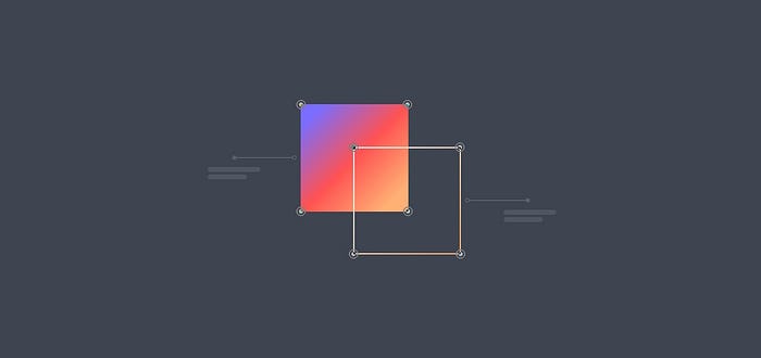
A modifieris a 'change' happening to blocks or elements. A change of appearance, behavior or a state.
Since every selector has an equal weight, every developer working with such strucutre, should recognize their position, function and overall purpose. He/she only has to read the selector's name.
Block
As mentioned above, every standalone component that is meaningful on its own is considered a block. Here is an example:
.card {
  height: 256px;
  width: 512px;
  border-radius: 8px;
  background-color: #f1f1f1;
}
<div class="card">
</div>
Element
A block on very rare occasions exists as a complete monolith without any additional parts or segments.
Thus our showcasedcard, in order to be more realistic, should have at least an image, title, description and a button.
The image, title, description and a button are all elements within the card. Let's call them child components.
Now in BEM, elements' class names are formed by taking the block name and supplementing it with two underscores, followed by the particular element name. Like this:
.card__image {
  width: 100%;
  aspect-ratio: 2 / 1;
}
.card__title {
  font-size: 16px;
  font-family: var(--secondary-font);
}
.card__desc {
  font-size: 12px;
  font-family: var(--primary-font);
}
.card__button {
  padding: 12px 24px;
  background-color: var(--primary-color);
  color: var(--neutral-color);
}
<div class="card">
  <img class="card__image" src="#"/>
  <h4 class="card__title">Title</h4>
  <p class="card__desc">Description</p>
  <a class="card__button" href="#">Button</a>
</div>
Modifier
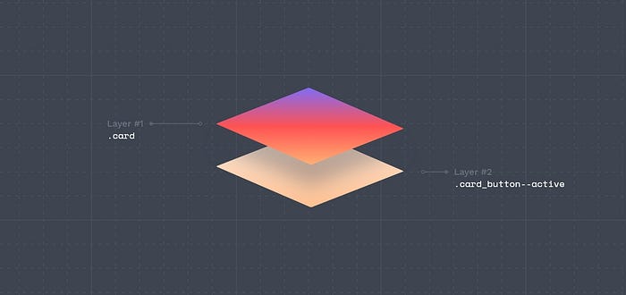
Card can get in different states, such as: active,highlightedor disabled, and using BEM convention, modifier class names are created by taking the block name or a block name with modifier adding to it two hyphens, followed by a modifier name. Like this:
.card__image--active  { }
.card__title--active  { }
.card__desc--active   { }
.card__button--active { }
or this
.card--active     { }
.card--disabled   { }
.card--highlighed { }
Let's continue with our card example:
.card--active {
  background-color: #aaaaaa;
}
.card__image--active {
  filter: opacity (.8);
}
.card__title--active {
  color: var(--primary-color);
}
.card__desc--active {
  color: #8a8a8a;
}
.card__button--active {
  opacity: .8;
}
<div class="card card--active">
  <img class="card__image card__image--active" src="#"/>
  <h4 class="card__title card__title--active">Title</h4>
  <p class="card__desc card__desc--active">Description</p>
  <a class="card__button card__button--active" href="#">Button</a>
</div>
BEM in Design
Now the anwser to probably most important question. How to use this knowledge in designer's daily work in UIdesign tools like Figma, Adobe XD, InVision, UXPin etc. or in delivering design tokens or any other design-related deliverables?
Well it's actually quite straightforward.
When creating a button with a UI design tool, give button's layer a name like card__button--active or button--primary--md--active.
When creating a design token for a color of a particular button, name it tok.button-color__primary--500 or when creating a variable, name it $color__secondary--100.
Learn more
This is how BEM pretty much works. If you'd like to explore more technical matters, you can read all about them here.
RSCSS
Stands for Reasonable System for CSS. As a primary rule RSCSS treats everything as a separate parent components, which will govern the internal elements from the child selector.
RSCSS is a guideline in keeping the CSS:
- well-organized,
- scalable and most of all,
- maintainable.
RSCSS attempts to divide the overall user interface into reusable components.
A component is a standalone entity that is meaningful on its own and described by preferably two-word name, like component-item.
An element is a part of a component and have no standalone meaning and described by one-word name, like image or button.
A variant is a modifier of a component or an element, a change of appearance, behavior or a state and described by one-word name with a hyphen prefix, like -active.
Premises
When working with RSCSS you should think in components. Each piece of UI should be viewed as an individual component, full stop.
However, it is very important to draw precise lines between components, like, the parent and the child. This all boils down to seeing component as single-purposed entity that does one thing and one thing only.
Use the UI Elements list to support your decision if needed.
General rules
- Use the
SCSSsyntax exclusively, - Components should be saved as their own files (eg.
css/components/feature-card.scss), - Using
tagandidselectors while writing your CSS should be avoided, - Avoid making components deeper than 3 levels,
- Components can be inside other components. In such case add variants to a nested component, placing the variant inside the component it is adhering to and not to the parent.
RSCSS can be visualized by this piece of SCSS syntax:
.component-item
> .elements
& .-variants
Component
A component is the container containing all the elements of the UI. Its class name should have at least two words, using hyphen in-between.
Consider these examples:
.feature-card
.nav-menu
.search-bar
.input-field
Element
Each component contains elements. Classes should have only one word, In case the element has to be multiple words, combine it without using spaces or dashes. Like this:
.feature-card
> .image
> .title
> .desc
> .button
In SCSS syntax elements are selected with the child combinator (>).
Variant
Variants are the modifiers of your component or elements. They are usually used to change the look and behavior of the component or element. Variants are prefixed with dashes (–) for easy identification. Like this:
.feature-card
&.-active
&.-disabled
&.-large
RSCSS in Design
How does RSCSS translate in design work? Well similarly to BEM, through naming layers and object the right way including usage of the right punctuation marks (dashes).
When creating a button with a UI design tool, give button's layer a name like button-primary or button-primary-md.
When creating a design token for a color of a particular button, name it tkns-headings-font-family or when creating a variable, name it $hover-primary-text.
So in the end there is not much of a difference between RSCSS in BEM in design realm, yet RSCSS seems to be more reasonable on naming piece of UI.
Learn more
This is how RSCSS naming convention pretty much works. If you'd like to explore more technical matters, you can read all about them here.
SMACSS
Stands for Scalable and Modular Architecture for CSS. SMACSS aims at categorizing CSS rules to produce patterns. It is more of a style guide than a rigid framework.
SMACSS is a style guide that aims to create a structure for stylesheet files. The main focus is on categorizing CSS rules to produce patterns that are easy to follow.
In other words, the main idea is to not mix code of several categories on a single file because it can be very complicated to find a simple line of code to change. The purpose of this categorization is to codify patterns, that results in less code, easier maintenance, and greater consistency in the user experience.
Though it has to be pointed out that SMACSS is more vague as a concept than the other methodologies.
Premises
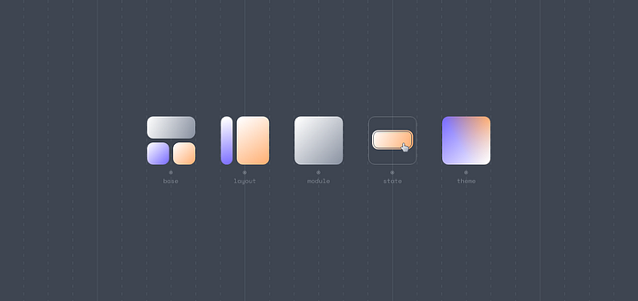
SMACSS is a series of rules for categorizing CSS rulesets in order to make the CSS codebase more organized, clean, scalable, and modular. Following the SMACSS methodology, we can separate our CSS rulesets into five categories:
- Base
- Layout
- Module
- State
- Theme
This breakdown should boil down to five separate files:
- _base.scss
- _layout.scss
- _module.scss
- _state.scss
- _theme.scss
Base
Base are the default values. They are like the padding, margin, border, typography properties — like font-family, etc. — and other properties.
This values are used within the entire website and for all elements. In other words, the base contains reset styles and global styles.
Layout
Layout divides a page into sections with elements like header, footer, main-page, etc. Layouts hold one or more modules together. Often layout elements are ID's eg. #header, #footer or by prefixing the class with l-, eg. l-fixed, l-grid.
Modules
Modules are the most important aspect of SMACSS. They are the reusable, modular parts of design like navbar, sidebar and any elements that are repeated in the website. They are unaffected by other user interface modules or layouts. Good examples would be an accordion, modal, dialog, or a carousel.
State
States are ways to describe how our modules and/or layouts will look when they are put into a particular state (eg. active, inactive, expanded, hidden). These are prefixed with is-, eg. is-active, is-inactive, is-expanded, is-hidden.
Let's see how all of it translate in to code, based on an example:
body { } /* base */
a:hover { } /* base with pseudo-class */

#header { } /* layout */
.l-grid #footer { } /* two layouts */

.btn { } /* a module */
.btn:hover { } /* a module with pseudo-class */

.btn-xl{ } /* a sub-module */
.btn-xl:hover { } /* a sub-module with pseudo-class */

.btn.is-active{ } /* a module with state */
.btn.is-active:hover { } /* a module with state */

.btn-xl.is-active{ } /* a sub-module with state class */
.btn-xl.is-active:hover { } /* a sub-module with state with pseudo-class */
SMACSS in Design
How does it translate to design work? Biggets impact on design work has the division of patterns of UI pieces — base, layout, modules and states. Meaning that in order to go with this methodology you should also divide your design in the above-mentioned way.
So in the end, it would neither impact the wording of your layers in UI design tools, nor design tokens you'd create, but actually influence the grouping method of your layers.
I'll give you an example. Based on SMACSS naming convention divide your artboards into to (1) base, with all the global tokens. Then have all different (2) layouts with all their use cases. After that (3) modules with all (4) sub-modules and each of their (5) states.
This unique trait of SMACSS is inherently connected to the fact that it's more vague as a concept, than the other methodologies like BEM and RSCSS.
Learn more
This is how SMACSSpretty much works. If you'd like to explore more technical matters, you can read all about them here.
Rest of the Shared Vocabulary
This study wouldn't be complete without its last piece. The complementary list of terms used in software development, every developer and designer should know.
We discussed in-depth most of UI Elements (Components) there are, compound names created through different methodologies, but do you exactly know what a wrapper is or a figcaption? Let's explore rest of the developer-centric design glossary.
Commonly used CSS classes
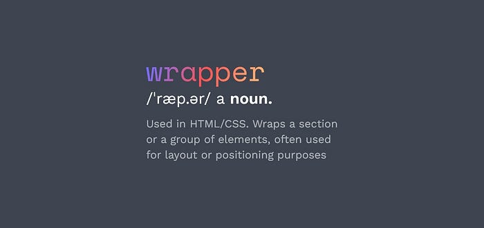
.containerDefines a responsive container to hold and center the main content of a webpage..wrapperWraps a section or a group of elements, often used for layout or positioning purposes..contentRepresents the main content area of a webpage..mainSpecifies the primary content of a webpage..rowRepresents a horizontal row in a grid system..color.columnDefines a column within a grid system..navbarCreates a navigation bar for the header section..menuDefines a menu within the header or footer.
HTML Sectioning Elements
<body>Represents the main content area of an HTML document. It contains all the visible content rendered on the webpage.<main>Represents the main content of a document or a specific section within a document.<header>Used to contain the header content of a site.<footer>Contains the footer content of a site.<nav>Contains the navigation menu, or other navigation functionality for the page.<article>Contains a standalone piece of content that would make sense if syndicated as an RSS item, for example a news item.<section>Used to either group different articles into different purposes or subjects, or to define the different sections of a single article.<aside>Defines a block of content that is related to the main content around it, but not central to the flow of it.<div>Commonly used for grouping and structuring content. It provides a generic container without any inherent semantic meaning.<figure>Represents self-contained content, typically an image, illustration, diagram, code snippet, or any media that is referenced in the main content of a document. Purpose of it is to provide semantic meaning and improve accessibility for assistive technologies.<figcaption>Defines a text description that helps explain or provide context to the content within the<figure>element. It is particularly useful when presenting visual content that requires additional information or a caption to make it more understandable or more accessible. Usage of<figure>and<figcaption>, creates a clear relationship between the content and its caption, helping search engines optimization.<canvas>Used to create graphics and visualizations dynamically using JavaScript. It provides a drawing surface on which you can programmatically render shapes, images, animations, and interactive elements.
Concepts
boxThe visual space occupied by an HTML element's content.toolbarTypically a horizontal or vertical strip that is placed at the top, bottom, or side of a web page or application interface. It often consists of buttons, icons, or other interactive elements that allow users to access frequently used features, perform actions, or navigate through the application.startandendProperties that are used to define the alignment and positioning of items along the main axis. These properties specify the starting and ending points based on the reading direction. So they can be used universally both for system in languages that are written from left-to-right as well as right-to-left, without change of any value, in opposite toleftandrightdirections.itemRefers to an individual element or component within UI. It can represent various entities depending on the context and the specific layout technique being used. It can be used inlists,flexboxes,grids,carouselsandmenus.clearfixA technique used to clear the floats of preceding elements within a container. This technique is commonly used with floated UI elements like images or columns. Everything to prevent layout issues and maintain the desired structure and positioning of these elements.viewportThe user's visible area of a web page displayed within a web browser window or device screen. In CSS, theviewportunits (vw,vh,vmin, andvmax) are relative units that allow elements to be sized proportionally to the size of the viewport. In HTML, theviewportcan be set in<meta>to control how the browser sets the initial viewport properties.widgetrefers to a self-contained and interactive UI component, that serves a specific purpose or provides a particular functionality.
What is this all fuss about? What's in it for designers?
So why should a designer bother with CSS, BEM, self-documenting names, methodologies, shared vocabulary and other concepts I've just mentioned?
A simple explanation is that, by knowing how all these structures and concepts, designers can adjust their UI Kits, mockups, designs accordingly and reduce the amount of issues that might arise between design and its implementation. And as mentioned in the introduction part, way at the top, to enhance functioning of these areas:
- Collaboration and Communication,
- Management and Scalability,
- Understanding and Review,
- On-boarding and Delivery Speed.
In other words, if a design follows guidelines on naming conventions, it will be an invaluable advantage for communication, management, scalability, review and on-boarding new people to develop and deliver fast and error-free, for the benefit of us all.
And this is precisely why I've created UI Crux website. Go and check it out now.
Share it
If you find this story valuable, please share it with your design community.
If you'd like to talk about it, discuss something more in-depth or just want to say 'Hi', book a session with me through ADPList.