

Rich Informatics in a GeoMap
If you are a retail marketer, you may ask about the next areas of growth opportunities. If you are a political scientist, you may demonstrate the voting results by state or county. If you are an epidemiologist, you may explain the distribution paths of a new virus. All of these tasks have one in common: visualizing the information on a map to take action. In this article, I will show you how to use Plotly to produce interactive maps. I have written a series of articles on data visualization, including "Pandas-Bokeh to Make Stunning Interactive Plots Easy", "Use Seaborn to Do Beautiful Plots Easy", and "Powerful Plots with Plotly" and now this one. My goal is to assist you to produce data visualization easily and proficiently. I have written articles on a variety of data science topics. For ease of use, you can bookmark my summary post "Dataman Learning Paths — Build Your Skills, Drive Your Career" which lists the links to all articles.
Use Plotly Express for Geomaps
Plotly Express is now part of Plotly. It is a high-level wrapper for rapid data exploration and plot generation. I demonstrate many use cases in "Plot with Plotly" using Plotly Express. For geomaps, it wraps plotly.graph_objects to produce graphic plots. It offers geomap functions such as px.scatter_geo, px.line_geo or px.choropleth.
Produce Area/Region (Choropleth) Plots
I will show you how to use go.Choropleth or go.Scattergeo graph objects to modify the appearance of the base map. You may wonder what Choropleth means. It comes from Greek, meaning area or region. A choropleth map is a thematic map that areas are shaded in proportion to a statistical variable. Have you seen a heat map by area for population density or GDP per capita? That's a type of choropleth map.
Four common types of geographic plots will be covered:
- Bubble plots on maps: using
px.scatter_geo() - Statistics on the boundary (such as country or county) maps: using
plotly.graph_objects() - Density plots on maps: using
px.density_mapbox() - Bubble plots on OpenStreet maps:
px.scatter_mapbox()
(A) Bubble Plots on Maps
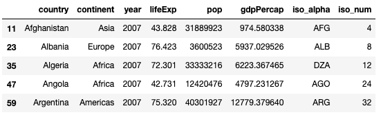
Before I load the data, I like to promote the organization Gapminder.org. I do not know about you, but I often comment on a country or a region ignorantly without data support and end up losing a debate embarrassingly. Knowing there is a gap between what people think and what the data show, this organization aims at promoting a fact-based worldview by offering data and facts that people may be ignorant of. This Gapminder Quiz may get you to agree on this point to some degree.
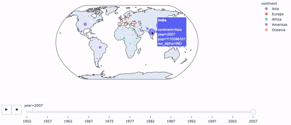
Okay. Let's load Gapminder's "life expectancy and GDP data of all countries", which are already available in Plotly Express. This dataset includes a column "iso_alpha" for the three-letter country codes, that is used by the syntax px.scatter_geo() for locations.
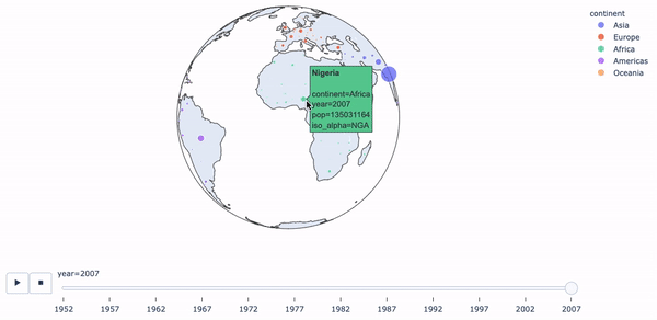
Do you see the interactivity of the plots? There is a sidebar below the map to select the range of the years. This is controlled by animation_frame='year'. There can be many ways to flatten a globe's surface into a plane to make a map. This process is called map projection (see the list of map projections). I show you two types of projections: "natural earth" and "orthographic".
How to export your plotly figure? You can useplotly.offline.plot() and turn the auto_open=False as below:
(B) Statistics on Boundary (such as country or county) Maps
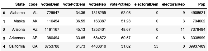
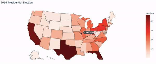
Many of you may still remember the U.S.2016 presidential election which caught worldwide attention. How do we plot the results on a map?
(B.2) Economic Data on a map
The next one I want to show you is the U.S. unemployment rate data by county. This example uses go.Choroplethmapbox(), which is a function of plotly.graph_objects. This function requires two inputs: the geographic index (such as county name), and the statistics that you want to display. The following code first loads the geojson data "counties" that contains the county coordinates.
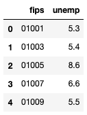
Column "fips" is the 5-digit Federal Information Processing Standard code that uniquely identified counties and county-equivalents in the United States. The following code plots the data.

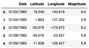
(C) Density Plots on Maps
A heat map on map lets readers comprehend the distributions and locations of events quickly. The code below plots the earthquakes around the globe.

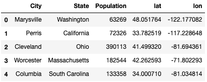
(D) Bubble plots on OpenStreet Maps
The OpenStreetMap is a map of the world, free to use and voluntarily contributed by many people. It can zoom in to even city and street details. The following dataset contains the latitude and longitude of each city and its population size. By using mapbox_style="open-street-map", the OpenStreetMap is plotted in the graph.