Introduction
Sony Network Entertainment International (SNEI) develops the online network infrastructure to provide top-quality entertainment around the globe through games, videos, music, and other services. I worked as a user experience (UX) design intern at SNEI over the summer of 2015, and was responsible for evaluating and improving the user experience of the PlayStation web store.
What is the PlayStation Store?
The PlayStation web store is a digital media store that offer PlayStation console owners a variety of downloadable content for purchase or for free, such as full console games, add-ons, movies, and TV shows. The store exists in three main platforms: a native PlayStation app, an online desktop store, and a mobile web app embedded within the PlayStation® App, which has over 100 million downloads on Android. Although most users purchase and download content through the console store, usage of the web version is increasing and has unique use cases, as discovered through user research.
Design Problem
My work focused on the online . The store has all the basic, primary user functions of an e-commerce website: the ability to browse, search, and purchase products.
The current state of the store has a lot of room for improvement. My fellow intern Wynn and I performed an heuristic evaluation of the site and collectively found around 200 issues relating to visual layout, UI, and UX. One set of guidelines we used was Contrast, Repetititon, Alignment, and Proximity (ie. "C.R.A.P."), coined by visual designer Robin Williams. Although it was originally intended to be used for visual design, these principles can be applied to evaluating user experience as well — for example, repetition refers to having things that look the same should perform the same function, which matches Nielsen's usability principle of having "consistency and standards." For example, both call-to-actions below perform the same action of bringing users to a new page, but one has an extra arrow that might confuse users as to if it performs a different function than a button that only has one arrow.
While top priority issues were being fixed for the short-term, we were tasked with the project of completely revamping the design and exploring new design directions that the PlayStation store can take.
User Research
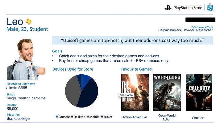
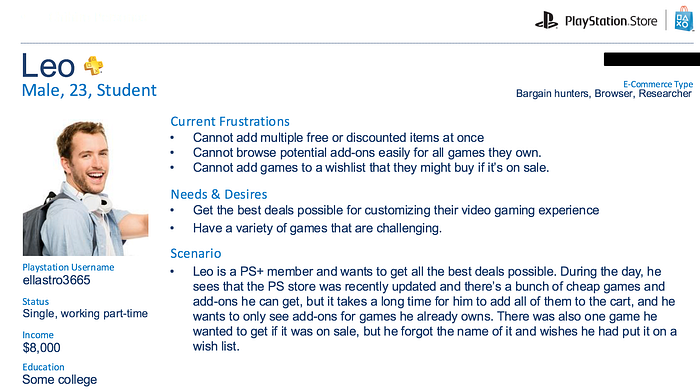
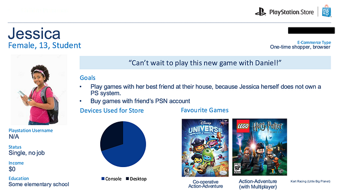
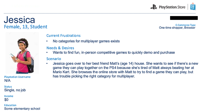
I first started off the process by creating personas to see how we could empathize with the users and their current frustrations with the PlayStation store, both the console and online version. This was especially important as I was not a regular user of any PlayStation products. Although I own some older generation consoles, I had never used the console store or the web store since its launch in 2011.
Although I was unable to recruit participants for interviews as primary research due to time and budget constraints, I was able to do secondary research by going through many forum sites, both official PlayStation ones and non-official. I captured quotes that had to do with how PlayStation users were interacting with the PlayStation store, especially the web version. I looked for both overall goals and context for using the website version, and particularly any points of frustration with the website. Once I collected around 50 quotes or so, I was able to see some patterns and was able to group the quotes into what would become the foundations for the different persons.
I also explored some general research on e-commerce usage — I came across a neat article from Nielsen Norman group that grouped e-commerce users into different types of shoppers, each having distinct use cases and motivations when using an online store. I saw some potential overlap between these groups, the quotes I collected, and internal PlayStation "gamer" personas, and incorporated them into 6 distinct personas, two of which can be seen below:
Competitor Analysis + Mobile Inspiration
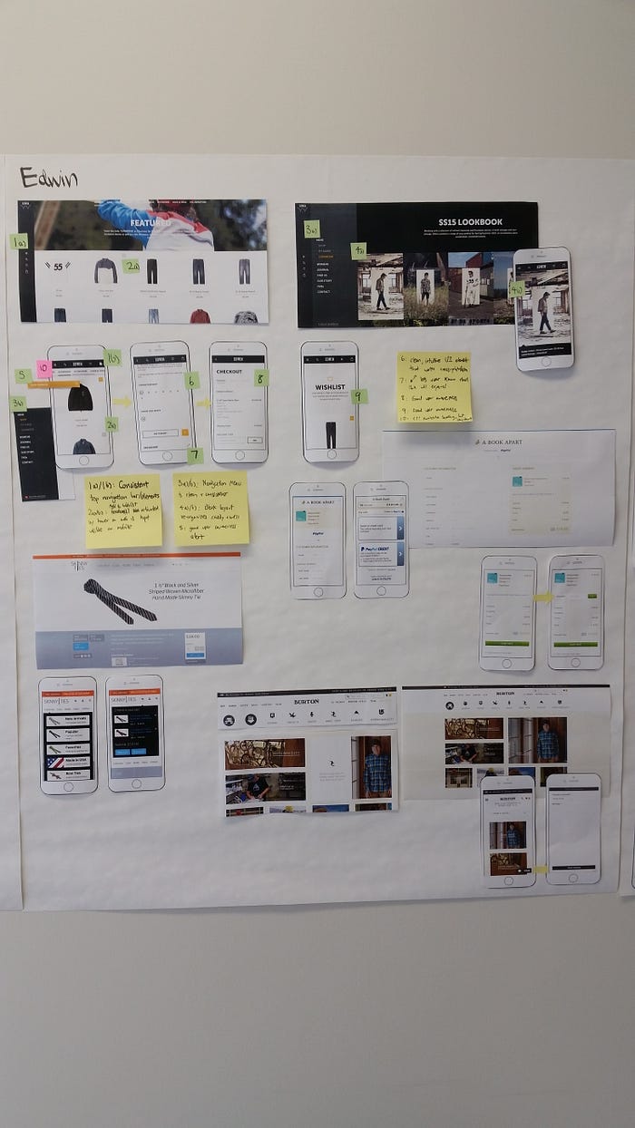
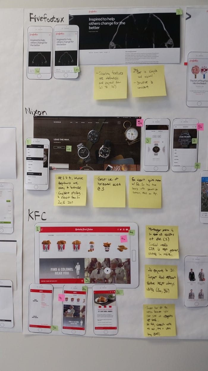
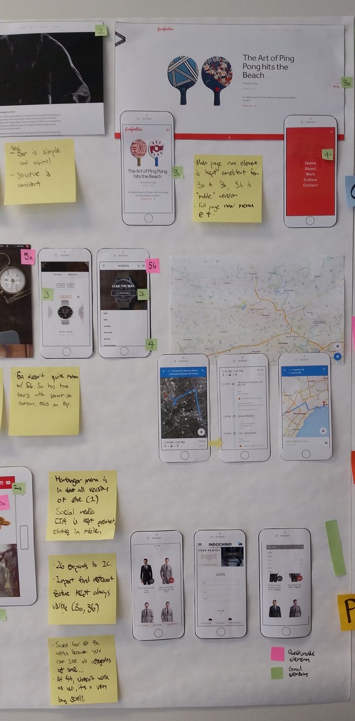
I then looked into how other e-commerce sites were designed, especially on mobile. An e-commerce store has many functions, so to elegantly present it on small screen is no easy feat. I also looked at search design on websites that were not e-commerce. One main thing I began to notice is that many e-commerce sites were clearly designed mobile-first. Even on the desktop version, it had elements that you usually only saw on mobile, such as a hamburger menu and interaction items/areas that took up a large percentage of the screen. I printed some of my favourite ones and labelled both interested and flawed UI interactions and UX points (particularly searching and check-out) flows, as seen in the following photos:
Conceptualizing Design Goals
Based on the user research, competitive analysis, our mood board, our own design intuition, design heuristics, and new PlayStation Store branding guidelines (which we also made but unfortunately am not allowed to share), Wynn and I came up with about 30 qualitative descriptors that we think a user would use to describe the overall user experience of the new PlayStation store. We then wanted to see what more people thought about our goals to identify the ones that are the most important. Again, since we didn't have access to regular users via recruiting, we did a card sorting exercise with various employees at SNEI Waterloo. This is obviously less than ideal as it doesn't truly represent our user base, and presents a bias towards people that are very technical and close to the product. However, almost all of the employees were regular users of the PlayStation and PlayStation store, so they represent at least some of the user base. It also allowed a unique opportunity for our developer-heavy group to contribute to the product vision.
In the exercise, the employees were asked to sort the words into three tiers of importance, with the 1st tier being the most important. Some keywords were also added in by the employees during the exercise. In the following table, the user experience keywords are shown in order of their overall score.
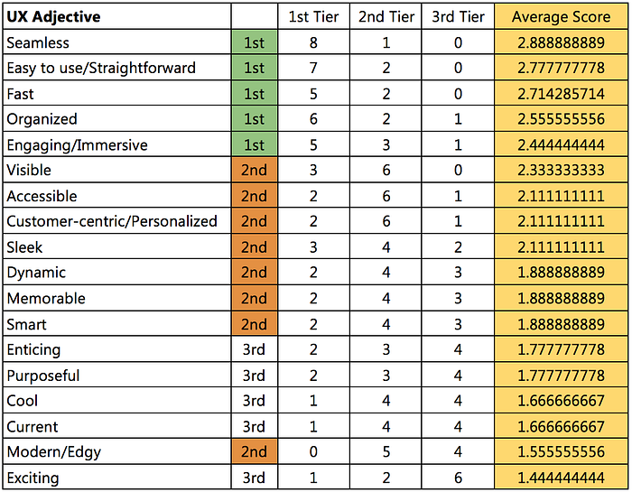
The overall score was calculated by giving three points every time it was sorted into 1st tier, two points every time it was sorted into 2nd tier, and one point every time it was sorted into 3rd tier, then dividing up that total by the number of employees that participated (nine, in this case.) In other words, if a key word was sorted into 1st tier by all of the participants, its overall score would be 3.
As seen, some obvious user experience key words are at the top. An e-commerce store most certainly should be easy to use and organized, and should perform fast to allow for the user to get the product they want as quickly as possible. Other, less technical terms also came up, which the design team felt was important to keep in mind, since users also want to feel certain ways about the overall store based on its aesthetics and user experience choices, such as being seamless and engaging. These also fit in with the PlayStation brand, as many modern video games are becoming more and more engaging, realistic, and seamless. Other design requirements are that the mobile website should include familiar mobile gesture like scrolling down, offer menus for specific navigations, offer an option use the full site, as well as keeping high-level, important functions visible at the top.
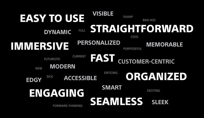
To remind ourselves of the keywords that we came up with throughout the design process, Wynn created a lovely wordle with the most important keywords having the most prominence.
Although I had not realized it at the time, this process was very similar to Microsoft's desirability toolkit.
Mobile Search Design
After all the initial research done, I was tasked with specifically exploring mobile search design. I started out with sketches of ideas. The particular challenge in this case was how to display the results. The PlayStation Store has a variety of media content, mainly sorted in 3 types: Video Games, TV, or Movies. This presented unique requirements and constraints, as these sections are very distinct, so searches for these products was also likely to be distinct.
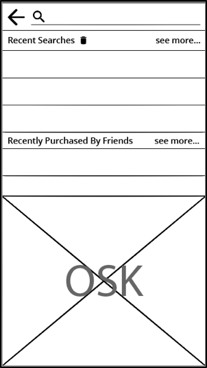
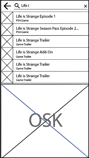
I first sketched out various wireframes for the pre-search screen, when the user first clicks the "search" function, or clicks the search field. I wanted to give them their history as many users search for products, but don't end up buying it as they want to do more research on the game, and then come back to it. Also, I wanted to give users the ability to see what other people were searching and what was popular, as many users also wanted to see that. Based on user research, many users searching on the store are looking to get to an exact product in the fastest time possible. As such, I also created a "mid-search" screen that auto-searched in the middle of the user typing out their query. Sorted based on relevancy, this provides a fast way to get to potentially what they are looking for. The solutions I liked the most and created a wireframe for can be seen below:
Once the user clicked the search or enter button on their keyboard, they would be taken to a more detailed results screen to browse, filter, and sort for the products they want. One unique requirement for this is that the search results have to show if the game has a special "PS+ Membership" price, on sale, or has some other unique promotion, all denoted with a small badge. In the final search result screen, I knew that I wanted to automatically presented the results sorted by each of the three content types offered by the PlayStation store (i.e. Games, Movies, TV Shows). This is because the categories are very distinct, so if users are looking for a TV show, their search result will definitely not be part of video games. With these requirements in mind, many alternatives were wireframed. The top two that were considered are seen below:
Alternative #1
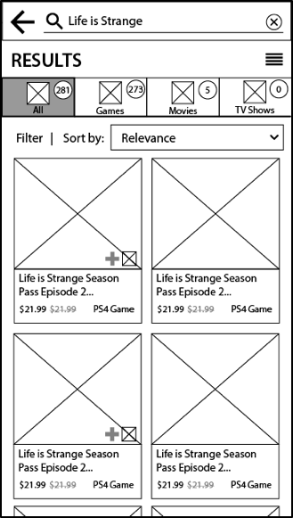
In alternative #1, the search results split into four tabs, With this interaction, if they search for a term like "Batman" which has products in all 4 categories, they can easily switch to the type of product they're looking for. Filters and sorting options are under each tab because they change depending on the type of content. The layout also displays only 4 products at a time, since each product has a relatively large image associated with it. This is to make the experience very immersive and engaging by providing large visuals of the media cover art, similar to how they would see it in a retail store.
Alternative #2
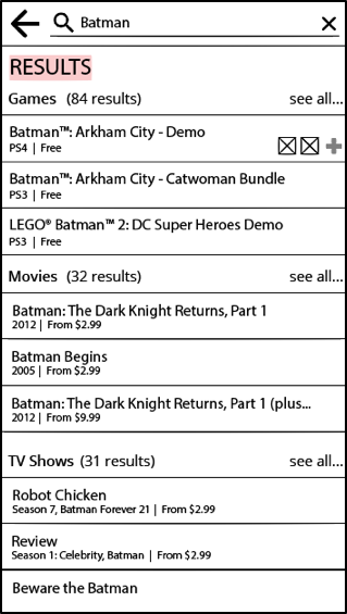
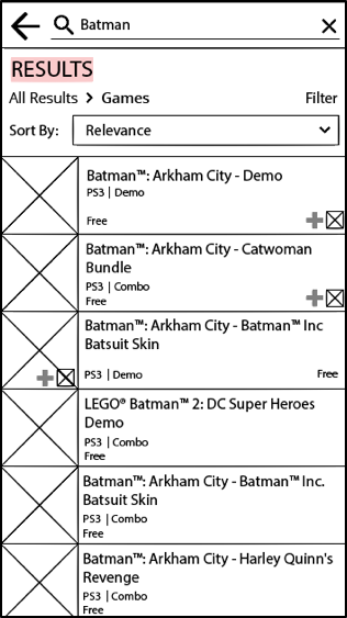
In alternative #2, all three content categories are displayed at once, and the top three most relevant results per category are displayed in a list view. No thumbnails are displayed with the results so there is ample room to have the product title on one line and save vertical space in order to display as many results as possible. Clicking "see all" for any particular category will take users to a page that would display results with a small image and some product details in a list view to provide more visuals within a category. Breadcrumbs at the top keep the user reminded of where they are and allow for easy way to go back and see all.
Analysis of Alternatives
Alternative #1 is more engaging because it uses a grid view with larger images that also invoke the look of a physical video game or DVD case, but it is less organized since there is less room for information about the product. A list view would be easier to sort and compare as you can see more products at once, which is seen in alternative #2. This is important since a main purpose of the search function is to allow users to compare between options and find content easily based on their preferences. A main feature of alternative #1 that's really great is sorting the results into different tabs, since it makes it easier to go between the different categories of results (minimizing information access cost), and each tab has an icon in addition to text to emphasize the type of content each tab contains. Another plus for alternative one is that it displays an "all" results initially. Since users use the PlayStation store primarily for games, displaying the most relevant movies and TV shows upfront, as alternative #2 does, doesn't make efficient use of space.
Recommendations
From the comparison of the three search results alternatives, alternative #1 seems to be the best choice for potential implementation to improve overall user experience. However, both alternatives have elements in their design that help increase the overall usability. For example, alternative #2 has a list view that would allow for easier comparison of basic information between different products in the search results than the grid view in alternative #1. As such, a final design should incorporate both elements by offering a choice to the user for the view of the search results. This way, users can either have a more immersive, visual experience of browsing the search results with a grid view, or have a quicker overview of more products at once with a list view.
Usability testing should be done on the new design. Realistic scenarios and search tasks should be created and tested on to see how well users are able to complete them, and based on the results, the design should be iterated upon.
Retrospective
During initial analysis of the store, only a couple of design heuristics of the many that exist were used evaluate the usability of the store. A more in-depth analysis could have involved other usability heuristics. The UX goals card sorting exercise could have been done with more users, such as randomly recruited PSN members, in order to hear directly from the users and have a great variety in opinion. This is crucial in user experience design, as different users may have varying opinions on the usability of a product. For the mobile search design, I would've wanted to create even more iterations and variations. Also, because only basic wireframes were made and analyzed, some usability issues might have been overseen before deciding on a solution to move forward with for user testing. I also wished I had more varied content in the mock-ups to put a focus on content-first design for a content-heavy feature, to ensure we cover edge cases and let content more strongly inform design (e.g. visual hierarchy, placement, multi-language) Higher fidelity prototypes can be made for more thorough and accurate user testing.
Remarks
I would like to thank Jesse Wong for being a great mentor and supervisor, and Wynn Yau for being a wonderful fellow design co-op student to work with.