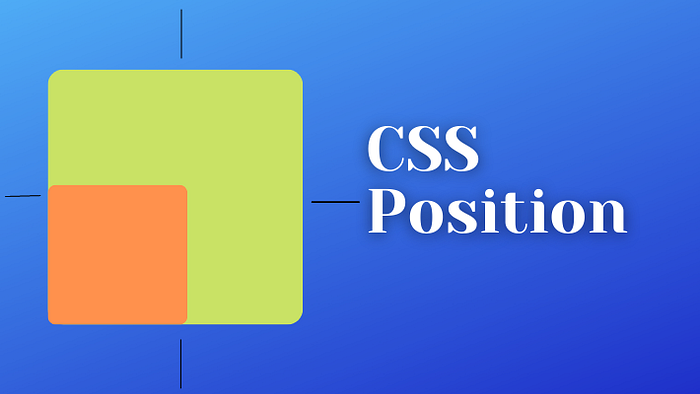


CSS positions determine how an HTML element is placed or positioned within a web page or layout. Several position values in CSS control the positioning of elements, which are static, sticky, absolute, relative, and fixed.
Overview of Document Flow
HTML elements are shown on the UI as they written on the file. Let's understand via an example.
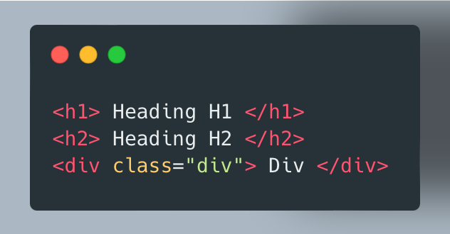
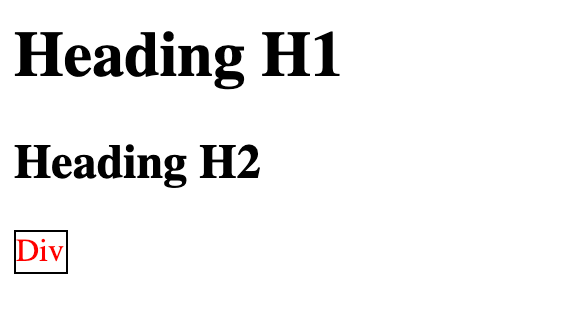
H1, H2 and div are displayed on the webpage in exact order as they written in the file. Now you are good to go to learn positions. Let's start with relative position
Relative Position
The relative position allows you to adjust the position of an element relative to its normal position in the document flow. When an element is given a relative position, you can use the top, right, bottom, and left properties to move it from its default position.
Let's understand via an example:
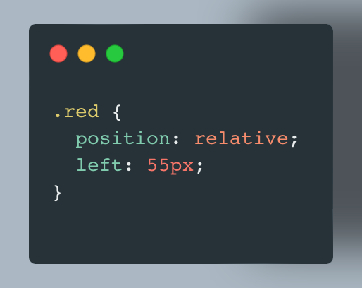
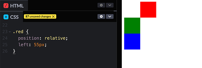
You can notice that after applying position: relative and left:55px Red box is shifted 55px from left. Relative position is relative to itself only. Original position of the red box is just above the green with the same width and height as green box. Now let's day you want to shift green to the right of the red box then what you will do? You can write something like this:
.green {
  position: relative;
  left: 110px;
}
So, now output will be like this:
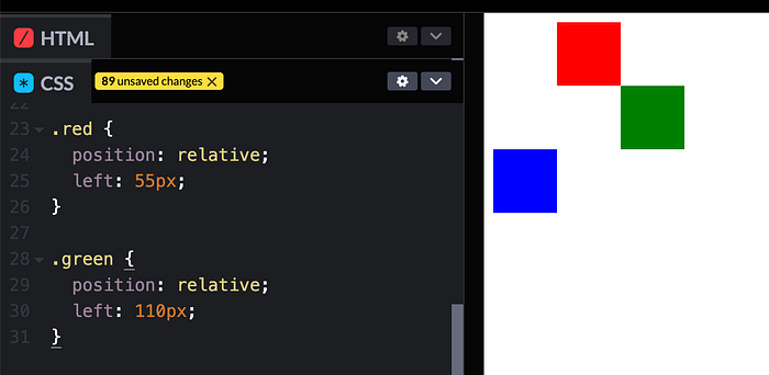
If you noticed, document flow is not affected by relative positioning. So, this is how you can apply relative position.
Absolute Position
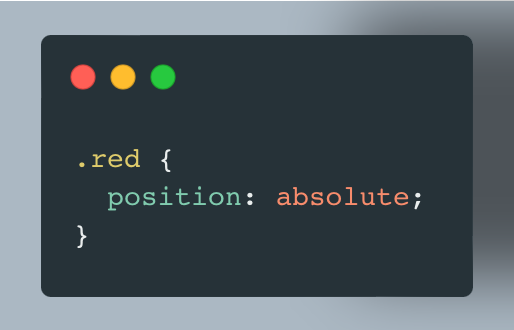
The absolute position allows you to place an element precisely in a specific location on the web page, completely removed from the normal document flow. When an element is given an absolute position, it is positioned relative to its nearest positioned ancestor, which means that it's often used within a container that has a non-static (e.g., relative, absolute, or fixed) position. Let's modify the above example, and apply position: absolute for red block.
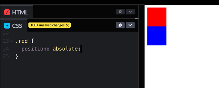
As you can see in the output, there's no green block. So, here comes absolute position in the picture. Green block is hidden, it's just behind the red one because red block is now out of the flow, no separate space is allocated to red one. As mentioned above: Absolute position is relative to element's closest ancestor, which has some position. Let's take another example to understand this sentence.
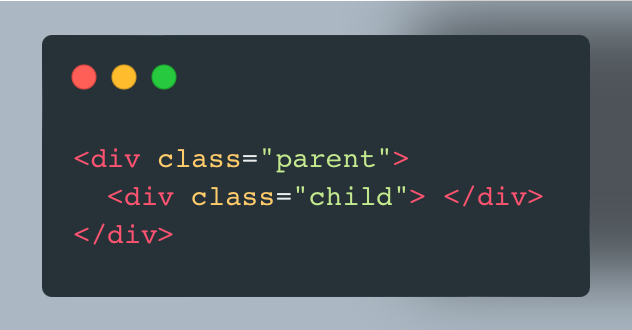
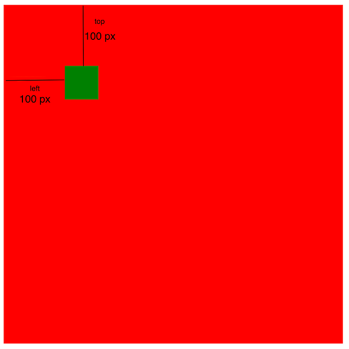
Here, I took two div. One is parent (red) and another is child (green). On red i've applied relative position and on green I've applied absolute position. Now you can see green is placed 100px top and 100 px left on red because of absolute position is relative to closest ancestor having some position property.

Now you can play with multiple parent-child blocks and try positioning.
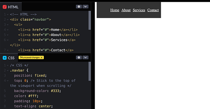
Sticky Position
The sticky position allows an element to act as a hybrid between position: relative and position: fixed, based on the user's scroll position. When you apply position: sticky to an element, it remains in the normal document flow until a specified scroll position is reached, at which point it becomes fixed in its position. When you scroll back up, it returns to its original position. Sticky positioning is commonly used for creating elements like navigation bars that "stick" to the top of the page as you scroll down.
Here's how position: sticky works:
- The element is initially in the normal document flow, just like elements with
position: relative - You specify an offset value using the
top,right,bottom, orleftproperties to determine the point at which the element becomes "sticky" as you scroll - When the user scrolls down the page and the element's specified offset is reached, it becomes fixed in place relative to the viewport. It remains at that position while the user continues scrolling
- When the user scrolls back up and the element's original position is reached, it returns to its original place in the document flow
Let's understand via one example:
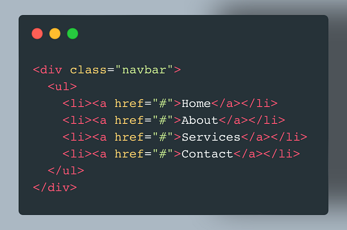
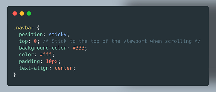
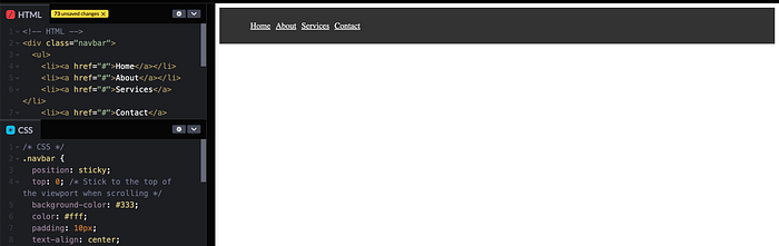
In this example, the .navbar element is given a sticky position with top: 0, which means it will stick to the top of the viewport when the user scrolls. As the user scrolls down, the navigation bar will remain at the top of the screen, providing easy access to the navigation links. When the user scrolls back up, it will return to its original position.
Fixed Position
The Fixed Position allows you to position an element relative to the viewport, making it "fixed" in place, even when the user scrolls the page. This is commonly used for elements like navigation bars or headers that you want to remain visible at the same position on the screen as the user scrolls.
Here's how position: fixed works:
- The element is removed from the normal document flow, meaning it doesn't affect the layout of other elements.
- You can use the
top,right,bottom, andleftproperties to specify the exact position of the element relative to the viewport. - The element remains fixed at that position regardless of how the user scrolls the page.
Let's understand via an example:

In this example, the .fixed-navbar element is given a fixed position with top: 0; and left: 0;, which means it's fixed at the top-left corner of the viewport. As the user scrolls down the page, the navigation bar remains in the same position, providing easy access to the navigation links.
Fixed positioning is useful for creating elements that you want to remain visible on the screen regardless of how the user interacts with the page. It is commonly used for fixed headers, navigation bars, sidebars, or any other elements you want to "stick" in place.
Now one question arise in your mind is what is difference between sticky and fixed position? Alright, let's simplified that as well: position: fixed is suitable for elements that you want to stay in the same position on the screen at all times. It doesn't rely on any ancestor's positioning. On the other hand, position: sticky is used when you want an element to change its behavior (from relative to fixed) when a specific scroll point is reached. It is often relative to an ancestor, allowing it to interact with the surrounding content more naturally.
Static Position
It's the default positionaling value. When an element is set to position: static, it follows the normal document flow, and the properties top, right, bottom, and left have no effect on it. Essentially, it's positioned exactly as it would be without any additional positioning properties.
That's a wrap. Hope you had a good learning. If you like this article please share it with the needy ones.
Let's connect on Twitter, LinkedIn, and GitHub! For contribution: BUY ME A COFFEE
If you have further queries feel free to reach out!
In Plain English
Thank you for being a part of our community! Before you go:
- Be sure to clap and follow the writer! 👏
- You can find even more content at PlainEnglish.io 🚀
- Sign up for our free weekly newsletter. 🗞️
- Follow us: Twitter(X), LinkedIn, YouTube, Discord.
- Check out our other platforms: Stackademic, CoFeed, Venture.