

USER EXPERIENCE
I love language learning—and I use technology to help me. Specifically: Duolingo.
I work as an Experience Strategist at Method (referral link). When I had first begun my exploration of language learning apps, I compared Duolingo and Rosetta Stone from a UX onboarding perspective:
Ever since, I deleted Rosetta Stone!
I'd been using the free version of Duolingo for over a year for Japanese, and ten months for Scottish Gaelic and Welsh. Although I'd gotten used to the constant ads in the free version, I decided to invest in the Family Plan thanks to my professional learning budget at Method.
In that year and few months, Duolingo has continued to evolve its product, interface, and user experience. Let's tackle it:
Duolingo UX Pros
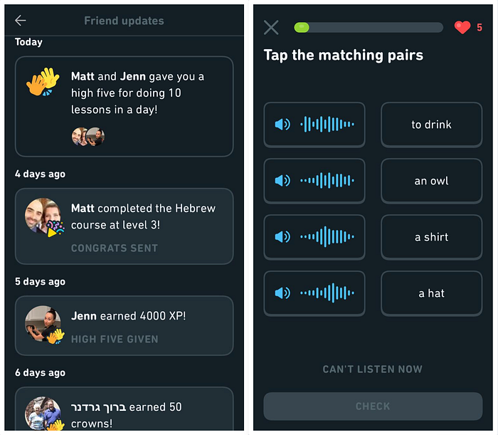
Friends
Notifications from friends are encouraging! Keeps me connected to other language learners and reinforces a sense of communal learning:
Audio-Only
Lately, I've seen some questions which show an audio waveform along with the translation for you to match it with (above). This is a refreshing change from the typical word matching, and helps learners build their listening skills. More of this, please.
Monthly Badges
The new monthly badges are wonderful. Monthly badges motivate me much more than the weekly leaderboard and various "leagues." I'm in Diamond League? I don't care. I want that badge, though! Makes me feel like a real Pokémon trainer:
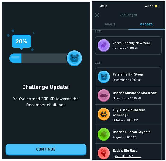
Why are the badges more motivating? Because they are scarce. There's a limited time in which I can earn a badge, and if I miss it—poof! It's gone and I'll never get it. It's an excellent way to leverage time limits, scarcity, and FOMO to motivate users.
Screenshots
Another new update: when you take a screenshot while in the app, Duolingo senses it and creates a downloadable and shareable version which looks cleaner and more social media-friendly:

Self-Service
Duolingo also has small self-help buttons when you answer a question. If you're confused about why you got something wrong, you can click on the little bubble (above) to see a discussion and explanation of the answer. Keeps me from having to look things up outside the app.
Year in Review
This was a super-cool, user-first experience. It wasn't just passive, either; it made me get involved and lean forward to see how I'd progressed. I wouldn't mind a month in review feature, either!

Stories
The new "story" feature is quite useful, as I'm a huge believer in learning languages through the power of story. However, especially with Japanese, this new facet of Duolingo is intimidating! I'm never sure if the stories are above my current skill level or not. It might be good if they were locked according to Checkpoints or Units completed so I don't get overwhelmed!
Duolingo UX Cons
Screenshots
The downside to the screenshot fuction is that taking an actual screenshot is the only way to generate the Duolingo image, which means I now have two images on my phone. I wish there was a way to reduce this duplication.
App Stall
Once I complete a lesson, the app will often stall for 10–20 seconds. Sometimes the ad which plays afterward will turn white and never work. Duolingo won't let me try again and it won't give me gems. This lack of error recovery is irksome, but since I upgraded my plan (and got a newer phone) this ain't been happening.
Heart Refill
Annoyingly, my hearts (strikes you get for mistakes make during lessons) don't seem to operate according to the same logic as other parts of the app. Midnight is the cutoff for completing a lesson to maintain one's study streak, but hearts get refilled slowly, which can be annoying. To follow the same logic as the streaks, hearts should likewise automatically refill at midnight.
Forced Five
Even once you run out of hearts, you can buy more with gems to keep studying. I really liked how I was able to purchase one heart instead of five at once (since they'll eventually all refill), but that feature didn't last long. Bummer! I reckon it's because Duolingo wants to encourage more in-app purchases of gems, and they'd rather folks spend more gems at once.
Email Updates
I get regular email updates which show my weekly progress, which is cool, but…I don't see a clear way to use the data I'm given. These emails aren't vast and engaging like the "Year in Review" I mentioned above. If there was a clear purpose for this notification and an actionable use for its data, perhaps I'd find the feature more helpful.
Big UX Issues?
Most of these cons are irrelevant now that I have the paid Family Pro plan, since I don't have to worry about ads or hearts. Plus, since I can add family and friends to this program, it's more value for the money compared to a single-user plan.
Still, there's a larger issue than these small gripes. My biggest complaint is:
No Mobile Word List
It's impossible to look at my word list on the mobile app! Why!?

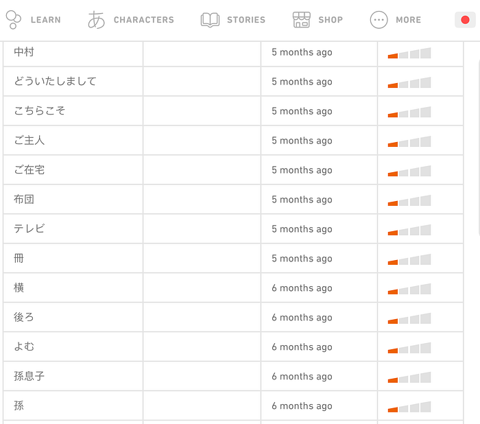
In case you're unfamiliar, Duolingo keeps track of all the words and phrases you learn for each language. It's got a running dictionary which shows all your words as well:

However, you can ONLY access this on the webapp version of Duolingo. It's not available on the mobile app!
Why This is a Major Problem
Duolingo has an issue with how it counts a word as "learned."
In my weekly progress reports and "Year in Review," Duolingo touts that I've learned 1,224 words. Sounds cool, right?
It's actually unhelpful.
Just because I've seen this new word in one lesson doesn't mean I've memorized it. That's not how memory or language learning works. You have to have repeated exposure to new words in order to truly learn them—in order to move them from short term memory to long term memory.
Duolingo is supposed to have a SRS (spaced repetition system) incorporated into its algorithm. I'm sure it does, but it's not a focus of the user experience since that's not as fun of a "game," which is based on novelty. Duolingo is all about gamification, so I get it.
Still…this means the need for me to be able to study a list of words and phrases on mobile even more crucial for developing my language skills, and is another reason why I'm annoyed this feature isn't even available in the paid version of the app.
Even Worse
In the past, you could click on each word in the word list. This would then show you the definition of the word:
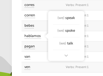
You could even example sentences — likely the sentences you practiced with while using the app. Super useful!
…Duolingo removed this functionality.
So, not only do I not have access to the word list on my phone—which is the most convenient, habitual way I access Duolingo—but even if I go to the trouble to look up words on the web app, I can't even see the definition or example sentences!
I'm not the only one annoyed. Others have complained about this in the Duolingo user forums, and we're all mystified as to why this happened.
As a UX professional, I'm at a loss as to why this functionality Duolingo had already implemented was removed. Perhaps I'm in the minority of those who enjoyed the feature, but if the whole point of Duolingo is to help users learn languages, why relegate a feature to web-only and then gut its functionality?

So…where does this leave us language learners?
Duolingo is…Okay
I still like Duolingo. I still use it frequently despite its failings.
Duolingo alone won't make you fluent, but it is a helpful part of language learning for me. It reminds me daily that I'm a "language learner," which enables me to stay motivated. Plus, I'm grateful that Duolingo has more obscure languages like Welsh and Scottish Gaelic, which I'm passionate about:
If Duolingo wants to be even more effective, they should consider focusing on more than just gamification. If users want to deep-dive into word lists and example sentences for self-study, let them do that. Make it a paid-only feature if you have to. The gamification is what keeps users engaged, but to actually aid them in fluency, the product needs more.
Carl T. Rogers, MFA is a writer and director who works by day as a Sr. UX Strategist at Method. We're hiring!
Finally, I'm available to assist you on your UX journey with ongoing mentorship and one-off coaching sessions via MentorCruise:
