

These days, businesses have abundant information, and decisions are driven by data. The ability to effectively communicate insights through compelling visualizations is paramount. Visualizations have the remarkable ability to distill complex data into meaningful patterns and trends, empowering decision-makers to grasp critical information at a glance. They bridge the gap between raw data and actionable insights, enabling us to unlock the full potential of our data-driven endeavors. In this article, we embark on a journey to master the art of data visualization. By the end of this exploration, you will possess the skills and knowledge to breathe life into your data, transforming it into powerful visual narratives that leave a lasting impact. So let's dive in.
Choosing the Right Visualization Approach:
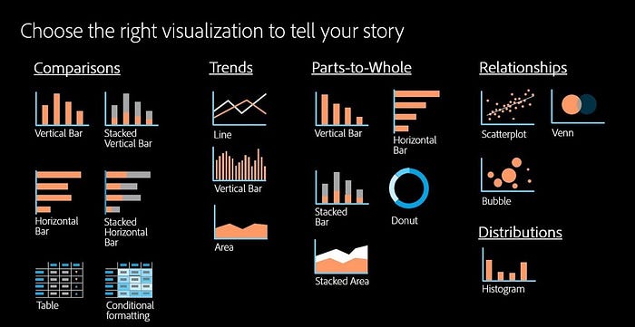
Selecting the appropriate visualization approach is crucial for effectively conveying your data's message. Consider using techniques such as bar charts, line graphs, scatter plots, and heatmaps based on the nature of your data. For example, when comparing categorical data, a bar chart can provide a clear visual representation of the differences. If you have numerical data over time, a line graph can effectively showcase trends and patterns.
Enhancing Visual Appeal with Color and Design:
Colors and design elements play a significant role in capturing attention and guiding the viewer's focus. Use color palettes that are visually appealing and ensure accessibility. Incorporate design principles like proper spacing, alignment, and font choices to create a harmonious and professional visualization. Consider using contrasting colors to highlight specific data points or using gradients to represent intensity or magnitude. Experiment with different color schemes and visual styles to find the best fit for your data and audience.
Telling a Story with Interactive Visualizations:
Interactive visualizations allow users to explore data and discover insights at their own pace. Consider incorporating interactive elements such as tooltips, filters, and drill-down functionality. This not only engages your audience but also empowers them to derive insights specific to their needs. Interactive visualizations can be created using tools like D3.js, Plotly, or Tableau. For example, you can build an interactive dashboard that enables users to interact with different charts and explore different dimensions of the data.
Utilizing Infographics for Summarizing Complex Data:
Infographics are powerful tools for condensing complex data into visually appealing and easily digestible formats. Use infographics to provide a comprehensive overview or summarize key findings. For instance, a flowchart or decision tree can simplify complex processes or decision-making paths. Infographics can be created using graphic design software or online tools like Canva or Piktochart. Remember to use clear and concise visuals, incorporate icons and illustrations, and organize information in a logical and visually engaging manner.
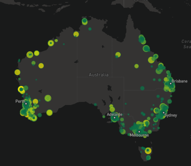
Visualizing Geospatial Data with Maps:
Geospatial data can be effectively presented through maps. Use choropleth maps, bubble maps, or heat maps to showcase regional patterns, spatial distributions, or demographic information. Displaying a map with color-coded regions based on a specific metric can instantly highlight regional variations or trends. Consider using interactive maps that allow users to zoom in, hover over regions for details, or toggle different layers of information. Mapping libraries like Leaflet, Mapbox, or Google Maps API can assist in creating visually appealing and interactive maps for your data.
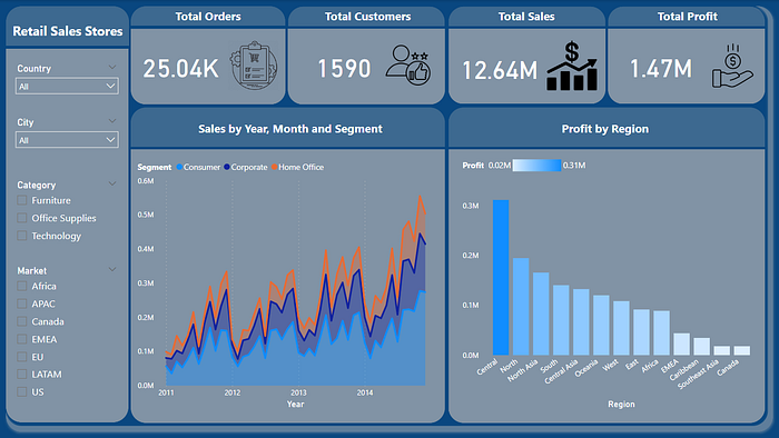
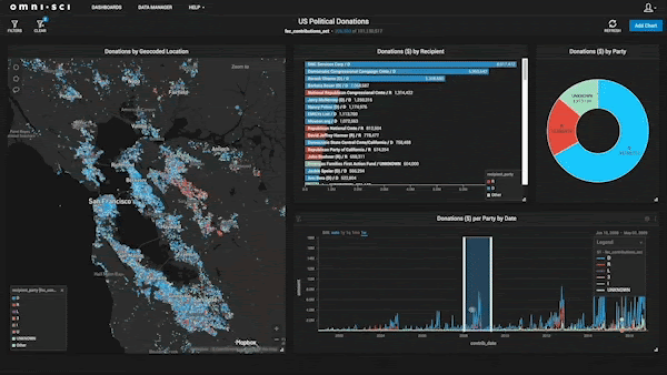
Incorporating Interactive Dashboards for Data Exploration:
Dashboards offer a centralized view of multiple visualizations, providing a comprehensive understanding of various data aspects in one place. Develop interactive dashboards using tools like Tableau, Power BI, or Plotly. By allowing users to interact with different visualizations, they can uncover deeper insights and make informed decisions. Consider including filters, drop-down menus, or sliders to enable users to customize the dashboard based on their interests. Additionally, provide clear and intuitive navigation within the dashboard to ensure a seamless user experience.
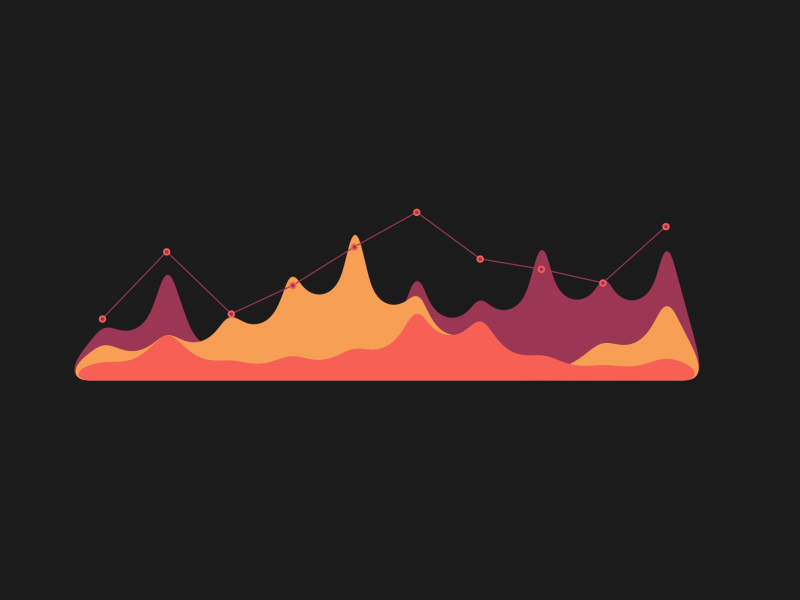
Visualizing Time-Series Data with Line Graphs:
Line graphs are effective in showcasing trends and patterns over time. Utilize this visualization technique for time-series data, such as stock prices, website traffic, or temperature variations. Highlight significant events or fluctuations using annotations or markers. Ensure the axes and labels are clearly labeled, and consider using secondary axes if multiple variables are involved. By effectively visualizing time-series data, you can identify long-term trends, seasonal patterns, or anomalies that may impact your business decisions.
Conclusion
Mastering the art of data visualization is a valuable skill for data scientists and analysts alike. By employing the right visualization techniques, enhancing visual appeal, and leveraging interactive elements, you can create impactful visualizations that engage your audience and drive actionable insights.
🎯Ask anything, I will try my best to answer and help you out.

If you found my article helpful, I would greatly appreciate it if you could share it with your network. You can also show your support by clapping (up to 50 times!) to let me know you enjoyed it.

Don't forget to follow me on Medium, Twitter and connect with me on LinkedIn to stay updated on my latest articles.