


As someone who is relatively new to Medium but uses it frequently, I'd like to share a few things I've noticed that affect my user experience. I use the app almost every day and have developed some certain habits, but the interface doesn't always align with those habits. Through my own usage, I've observed how small changes on Medium can lead to significant improvements in user experience.
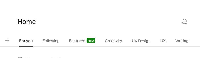
For instance, every time I open the app, I'm greeted by the "For You" section at the top. While this area shows content based on my interests, I personally prefer to see new posts from the accounts I follow first. From a user experience perspective, it might be more helpful to make the "Following" tab the default landing section.
In the profile section, the "Short bio" is located within the "About" area. These sections could be separated more clearly, and placing the short bio under the follower information might make profile introductions more effective and accessible.
Finally, like many other platforms, Medium could benefit from allowing users to log in to multiple accounts. Currently, Medium doesn't support multi-account access, which can be frustrating for users like me who manage more than one profile. It results in a loss of time and efficiency.
Small changes – like a default section switch, clearer profile structure, and multi-account support – can create big improvements in the overall experience. Truly understanding your users starts with closely observing their habits and taking them into account.
Do you also believe that small changes can create big differences? What aspects of Medium influence your experience the most?