

Hello everybody, in todays story I will show you how to build a custom menu made with radial floating buttons and morphing icon, totally in SwiftUI.
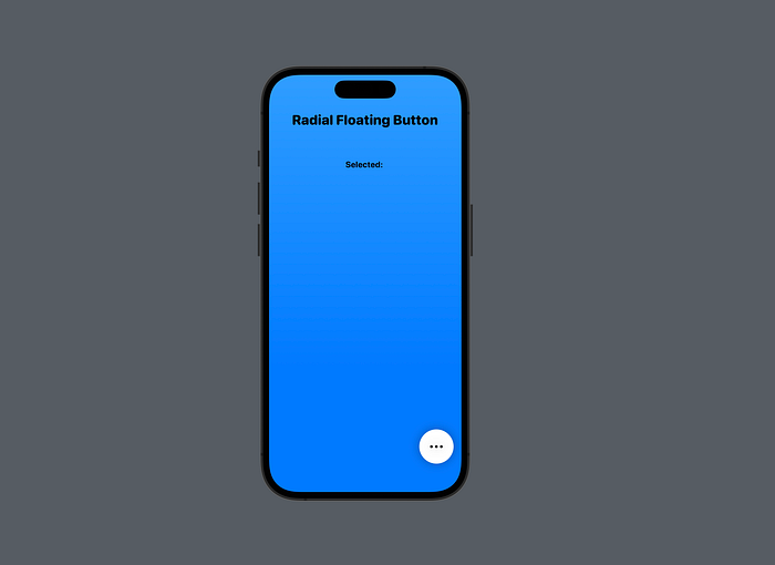
This will be the final result:

As usually you can find the full code of the final project in my Patreon page:
If you like my articles, think about supporting me 👍
A floating button is a great tool to create very light and intuitive user interface to start an action or a flow. Sadly sometimes, one single button is not enough so we can leverage the power of SwiftUI to create something more powerful and interesting. So, basically, we will create a button that once tapped will animate a series or supplementary buttons to offer the user more options. In a compact and single component, we will have all the basic options of a screen.
We will follow the next steps:
- The Idea
- The Main View
- The Basic Main Floating Button
- The Satellite Models
- The Satellite Buttons
- Updating the Main Floating Button
The Idea
The idea is pretty simple. We will create an array of objects describing every single satellite button. Then we will give them to our main floating button and we will animate their position and opacity. To make everithing nicer, we will modify the main floating button itself adding a resize and some morphing effect on the main icon.
The Main View
Let's start building our main base view. Something simple, just a title and a text:
As you can see, nothing special. If you are confused about I configured the Text take a look at this article:
The Basic Main Floating Button
It is time to create our button, so add a new SwiftUI file called RadialFloatingButton :
This will be our basic implementation. A lot of stuff will be removed and modified later.
Anyway, I've created a white circle (line 13) with an image of ellipsis on overlay (line 17). Later we will discard this image in order to draw something that will morph according to the button status.
A tapGesture has been added (line 23) and it is connected to a binded variable that will configure s lot of parameters. For now it changes with an animation just the rotation of the button itself (line 21).
This is the current situation of our views:
The Satellite Models
It is time to think about the satellite floating buttons. The main button will receive an array of some kind of models and it will use them to create the option buttons.
Let's build our model first. Basically we will need three things: a color, an icon and of course an action. Let's create a new simple Swift file called SatelliteButtonModel :
Nothing complicated. Just note the action given as closure of type () -> Void .
Very well, we have our model, let's create an array of objects. Go back to the ContentView file and add this code under the variable selectedText :
Let's modify the RadialFloatingButton file to accept this list:
The Satellite Buttons
Very well, we have created our datasource and passed to the button. It is time to show the satellites.
First of all let's add two computed variables and a function that will be needed soon:
- Line 2: we configure the opacity of every satellite button according to the
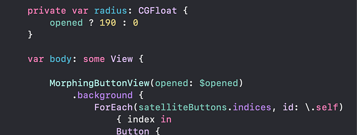
openedstate of the main button. - Line 6: we configure the orbital radius of every satellite button according to the
openedstate of the main button. - Line 11: a function will determine the elevation angle of every satellite button according to its position in the array. Every button will be positioned spaced evenly in an arc of 90°.
Well, now just iterate on the array and code a button using a ForEach view. Add this code under the onTapGesture modifier in the RadialFloatingButton view:
- Line 2: we use a
ForEachto keep track of the element index. - Lines 4–5: we close the main button and we fire the satellite action.
- Line 8: we use the satellite color to create the button.
- Line 10: we use the satellite icon to create the button icon.
- Lines 18: we give an offset according to the state of the button. 0 is full closed, 190 is full opened.
- Lines 19 and 13: every button is rotated clockwise according to its position in the array. To give the icons the right orientation, we apply a counter clockwise rotation to the icon image only.
- Line 20: we set the satellite opacity according to the main button state.
- Line 22: we apply a nice spring animation over the parameters controlled by the
openedvariable.
The basic component is done and let's see the result:
That's already nice, but we can improve the user experience adding some upgrades to the main floating button…
Updating the Main Floating Button
Very well it is time to spice it up with a little upgrade on the main button. I would like to add two behaviors; first, I would like to change the "ellipsis" gliph and create something that morph between the dots and an X. Doing so the user will understand that this is a "show more" button and has to close it. Secondly I would like to shrink a bit the button, once selected, to allow the user to focus mainly on the satellite buttons.
In order to do so let's create a new SwiftUI file called MorphingButtonView . And add this code:
Nothing special. Please note at line 16 that I previewed the whole ContentView in order to work easly.
Now go to the RadialFloatingButton and remove the Circle view till the .background() modifier adding our new view:
Very well. Go back to the MorphingButtonView now and let's add some stuff:
Basically I've added a scaleFactor computed variable at line 2, a onTapGesture at line 7 to toggle the binded variable and I've connected it all at lines 10 and 11 adding a basic animation too.
If you run the code you will see the satellite buttons appear and the main button shrinks a little. It's really a nice touch!
It is time to add the morphing icon. First of all, remove the circle view and put it inside a GeometryReader. We will need it soon in order to morph the glyph:
Now, the idea is pretty simple. We will create three dots in line. The side ones will have a little offset from the center. Once the button is in opened state, the left dot will stretch horizontally becoming a rounded line, the central one will stretch vertically and the right side one will translate on the left becoming invisible. Everything will work with an animation.
Add this code to the struct view:
I think the code is pretty clear… three dots with different offsets and final states.
One last thing to add is the rotationEffect modifier to rotate the button and basically transform the + into an x:
This is the final code for the whole view:
It's done!
Of course it is just an idea, you can modify it adding other stuff, changing color or sizes. It's up to you!
I hope you liked this article, if you did please clap it and consider to support me in my Patreon page, where you can find the full project and the code of this article.
If you are interested in SwiftUI animations, I may suggest you this great resource:
Enjoy your coding!