
When building iOS-style applications with Flutter, maintaining a consistent Cupertino design is essential. One of the most useful and recently introduced Cupertino widgets is the CupertinoListTile. A simple yet powerful widget that helps create clean, structured list items following Apple's Human Interface Guidelines.
If you are members, please continue reading. Otherwise, read this article with my friend link.
In this article, we'll explore what CupertinoListTile is, how it works, and how you can use it effectively in your Flutter applications.
🌟 What is CupertinoListTile?
The CupertinoListTile widget is a part of the flutter/cupertino.dart package, introduced to provide an iOS-styled equivalent of the Material ListTile.
It's designed for creating list rows (like in the iOS settings app) with optional icons, titles, subtitles, and trailing widgets (like switches or navigation indicators).
This widget helps developers build Cupertino-style lists that perfectly match iOS UI patterns while maintaining Flutter's declarative design principles.
Key Properties and Usage
Let's delve into the essential properties of CupertinoListTile and how to use them effectively:
leading: This property accepts a widget that will be displayed at the beginning (left side) of the list tile. It's commonly used for icons or avatars.
CupertinoListTile(

  leading: Icon(CupertinoIcons.profile_circled),

  title: Text('Profile'),

)title: This property is used to display the main text content of the list tile. It typically contains the primary information you want to present.
CupertinoListTile(

  title: Text('Settings'),

)subtitle: This property allows you to add a secondary line of text below thetitle. This is useful for providing additional context or details.
CupertinoListTile(

  title: Text('Notifications'),

  subtitle: Text('Manage your notification preferences'),

)trailing: This property accepts a widget that will be displayed at the end (right side) of the list tile. It's often used for icons indicating navigation or actions, such as a right-facing chevron.
CupertinoListTile(

  title: Text('About'),

  trailing: Icon(CupertinoIcons.forward),

)onTap: This property takes a callback function that is executed when the list tile is tapped. This is where you define the action to be performed when the user interacts with the list tile.
CupertinoListTile(

  title: Text('Logout'),

  onTap: () {

    // Handle logout logic here

    print('Logout tapped!');

  },

)padding: This property allows you to customize the padding around the content of the list tile. You can useEdgeInsetsto specify different padding values for each side.
CupertinoListTile(

  title: Text('Privacy'),

  padding: EdgeInsets.all(16.0),

)backgroundColor: This property sets the background color of the list tile.
CupertinoListTile(

  title: Text('Help'),

  backgroundColor: CupertinoColors.systemGrey6,

)leadingToTitle: This property is a boolean that controls the spacing between the leading widget and the title. When set totrue, the leading widget will be closer to the title. The default value is `0.
CupertinoListTile(

  leading: Icon(CupertinoIcons.question_circle),

  title: Text('FAQ'),

  leadingToTitle: 5.0,

)additionalInfo: This property allows you to add a widget to the right of the title, but before the trailing widget. This is useful for displaying additional information, such as a badge or a switch.
CupertinoListTile(

  title: Text('Dark Mode'),

  additionalInfo: CupertinoSwitch(

    value: _darkModeEnabled,

    onChanged: (bool value) {

      setState(() {

        _darkModeEnabled = value;

      });

    },

  ),

  trailing: Icon(CupertinoIcons.right_chevron),

)
Example Implementation
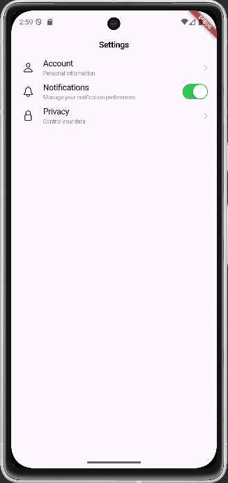
Here's a complete example demonstrating how to use CupertinoListTile within a Flutter application:
class CupertinoListTileExample extends StatelessWidget {
  const CupertinoListTileExample({super.key});

  @override
  Widget build(BuildContext context) {
    return CupertinoPageScaffold(
      navigationBar: const CupertinoNavigationBar(
        middle: Text('Settings'),
      ),
      child: SafeArea(
        child: ListView(
          children: [
            const CupertinoListTile(
              leading: Icon(CupertinoIcons.person),
              title: Text('Account'),
              subtitle: Text('Personal information'),
              trailing: CupertinoListTileChevron(),
            ),
            CupertinoListTile(
              leading: const Icon(CupertinoIcons.bell),
              title: const Text('Notifications'),
              subtitle: const Text('Manage your notification preferences'),
              trailing: CupertinoSwitch(
                value: true,
                onChanged: (bool value) {
                  print('Notifications switch toggled: $value');
                },
              ),
            ),
            const CupertinoListTile(
              leading: Icon(CupertinoIcons.lock),
              title: Text('Privacy'),
              subtitle: Text('Control your data'),
              trailing: CupertinoListTileChevron(),
            ),
          ],
        ),
      ),
    );
  }
}
Styling and Customization
While CupertinoListTile provides a default iOS-style appearance, you can further customize its look and feel using various properties and techniques.
- Text Styles: You can customize the appearance of the
titleandsubtitletext using theTextStyleclass.
CupertinoListTile(

  title: Text(

    'Terms of Service',

    style: TextStyle(fontWeight: FontWeight.bold),

  ),

  subtitle: Text(

    'Read our terms and conditions',

    style: TextStyle(color: CupertinoColors.secondaryLabel),

  ),

)- Color Customization: You can change the background color of the list tile using the
backgroundColorproperty. - Padding Adjustments: The
paddingproperty allows you to control the spacing around the content of the list tile.
When to Use CupertinoListTile
CupertinoListTile is most appropriate when you are building a Flutter application that aims to closely mimic the look and feel of iOS. It's particularly useful for settings screens, lists of options, and other UI elements where a native iOS appearance is desired. If you are building a cross-platform application and want a more generic list item, consider using ListTile from the material library.
💡 Pro Tips
- Use CupertinoListSection to group related tiles together and achieve a native iOS grouped list effect.
- Combine it with CupertinoSwitch for toggle options.
- Avoid mixing Material and Cupertino widgets in the same UI unless necessary. It's best to maintain a consistent design style.
Conclusion
The CupertinoListTile widget is a must-know for any Flutter developer aiming to build a native iOS look and feel. It's flexible, elegant, and easy to implement.
By using this widget, you can ensure your Cupertino apps follow Apple's interface design patterns while taking full advantage of Flutter's rich widget ecosystem.