Some years ago, before I fully got into UI/UX, I heard about an internship program and how rigorous and fast-paced it was. From what I heard, it was like a Hunger Games-style program — if you didn't get your act together, you'd be knocked out. Crazy, right? But guess what: it fueled me even more to perfect my skills so I could enroll and put myself to work. And now, here I am taking my first step on this new adventure.
I love a challenge, and it looks like HNG will be the next one I face. I am eager to dive into this intensive learning experience, connect with other talented creatives, and develop skills that will elevate my craft.
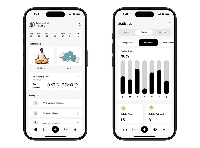
The first task at HNG was to design Sonder, which is a minimalist mental wellness app that helps users cultivate positive habits.
Before we return to the Sonder app design, let me outline my goals for this internship and explain how I plan to achieve them.
My Goals for the HNG Internship
My goal for HNG12 I believe is the same as every other intern in the program:
- To Deepen My Design Expertise: I want to sharpen my skills in design tools (Figma most especially), and also master user interface and user experience design to create intuitive, impactful solutions.
- To Build a Strong Portfolio: I want to build a Portfolio so strong that Hiring managers won't be able to resist, and I believe that through the hands-on projects HNG has in store for us, I will be a step closer to achieving that.
- To Network, Collaborate, and land opportunities: I want to work alongside peers and mentors to gain new perspectives and insights and in the process create opportunities for myself.
Armed with discipline, time management, continuous learning, and networking, I believe achieving these goals is within reach. Still, it's easier said than done — I hope I have the strength to keep up, haha.
Sonder App Design
When I first saw the brief, I was a bit confused. However, after reading it thoroughly to fully grasp the task, everything became clear. I needed to design two screens for the Sonder app — the Homepage and the Habit Tracker page — using an achromatic palette (black, white, and gray).
Once I understood the task, it was time to get to work. Here's how I proceeded.
Step 1: I began by grasping the project's objectives and identifying the target users, then brainstormed features to boost user engagement.
Step 2: With a clear vision in mind, I created low-fidelity wireframes to map out the user journey and the app's structure.
Step 3: Next, I transformed these wireframes into visually appealing, interactive screens using Figma.
Step 4: After completing the first draft, I shared it with my colleagues to gather invaluable feedback, which I then used to refine the design.
Through this project, I learned the importance of balancing aesthetics with usability. I also gained a deeper appreciation for consistent design patterns and responsive layouts.
Below are the exported design screens:
HNG is the One for You
If you're seeking top-notch design talent, HNG is a hub for creative professionals ready to transform your ideas into impactful designs. From UI designers to creative designers, you can hire the best from HNG's pool of innovative minds. Check out HNG Designers to find exceptional talent for your next project.
The journey has just begun, and I am excited about the opportunities ahead. With every design challenge, mentorship session, and collaboration, I aim to become a stronger, more versatile designer. Stay tuned for more updates as I continue navigating this transformative experience.