
I went into this experiment with almost no hands-on experience using Gemini 3.0 Pro inside Google AI Studio. A few days earlier I had tried it with an engineer friend from DeepMind — and it surprised me — but I didn't really know how far it could go when asked to design things.
So I decided to push it.
In one sitting, I asked Gemini 3.0 Pro to design:
- A personal website
- A full SaaS dashboard
- A mobile app inspired by a real production app
I didn't want to over-engineer the prompts. I wanted to see what Gemini would do with minimal direction, real reference images, and iterative feedback.
What happened next genuinely shocked me.
Design Test #1 — A Personal Website (Microsoft XP vibes)
I started with my own site. It's functional but basic. I wanted something bold, nostalgic, and refreshingly different — so I gave Gemini a strange but fun direction:

"Redesign my personal website as if it were a Microsoft XP experience. Use XP–style UI, color, and personality."
I uploaded a screenshot of my current site and hit Build inside Google AI Studio.
Immediately Gemini started scaffolding:
metadata.jsonindex.htmltailwind.cssReact app entry point
You can actually watch Gemini work in real time. It's like seeing a junior designer + junior developer hybrid sprint through tasks at hyper-speed.
The Result
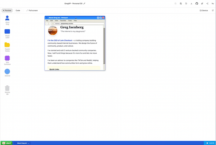
It produced a fully functioning XP-themed website — complete with:
- A Notepad-style window displaying my tagline
- XP-inspired icons
- Faux "applications" like About Greg, Greg's Letter, Guides, etc.
- Clean window components, draggable elements, and functional navigation
- Auto-pulled content from gregisenberg.com
On mobile, it…worked. That alone shocked me.
Taking Feedback
Some icons felt off, so I gave it a simple critique:
"The icons don't feel like real Windows/Mac app icons. Make them more authentic."
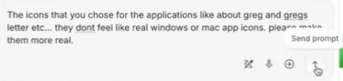
Gemini iterated. The icons improved dramatically — this was the first time I felt like I was working with a real designer who could revise on command.
Then I used one of my favorite features: Annotations.

Inside the preview, I literally drew over the white background and wrote:
"This white background is boring. Make it feel like classic XP — blue skies, grassy hills."
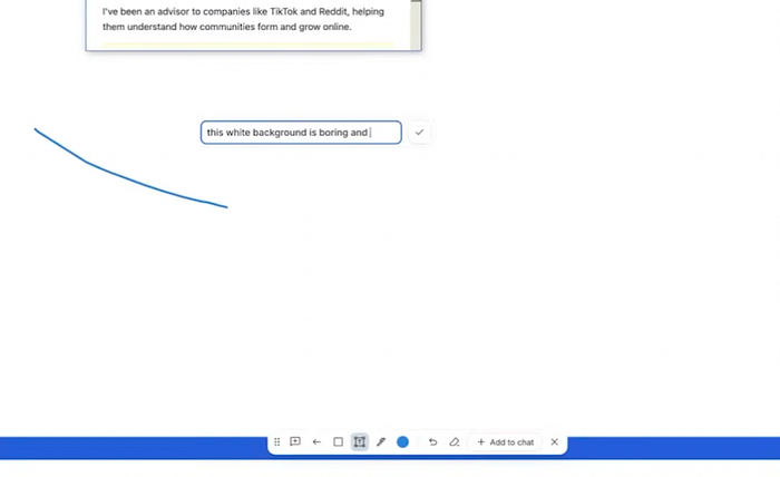
Gemini updated the background immediately. It wasn't perfect, but the workflow clicked: Reference → Draw feedback → Improve → Repeat.
Rating for Website Design
9/10. This genuinely exceeded my expectations. With a few reference images, it could be production-ready.
Design Test #2 — A SaaS Dashboard (with Teenage Engineering vibes)
Next, I wanted to see whether Gemini could design a modern dashboard.
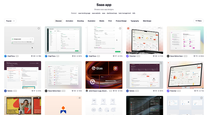
I grabbed:
- A clean SaaS dashboard screenshot from Dribbble
- A product photo from Teenage Engineering — the vibe I wanted the buttons to emulate
Then I prompted:
"Design a SaaS analytics dashboard for restaurants. Clean, modern, with physical-feeling buttons inspired by Teenage Engineering hardware."
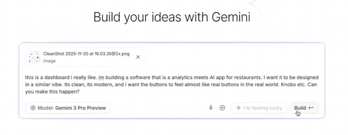
No deep PRD. No features spec. Just vibes.
The Result
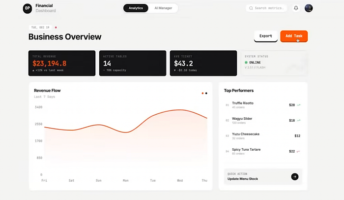
Gemini designed something far more unique than typical AI-generated UIs:
- A dashboard called Chef OS
- A live "AI analyst" module ("14 active tables, average ticket, etc.")
- Button components with a physical, hardware-inspired aesthetic
- Pleasing pastel color choices
- Micro-animations
- Layout hierarchy that actually made sense
It looked sellable — even without a feature spec.
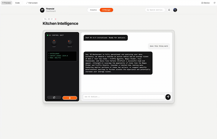
I could drag components around, trigger the "AI helper" panel, and see how it envisioned the product in motion.
Rating for SaaS Dashboard
8.5/10. Some details needed refinement, but the starting point felt professional, not "LLM-coded Tailwind boilerplate."

Design Test #3 — A Mobile App (Brain Rot → Fitness)
For the final test, I wanted to see if Gemini could riff on an existing mobile app style.
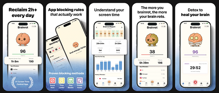
I uploaded the App Store screenshots of Brain Rot, created by my friend Yoni — a beautifully illustrated, gamified anti-addiction app.
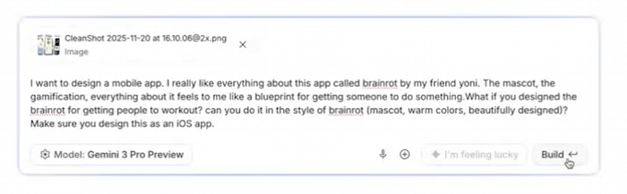
Then I prompted:
"Design a mobile app called Gains. It should feel like Brain Rot but for fitness. Warm colors, mascot, streaks, gamification, iOS-style layout."
I had no clue if Gemini could handle mobile-specific design structure.
The Result
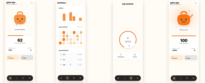
It created an entire mobile prototype inside Google AI Studio:
- An interactive mascot that reacts to workout consistency
- A streak system
- A "Gains calendar"
- An activity dashboard
- Logging UI (not functional yet, but visually clear)
- Clean typography and warm gradient choices
The mascot design was surprisingly cohesive. Playful. On-brand. Not uncanny.
Rating for Mobile App
8.3/10. Not perfect, but shockingly close given it was one prompt with rough context.
Bonus: AntiGravity vs. Gemini 3.0 Pro (Design Mode)
Google recently launched AntiGravity, basically their Cursor competitor. It uses Gemini under the hood, but in my tests the designs weren't as clean or elevated.
If you want the best design results:
- Use Google AI Studio directly
- Upload multiple reference images
- Annotate visually
- Iterate with clear feedback
This gets you the highest-quality UX/UI output.
Verdict — It's Terrifyingly Good
Across all three tests — web, dashboard, mobile — Gemini consistently produced:
- Coherent design systems
- Layouts with intention
- Color palettes that made sense
- Interactive components
- Realistic app flows
- The ability to take feedback visually and textually
- Code and design in the same workspace
We've clearly exited the era where AI-generated apps all look like purple Tailwind templates.
With Gemini 3.0:
- Your taste becomes the designer.
- Your references become the design system.
- Your annotations become collaboration.
If you understand what "good" looks like, you can produce stunning UI with a few prompts and a handful of screenshots.
The tools no longer limit creativity.
Only imagination does.
Now stop reading and go design something. I'll be testing more mobile-design tools next week — so subscribe, share, and drop your builds in the comments if you try this yourself.
Want to learn how to land a job in tech? Prepare for your next software engineering interview? Check out our frontend interview prep platform — www.techmade.co