
After years of building React Native apps, I've explored a variety of charting libraries to visualize data effectively. Charting in React Native used to feel like an afterthought, with limited options and inconsistent quality. However, recent advancements have brought us robust libraries like victory, react-native-chart-kit, and my personal favorite, react-native-gifted-charts. In this tutorial, I'll share why react-native-gifted-charts stands out, guide you through its setup, and demonstrate how to create beautiful bar and pie charts with minimal code. Whether you're building for Expo Go, native, or web, this library has you covered.
Why Choose react-native-gifted-charts?
Charting libraries in React Native often suffer from being outdated, buggy, or lacking cross-platform support. I've been frustrated by libraries that promise great features but fail in practice due to unmaintained code or compatibility issues. That's where react-native-gifted-charts shines. Here's why I recommend it:
- Actively Maintained: As of April 15, 2025, the library was updated recently, ensuring compatibility with the latest React Native versions.
- Cross-Platform: Works seamlessly on Expo, native iOS/Android, and web.
- Highly Customizable: Offers over 75+ example configurations with boilerplate code to jumpstart your project.
- Rich Chart Types: Supports bar, line, pie, donut, radar, pyramid, and more.
- Dependency-Friendly: Built with react-native-svg and expo-linear-gradient (or react-native-linear-gradient for non-Expo projects), ensuring smooth integration.
In this article, we'll focus on two common chart types: a bar chart for visualizing trends and a pie chart for showing progress distribution. Let's dive in!
Installation
To get started, install react-native-gifted-charts along with its dependencies. If you're using Expo, run:
npx expo install react-native-gifted-charts expo-linear-gradient react-native-svgFor non-Expo projects, replace expo-linear-gradient with react-native-linear-gradient:
npm install react-native-gifted-charts react-native-linear-gradient react-native-svgEnsure you follow the setup instructions for react-native-svg and the gradient library to avoid rendering issues. With dependencies installed, you're ready to create stunning charts.
Bar Chart Example
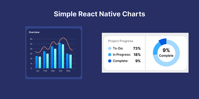
Let's build a sleek bar chart to display monthly data, such as sales or user activity. With just ~60 lines of code, react-native-gifted-charts delivers a polished, gradient-filled bar chart with a trend line. Here's the code:
import React from 'react';
import { View, Text, StyleSheet } from 'react-native';
import { BarChart } from 'react-native-gifted-charts';

const App = () => {
  const data = [
    { value: 2500, frontColor: '#006DFF', gradientColor: '#009FFF', spacing: 6, label: 'Jan' },
    { value: 2400, frontColor: '#3BE9DE', gradientColor: '#93FCF8' },
    { value: 3500, frontColor: '#006DFF', gradientColor: '#009FFF', spacing: 6, label: 'Feb' },
    { value: 3000, frontColor: '#3BE9DE', gradientColor: '#93FCF8' },
    { value: 4500, frontColor: '#006DFF', gradientColor: '#009FFF', spacing: 6, label: 'Mar' },
    { value: 4000, frontColor: '#3BE9DE', gradientColor: '#93FCF8' },
    { value: 5200, frontColor: '#006DFF', gradientColor: '#009FFF', spacing: 6, label: 'Apr' },
    { value: 4900, frontColor: '#3BE9DE', gradientColor: '#93FCF8' },
    { value: 3000, frontColor: '#006DFF', gradientColor: '#009FFF', spacing: 6, label: 'May' },
    { value: 2800, frontColor: '#3BE9DE', gradientColor: '#93FCF8' },
  ];

  return (
    <View style={styles.container}>
      <Text style={styles.title}>Overview</Text>
      <View style={styles.chartContainer}>
        <BarChart
          data={data}
          barWidth={16}
          initialSpacing={10}
          spacing={14}
          barBorderRadius={4}
          showGradient
          yAxisThickness={0}
          xAxisType={'dashed'}
          xAxisColor={'lightgray'}
          yAxisTextStyle={{ color: 'lightgray' }}
          stepValue={1000}
          maxValue={6000}
          noOfSections={6}
          yAxisLabelTexts={['0', '1k', '2k', '3k', '4k', '5k', '6k']}
          labelWidth={40}
          xAxisLabelTextStyle={{ color: 'lightgray', textAlign: 'center' }}
          showLine
          lineConfig={{
            color: '#F29C6E',
            thickness: 3,
            curved: true,
            hideDataPoints: true,
            shiftY: 20,
            initialSpacing: -30,
          }}
        />
      </View>
    </View>
  );
};

const styles = StyleSheet.create({
  container: {
    margin: 10,
    padding: 16,
    borderRadius: 20,
    backgroundColor: '#232B5D',
  },
  title: {
    color: 'white',
    fontSize: 16,
    fontWeight: 'bold',
  },
  chartContainer: {
    padding: 20,
    alignItems: 'center',
  },
});

export default App;
Key Features of the Bar Chart
- Gradient Bars: Each bar uses frontColor and gradientColor for a modern look.
- Customizable Axes: The y-axis is hidden (yAxisThickness={0}), and the x-axis uses a dashed style.
- Trend Line: A smooth, curved line (showLine) highlights the data trend.
- Responsive Labels: Custom y-axis labels (yAxisLabelTexts) make the chart easy to read.
Handling API Data
When fetching data from an API, always validate it before rendering the chart to avoid crashes. Here's how to adapt the bar chart for dynamic data:
import React, { useEffect, useState } from 'react';
import { View, Text, StyleSheet } from 'react-native';
import { BarChart } from 'react-native-gifted-charts';

const App = () => {
  const [data, setData] = useState(null);

  useEffect(() => {
    fetchData();
  }, []);

  const fetchData = async () => {
    try {
      // Replace with your API call
      const response = await fetch('https://api.example.com/data');
      const json = await response.json();
      setData(json);
    } catch (error) {
      console.error('Error fetching data:', error);
    }
  };

  if (!data) {
    return (
      <View style={styles.loadingContainer}>
        <Text style={styles.loadingText}>Loading...</Text>
      </View>
    );
  }

  return (
    <View style={styles.container}>
      <Text style={styles.title}>Overview</Text>
      <View style={styles.chartContainer}>
        <BarChart
          data={data}
          barWidth={16}
          initialSpacing={10}
          spacing={14}
          barBorderRadius={4}
          showGradient
          yAxisThickness={0}
          xAxisType={'dashed'}
          xAxisColor={'lightgray'}
          yAxisTextStyle={{ color: 'lightgray' }}
          stepValue={1000}
          maxValue={6000}
          noOfSections={6}
          yAxisLabelTexts={['0', '1k', '2k', '3k', '4k', '5k', '6k']}
          labelWidth={40}
          xAxisLabelTextStyle={{ color: 'lightgray', textAlign: 'center' }}
          showLine
          lineConfig={{
            color: '#F29C6E',
            thickness: 3,
            curved: true,
            hideDataPoints: true,
            shiftY: 20,
            initialSpacing: -30,
          }}
        />
      </View>
    </View>
  );
};

const styles = StyleSheet.create({
  container: {
    margin: 10,
    padding: 16,
    borderRadius: 20,
    backgroundColor: '#232B5D',
  },
  title: {
    color: 'white',
    fontSize: 16,
    fontWeight: 'bold',
  },
  chartContainer: {
    padding: 20,
    alignItems: 'center',
  },
  loadingContainer: {
    flex: 1,
    justifyContent: 'center',
    alignItems: 'center',
  },
  loadingText: {
    color: 'white',
    fontSize: 16,
  },
});

export default App;
This version includes a loading state and error handling, ensuring a smooth user experience when data is fetched asynchronously.
Pie Chart Example
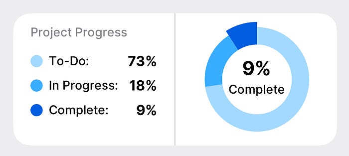
Next, let's create a pie chart to visualize project progress, inspired by my side project, BanKan Board. This chart displays the distribution of tasks (To-Do, In Progress, Complete) with percentages, using a clean, donut-style design. Here's the implementation:
import React from 'react';
import { View, Text, StyleSheet, Dimensions } from 'react-native';
import { PieChart as RNPieChart } from 'react-native-gifted-charts';

const theme = {
  toDoColor: '#FF6B6B',
  progressColor: '#4ECDC4',
  completedColor: '#45B7D1',
  frameBackground: '#FFFFFF',
  textPrimary: '#000000',
  textSecondary: '#666666',
};

type PieChartProps = {
  data?: {
    todoTaskCount: number;
    progressTaskCount: number;
    completeTaskCount: number;
  };
};

const PieChart = ({ data }: PieChartProps) => {
  const { width } = Dimensions.get('window');
  const isLargeScreen = width > 1024;

  if (!data) {
    return null;
  }

  const pieData = [
    { value: data?.todoTaskCount ?? 0, color: theme.toDoColor },
    { value: data?.progressTaskCount ?? 0, color: theme.progressColor },
    { value: data?.completeTaskCount ?? 0, color: theme.completedColor, focused: true },
  ];

  const totalTasks =
    (data?.todoTaskCount ?? 0) +
    (data?.progressTaskCount ?? 0) +
    (data?.completeTaskCount ?? 0);

  if (totalTasks === 0) {
    return null;
  }

  const todoPercentage = (((data?.todoTaskCount ?? 0) / totalTasks) * 100).toFixed(0);
  const progressPercentage = (((data?.progressTaskCount ?? 0) / totalTasks) * 100).toFixed(0);
  const completePercentage = (((data?.completeTaskCount ?? 0) / totalTasks) * 100).toFixed(0);

  return (
    <View style={styles.container}>
      <View style={styles.row}>
        <View style={styles.leftContainer}>
          <Text style={styles.secondaryText}>Project Progress</Text>
          <View style={styles.labelsContainer}>
            <PieLabelRow label="To-Do" percentage={todoPercentage} color={theme.toDoColor} />
            <PieLabelRow label="In Progress" percentage={progressPercentage} color={theme.progressColor} />
            <PieLabelRow label="Complete" percentage={completePercentage} color={theme.completedColor} />
          </View>
        </View>
        <View style={styles.separator} />
        <View style={[styles.rightContainer, isLargeScreen && styles.rightContainerLarge]}>
          <RNPieChart
            data={pieData}
            donut
            sectionAutoFocus
            radius={isLargeScreen ? 55 : 60}
            innerRadius={isLargeScreen ? 35 : 40}
            innerCircleColor={theme.frameBackground}
            centerLabelComponent={() =>
              !isLargeScreen ? (
                <View style={styles.centerLabel}>
                  <Text style={styles.centerPercentage}>{completePercentage}%</Text>
                  <Text style={styles.centerText}>Complete</Text>
                </View>
              ) : null
            }
          />
          {isLargeScreen && (
            <View style={styles.largeScreenLabel}>
              <Text style={styles.largePercentage}>{completePercentage}%</Text>
              <Text style={styles.largeText}>Complete</Text>
            </View>
          )}
        </View>
      </View>
    </View>
  );
};

const PieLabelRow = ({ label, percentage, color }: { label: string; percentage: string; color: string }) => {
  return (
    <View style={styles.labelRow}>
      <View style={styles.labelContent}>
        <View style={[styles.colorDot, { backgroundColor: color }]} />
        <Text style={styles.labelText}>{label}:</Text>
      </View>
      <Text style={styles.percentageText}>{percentage}%</Text>
    </View>
  );
};

const styles = StyleSheet.create({
  container: {
    backgroundColor: theme.frameBackground,
    borderRadius: 20,
    overflow: 'hidden',
  },
  row: {
    flexDirection: 'row',
  },
  leftContainer: {
    width: '50%',
    padding: 20,
  },
  secondaryText: {
    color: theme.textSecondary,
    fontSize: 16,
    marginBottom: 20,
  },
  labelsContainer: {
    flex: 1,
    justifyContent: 'center',
    gap: 10,
  },
  separator: {
    width: 1,
    backgroundColor: '#E0E0E0',
  },
  rightContainer: {
    width: '50%',
    flexDirection: 'row',
    alignItems: 'center',
    justifyContent: 'center',
    padding: 15,
    gap: 16,
  },
  rightContainerLarge: {
    justifyContent: 'flex-start',
    paddingVertical: 15,
    paddingHorizontal: 15,
  },
  centerLabel: {
    alignItems: 'center',
    justifyContent: 'center',
  },
  centerPercentage: {
    fontSize: 22,
    fontWeight: 'bold',
    color: theme.textPrimary,
  },
  centerText: {
    fontSize: 14,
    color: theme.textPrimary,
  },
  largeScreenLabel: {
    justifyContent: 'center',
  },
  largePercentage: {
    fontSize: 35,
    fontWeight: '700',
    color: theme.textPrimary,
  },
  largeText: {
    fontSize: 18,
    color: theme.textPrimary,
  },
  labelRow: {
    flexDirection: 'row',
    alignItems: 'center',
    justifyContent: 'space-between',
  },
  labelContent: {
    flexDirection: 'row',
    alignItems: 'center',
    gap: 8,
  },
  colorDot: {
    width: 14,
    height: 14,
    borderRadius: 7,
  },
  labelText: {
    fontSize: 16,
    color: theme.textPrimary,
  },
  percentageText: {
    fontSize: 16,
    fontWeight: 'bold',
    color: theme.textPrimary,
    lineHeight: 18,
  },
});

export default PieChart;
Why This Pie Chart Works
- Simplicity: The donut-style pie chart is intuitive, with a centered label showing the completion percentage.
- Responsive Design: Adjusts radius and label placement based on screen size.
- Clear Labels: The left panel lists percentages with color-coded indicators for easy interpretation.
- Real-World Use: This chart is perfect for dashboards, like tracking tasks in a Kanban board.
You can use it like this:
<PieChart
  data={{
    todoTaskCount: 10,
    progressTaskCount: 20,
    completeTaskCount: 30,
  }}
/>
Exploring More Chart Types
While we've covered bar and pie charts, react-native-gifted-charts supports a wide range of chart types, including:
- Horizontal Bar Charts
- Stacked Bar Charts
- Line Charts
- Area Charts
- Radar Charts
- Pyramid Charts
The library's official documentation is comprehensive, with over 75 examples and boilerplate code. I didn't include examples for every chart type here to keep this article shorter, but the documentation makes it easy to explore and implement other charts.
Best Practices for Charting in React Native
To ensure your charts perform well and have a good user experience, follow these tips:
- Validate Data: Always check API data before rendering to prevent crashes (as shown in the bar chart example).
- Optimize Performance: Use lightweight data structures and avoid re-rendering charts unnecessarily with React.memo or useMemo.
- Handle Loading States: Display a loading indicator or skeleton UI while fetching data.
- Test Responsiveness: Test charts on various screen sizes and orientations.
Conclusion
Choosing the right charting library for React Native can be challenging, with many options being outdated, buggy, or lacking cross-platform support. react-native-gifted-charts solves these problems with its active maintenance, extensive customization, and compatibility with Expo, native, and web. Whether you're building a dashboard, analytics tool, or project tracker, this library makes it easy to create beautiful, functional charts.
The bar and pie chart examples in this article demonstrate how quickly you can go from idea to implementation. With over 75 examples in the documentation, you'll find inspiration for any use case. Try react-native-gifted-charts in your next project, and let me know how it goes in the comments!
Try BanKan Board — The Project Management App Made for Developers, by Developers
If you're tired of complicated project management tools with story points, sprints, and endless processes, BanKan Board is here to simplify your workflow. Built with developers in mind, BanKan Board lets you manage your projects without the clutter.
Key Features:
- No complicated processes: Focus on what matters without the overhead of traditional project management systems.
- Claude AI Assistant: Get smart assistance to streamline your tasks and improve productivity.
- Free to Use: Start using it without any upfront cost.
- Premium Features: Upgrade to unlock advanced functionality tailored to your team's needs.
Whether you're building a side project, managing a team, or collaborating on open-source software, BanKan Board is designed to make your life easier. Try it today!