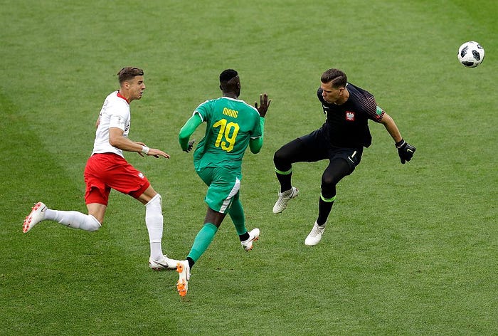

I still remember this game. I had high hopes that Poland has a great team and a great generation that would get promoted from the group in the World Cup 2018 and achieve something comparable to the success of EURO 2016, where we got to the quarterfinal. Unfortunately, Senegal beat us 2:1 (congrats Senegal!), Colombia 3:0 (congrats Colombia!) and then we won the last match 1:0 against Japan that finished our tournament (Thanks Japan for the game… we all know how it looked like). I never thought and even wanted to come back to this tournament…
… AND THEN DATA HAPPENED.
I remember when I was at a New Year's Eve party and I was scrolling LinkedIn in a small break between chatting with friends and a very interesting post written by Jan Van Haaren.

I used a "Save" article button and came back to the party. The next day morning, I read Jan's post and then his article. Interestingly, in fact, the idea of analyzing data and making it my way of living came from Football (I am a Liverpool fan and I remember Damien Comolli as a Sports Director of LFC) and from the book Moneyball (and the movie of course!). I did then what is very typical for new years resolutions… thinking about them, but did nothing for a while.
Then March arrived and Joe Swanson's voice said…

From Jan I went quickly to the David Sumpter course Soccermatics that You can find here. I set up an environment for a new course, downloaded desired datasets, and went through the first part of the course. After successfully finishing the first part I decided to ground my learning and keep additional motivation for continuing it — I will make my own analysis of one of the matches. Which team is better to analyze than Your national one? That is how we are back with Poland 1:2 Senegal match!
Description of the topic
I made a very brief visualization of the topics that were in 1st Chapter of David Sumpter's course Soccermatics. I can strongly recommend it because David made there a great job of describing everything clearly. As mentioned before — I also decided to ground my knowledge by trying to repeat his exercises on the example of the match that I know.
I decided to try:
- Visualizing shot positions of polish players with distinguishing goals, accurate shots, and not accurate ones
- Visualizing passes and offensive passes
- Visualizing Passing Network of Polish National Team
Enjoy!
Preparing Data (If You are more interested in football, scroll to the next chapter 😉)
EDIT: I forgot to mention libraries! I used mplsoccer library to draw the pitch, nodes, and arrows. It is a must-be for Football Analytics :))
To be honest, this part took me approx 70% of the whole time. Our data is available here, I used for my analysis these datasets:
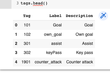
- tags.csv — dataset in CSV, with an explanation of the tags that are attached to the events
- events.csv — explanation of the events (I realized later that this is already in events_ json, so I only loaded this df and never used :)) )
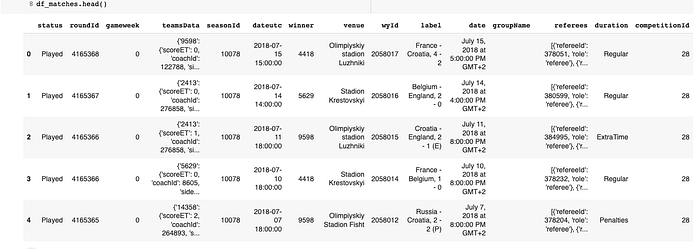
- matches_World_Cup.json — all world cup 2018 matches stored in JSON file
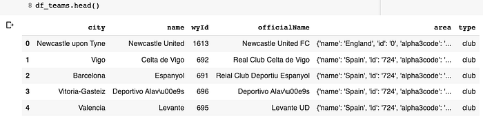
- teams.json — All teams from season 2017/2018 and World Cup 2018 in JSON
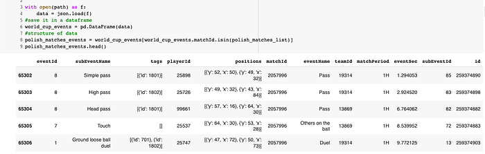
- events_World_Cup.json — The most important dataset — JSON with all of the events (passes, touches, shots, fouls).
- players.json — and the last JSON with data of all of the players.
About reading the data, we just need to apply two functions:
#For JSON datasets:
with open(path) as f:
    data = json.load(f)

df = pd.DataFrame(data)
#For CSV:
df = pd.read_csv('df.csv')
This way, I created my data frames:
Tags:
Matches:
Teams:
From these two datasets, I can create a new, smaller one that will be useful for my next step — let's filter matches df, and create one with only polish national team matches (I found that Polish National Team ID is �').
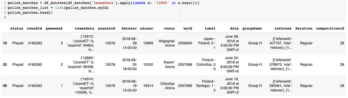
And the same way, we can create a new dataset with events from polish matches!
Then one question might appear? Why all matches? Well, honestly, my initial idea was to analyze all Polish matches, but then due to the fact, that It will be just too much, and too confusing, in the middle I decided that I will check only the Poland-Senegal match.
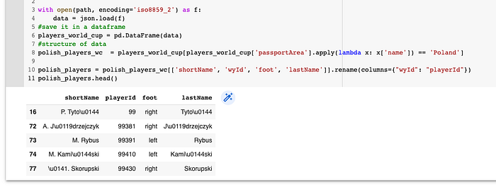
After loading the player's dataset and filtering it only with polish players (I used filtering by the dictionary in "passportArea", because some players, like Grzegorz Krychowiak, didn't have any value in the national team column).
Because the code is very long, and I did a lot of transitions, I won't write about everything, I will of course share the code on my GitHub. For now, I will just list the most important things:
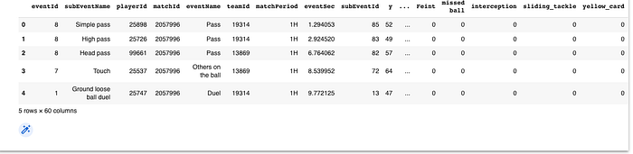
- from the position column in polish_matches_events to x,y, and end_x, end_y to get the starting and ending point of each player.
- creating a player's data frame with if the player was in a starting XI, when was he subbed, etc. (will be very useful during visualizing the passing net)
- decoding polish letters
- applying tags and making dummies from them (we will get info if the pass/shot was accurate, finished with a goal, etc.)
- Adding a column with "Shot Outcome" with distinction on "Goal", "Accurate shot", and "Missed".
Okay, let's go to some plots ;)
Visualizing Shots
Let's start with simple stuff — let's visualize shots on the goal of the polish team. When we have already cleaned the dataset, we can jump into action.
plot_df = df[(df.matchId == 2057996)].copy()
pitch = Pitch(line_zorder=2, line_color="black")
fig, ax = pitch.draw(figsize=(12, 8))
# Size of the pitch in yards
pitchLengthX = 120
pitchWidthY = 80
# Standardize the 'x' and 'y' values
plot_df['x_standardized'] = plot_df['x'] / 100 * pitchLengthX
plot_df['y_standardized'] = plot_df['y'] / 100 * pitchWidthY
# Plot the shots by looping through them.
for i, shot in plot_df.iterrows():
    # Get the information
    x = shot['x_standardized']
    y = shot['y_standardized']
    # Set circle size
    circleSize = 2

    # Set color based on shot outcome
    if shot.shot_outcome == 'Goal':
        pitch.scatter(x, y, alpha=1, s=500, color='green', ax=ax)
        pitch.annotate(shot["lastName"], (x + 1, y - 2), ax=ax, fontsize=12)
    elif shot.shot_outcome == 'Accurate':
        pitch.scatter(x, y, alpha=1, s=500, color='blue', ax=ax)
        pitch.annotate(shot["lastName"], (x + 1, y - 2), ax=ax, fontsize=12)
    elif shot.shot_outcome == 'Missed':
        pitch.scatter(x, y, alpha=1, s=500, color='red', ax=ax)
        pitch.annotate(shot["lastName"], (x + 1, y - 2), ax=ax, fontsize=12)

# Create legend
goal_legend = plt.Line2D([0], [0], color="green", lw=4)
accurate_legend = plt.Line2D([0], [0], color="blue", lw=4)
missed_legend = plt.Line2D([0], [0], color="red", lw=4)
ax.legend([goal_legend, accurate_legend, missed_legend], ['Goal', 'Accurate', 'Missed'], loc='upper right')

# Set title
match_name = plot_df['matchName'].iloc[0]  # Get the match name from the first row of plot_df
fig.suptitle(match_name, fontsize=24)
fig.set_size_inches(12, 8)
plt.show()
file_name = '{}_plot.jpg'.format(match_name)
plt.savefig(file_name)
I hope that the code above is quite clear, but I would like to distinguish standardization — due to the differences in pitch size in yards, plot size, and x, and y coordinates, I used the known Descriptive Statistics method called "Standardization". I aligned the X and Y values with the plot. If I didn't do it, there will be a mess.
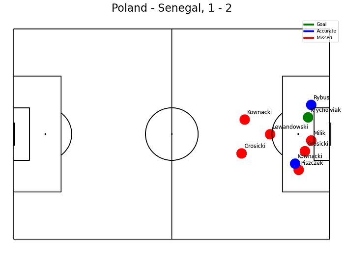
And here we can see the shooting positions of the players and the outcome. Unfortunately for Poland, there were 9 shots in total, 6 missed opportunities, and 3 accurate shots on goal with 1 positive outcome (Krychowiak's goal at the end of the match). One thing that I noticed right now — An accurate shot from Lewandowski from the free-kick was not counted — that is something that could be corrected. I spot that it was the missing information in the data.
Visualizing Passes
In terms of passes, we can visualize the whole polish team in one plot. Also to get some more from our data, we can add distinction for successful passes and not, and we can add info on how a big share of all of the passes was successful.
#prepare the dataframe of passes by England that were no-throw ins
mask_poland = (df.subEventName != "Throw-in") & (df.matchId == 2057996)
df_passes = df.loc[mask_poland, ['x', 'y', 'end_x', 'end_y', 'lastName', 'accurate']]
#get the list of all players who made a pass
names = df_passes['lastName'].unique()

#draw 4x4 pitches
pitchLengthX = 120
pitchWidthY = 80
pitch = Pitch(line_color='black', pad_top=20, pitch_length=pitchLengthX, pitch_width=pitchWidthY)

fig, axs = pitch.grid(ncols=4, nrows=4, grid_height=0.85, title_height=0.06, axis=False,
                      endnote_height=0.04, title_space=0.04, endnote_space=0.01)

#standarize x and y
df_passes['x'] = df_passes['x'] / 100 * pitchLengthX
df_passes['y'] = df_passes['y'] / 100 * pitchWidthY
df_passes['end_x'] = df_passes['end_x'] / 100 * pitchLengthX
df_passes['end_y'] = df_passes['end_y'] / 100 * pitchWidthY

#for each player
for name, ax in zip(names, axs['pitch'].flat[:len(names)]):
    player_df = df_passes.loc[df_passes["lastName"] == name]

    # Calculate the share of accurate passes
    total_passes = len(player_df)
    accurate_passes = len(player_df[player_df['accurate'] == 1])
    accuracy_share = accurate_passes / total_passes * 100

    # Put player name and accuracy share over the plot
    ax.text(60, -10, f"{name} ({accuracy_share:.1f}%)", ha='center', va='center', fontsize=14)

    # Plot arrow and scatter
    for idx, row in player_df.iterrows():
        arrow_color = "green" if row['accurate'] == 1 else "red"
        pitch.arrows(row.x, row.y,
                     row.end_x, row.end_y, color=arrow_color, ax=ax, width=1)
        pitch.scatter(row.x, row.y, alpha=0.2, s=50, color=arrow_color, ax=ax)

#We have more than enough pitches - remove them
for ax in axs['pitch'][-1, 16 - len(names):]:
    ax.remove()

#Another way to set title using mplsoccer
axs['title'].text(0.5, 0.5, 'Polish passes against Senegal', ha='center', va='center', fontsize=30)
plt.show()
plt.savefig('Polish_passes.jpg')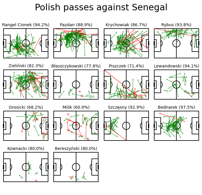
We can see the direction of passes and their accuracy. What is interesting, Jan Bednarek, the polish CB who is widely blamed for his mistake in the match, after we lost the goal 2:0, actually played very well in terms of accurate passes. The same can say about Cionek, Rybus, and Lewandowski.
What is not surprising — is the weak performance from Milik and the right side of the polish field — Piszczek and Błaszczykowski.
Let's take a look at what offensive passes looked like. For the sake of simplicity, offensive passes are passes where the player moved the ball toward the rival end line. It is a simple and minor change in the code.
#prepare the dataframe of passes by England that were no-throw ins
mask_poland = (df.subEventName != "Throw-in") & (df.matchId == 2057996)
df_passes = df.loc[mask_poland, ['x', 'y', 'end_x', 'end_y', 'lastName', 'accurate']]

#Offensive Passes
df_passes = df_passes[df_passes.end_x > df_passes.x]

#get the list of all players who made a pass
names = df_passes['lastName'].unique()

#draw 4x4 pitches
pitchLengthX = 120
pitchWidthY = 80
pitch = Pitch(line_color='black', pad_top=20, pitch_length=pitchLengthX, pitch_width=pitchWidthY)

fig, axs = pitch.grid(ncols=4, nrows=4, grid_height=0.85, title_height=0.06, axis=False,
                      endnote_height=0.04, title_space=0.04, endnote_space=0.01)

#standarize x and y
df_passes['x'] = df_passes['x'] / 100 * pitchLengthX
df_passes['y'] = df_passes['y'] / 100 * pitchWidthY
df_passes['end_x'] = df_passes['end_x'] / 100 * pitchLengthX
df_passes['end_y'] = df_passes['end_y'] / 100 * pitchWidthY

#for each player
for name, ax in zip(names, axs['pitch'].flat[:len(names)]):
    player_df = df_passes.loc[df_passes["lastName"] == name]

    # Calculate the share of accurate passes
    total_passes = len(player_df)
    accurate_passes = len(player_df[player_df['accurate'] == 1])
    accuracy_share = accurate_passes / total_passes * 100

    # Put player name and accuracy share over the plot
    ax.text(60, -10, f"{name} ({accuracy_share:.1f}%)", ha='center', va='center', fontsize=14)

    # Plot arrow and scatter
    for idx, row in player_df.iterrows():
        arrow_color = "green" if row['accurate'] == 1 else "red"
        pitch.arrows(row.x, row.y,
                     row.end_x, row.end_y, color=arrow_color, ax=ax, width=1)
        pitch.scatter(row.x, row.y, alpha=0.2, s=50, color=arrow_color, ax=ax)

#We have more than enough pitches - remove them
for ax in axs['pitch'][-1, 16 - len(names):]:
    ax.remove()

#Another way to set title using mplsoccer
axs['title'].text(0.5, 0.5, 'Polish offensive passes against Senegal', ha='center', va='center', fontsize=30)
plt.show()
plt.savefig('Polish_offensive_passes.jpg')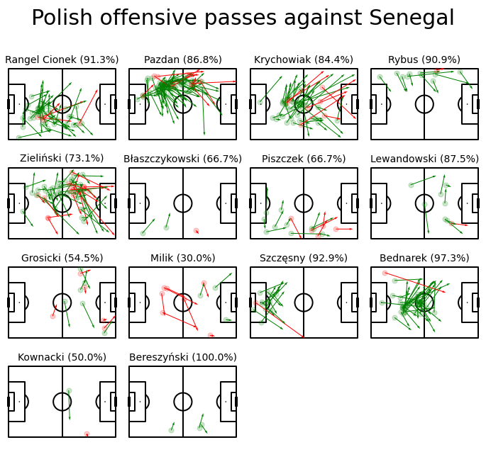
Here we can see a big change. Milik had only 30% of accurate passes in this game, also a lot of balls were lost by Piszczek, Błaszczykowski, and Zieliński (who is in fact the most creative player in the polish team). A very positive impact on the offensive game had Lewandowski, Rybus, Bednarek, and what might be surprising for polish fans — Krychowiak.
Visualizing Passing Network + Centralization
During David's course, in his first chapter, we can meet the definition of the centralization of the game. David Sumpter shared his thoughts in his article here. In short words — centralization shows how team play is distributed among one player or another. Usually, it can help You to find the team playmaker. According to the data — decentralized football is gaining more value and teams that play decentralized football are more successful. Let's see how it looked with Poland against Senegal.
The code for this part is quite complicated, so I will skip this part again (Sorry!). But what was needed to do is:
- Filter Data only of the match Poland — Senegal and successful passes are done by polish players
- Use the window function to find the player that received the next pass — we get that way a connection between players.
- Generate the field of the nodes, by circle size representing average activity (passes received and arranged)
- Create the key pairs between players, group by the pass amount
- Combine everything together and visualize.
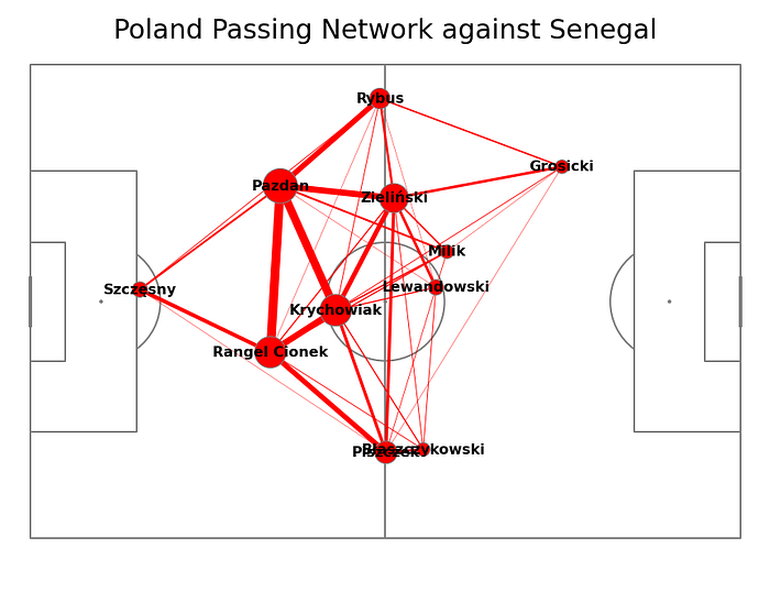
We are getting a very interesting plot with a graph of the players, their average position, and passes. What we can find?
- Most of the passes were in the triangle Pazdan-Cionek-Krychowiak
- Milik and Lewandowski — the forwards of the Polish national team were completely isolated from the passes (Good job Senegal defense)
- The most forward player was Grosicki, but he didn't receive enough passes.
- Another isolation of Piszczek and Błaszczykowski — Right part of the polish formation was always crucial for offensive potential.
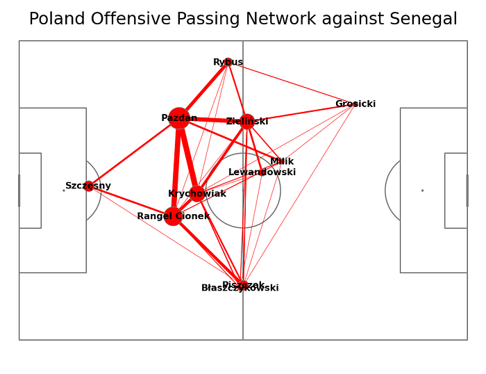
When we will check only offensive passes, we can see an even clearer answer, why Senegal blocked the Polish team in the first half. The Polish team was able to exchange offensive passes only at the safe distance from rival goals.
The Centralization Score for the polish team in this match, in the first half (we had subs in the second half), was approx 0.12. Not high, but in this case, it is mainly because in fact the polish team was blocked from playing forward and was mainly exchanging successful passes among defensive players.
Summary
That was my first approach to Football Analytics, and it was something that I always wanted to do. It was a great experience — reviewing players' passes, and shots, seeing football from a different perspective, and moreover — I had a great opportunity to learn new stuff.
From the cons? I had to go through Poland — Senegal match again :))
I loved it! I will be going deeper into David Sumpter's course and will hopefully publish something new in the coming weeks! 🤞
Links:
Check out my other posts: