

A while back, in the early days of our design system, we had a ticket for a component sitting in our backlog, with the title "Alert." My initial reaction was "Oh yeah, a colored box with a little icon to the left of it and some text, easy." Oh dear reader, how naive I was…
We started as we always do, with a component audit, which immediately revealed a bunch of complexity and conflicting needs and requirements. We started discussing which features our Alert component should support, and it very quickly became a bloated mess of properties and configurations. We realised we needed to take a step back, and split this component into multiple components with slightly different needs.
Should it be pop up from the corner of the screen? Can you dismiss it? Should it have a title? A description? An action? Multiple actions? Can the description contain links? Does clicking on the whole alert box perform an action?
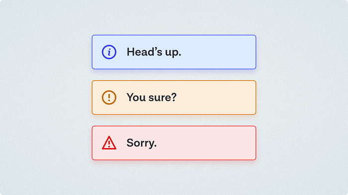
We eventually landed on three core patterns: Toast, Callout, and Notification. We reserved "Alert" for the group name for these types of components instead.
These shouldn't be considered canonical, your naming or grouping may differ slightly, and that's fine, as long as you're having that conversation with your team. I found the exercise of trying to define the capabilities and differences between these use cases useful enough, and have referred other designers to it enough that I thought it worth sharing more widely as a point of reference.
Note: this isn't technically part of my Design System Breakdown series as we have yet to build final versions of these. 😬
Toast
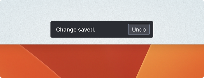
Some people like to call these "Snackbars" (Material design), but we preferred Toast as it seemed more ubiquitous and was shorter to say and write. It can also pop up from the bottom of the screen like toast does from a toaster! Delightful!
- Short and sweet. Once sentence or a few words.
- Appears on screen to indicate the status of an action that's just been taken (saved, changed, added, deleted), or a temporary system status (lost internet connection).
- Often used to confirm actions from UI that's no longer visible (Clicking save in a modal window, which saves and dismisses the modal)
- Floats over the UI but shouldn't obscure main actions
- Can be dismissed (optional)
- Action can be undone (optional)
- Can be color-coded for semantic states (success, error, warning)
Examples:
- Your change has been saved.
- Email sent [Undo]
- There was a problem connecting to the server.
Callout
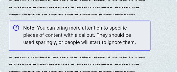
Notion users will be familiar with Callouts. These are often visually similar to toasts, but sit within the page's content, and are designed to highlight a particularly important piece of information. These can be all kinds of sizes/lengths and have plenty of variations.
- Should be already shown when the page or UI is loaded.
- Is part of the page flow. Doesn't overlap other elements.
- Optional variations with more or less visual weight (some might be a box, a box with a solid fill, or just a colored icon)
- Optional heading
- Optional description
- Optional link/action
- Optional dismiss
Notification
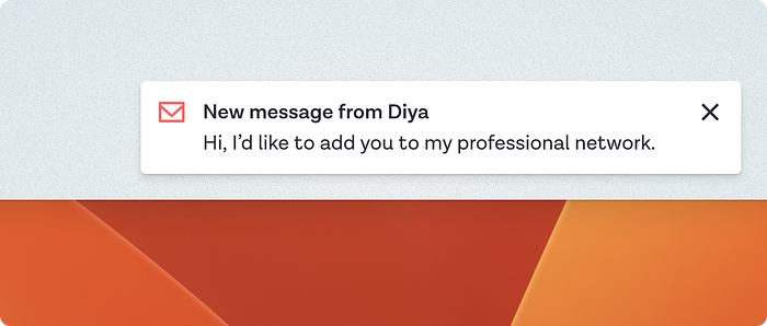
Notifications usually have more detail than a toast, though share other similar features like floating over the UI. They are less temporary than toasts, and can usually be dismissed and viewed later in their own notifications menu or area of the UI somewhere.
- Triggered by something external to the user. Either another user has taken an action that you need to know about, or something automated/systemic has happened that you need to be aware of
- Has an action to be taken, often viewing more detail
- History of past notifications available elsewhere in the application
- Can often be "read" or "archived" individually or in bulk
- Generally not urgent, does not disrupt current task
- Optional 1 or 2 lines of additional context detail (text excerpt, sender info, file name)
Examples:
- Message received [Read]
- An item has been shared with you [View item]
- New feature available [Read more]
A note on Accessibility
Toasts and popup notifications are incredibly easy to get wrong from an accessibility standpoint. While this isn't the focus of this article, if you are implementing pieces of UI that pop up for a set period and then disappear automatically, you need to be thinking about how to make people using assistive tech aware of these without interrupting current tasks, as well as the fact that people have different abilities to perceive changes happening outside their focus, and different reading speeds.
I recommend reading Sheri Byrne-Haber's Designing Toast Messages for Accessibility article as a starting point.
Thanks for reading. If you found this interesting, please consider subscribing to my newsletter, Clip Content for weekly writing about Design systems, tech, leadership, and more direct to your inbox.