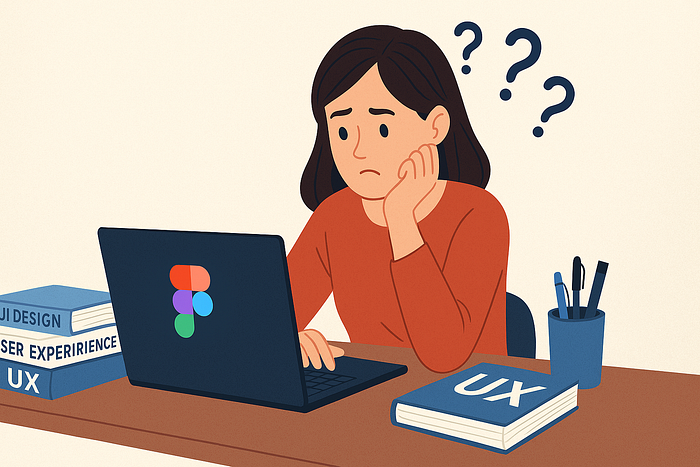

A fellow designer recently reached out after reading one of my case studies. Her question was simple:
"How do I learn Invisible UX and where should I start?"
It struck me because Invisible UX is something most of us intuitively want — a product that works without clutter, confusion, or too many steps — but very few actually know how to practice it.
In this article, I'll share the exact approach I've used to learn and apply Invisible UX principles, along with resources and tools you can explore to build your own AI-first design projects.
What is Invisible UX?
Traditionally, UX design was about making interfaces usable — buttons, menus, flows, and clear hierarchies. The assumption: users need to see everything to know how to act.
But in an AI-first world, things are shifting. The best UX is often the one you don't even notice.
Think about it:
- You don't pick from 12 categories of food anymore — you just type "healthy lunch" and Zomato shows you curated options.
- You don't scroll through endless playlists — you tell Spotify "play something relaxing" and it gets the mood right.
- You don't fill out 10 form fields — you authenticate with one click.
Invisible UX is all about hiding complexity while keeping power. The user focuses on their intent, not the mechanics of getting there.
Step 1: Start with a Problem Statement
Invisible UX isn't about removing design elements at random. It starts with identifying a friction point in the user journey.
Example: "Users struggle to decide what to order on Zomato."
Instead of adding more categories, filters, or banners, think
- Can we reduce choices upfront?
- Can we surface intent-based recommendations?
- Can we make the flow simpler, not richer?
Always ask: What's the complexity I can hide without breaking trust?
Step 2: Study Current Design Trends
The most exciting trend right now is category-less, prompt-based experiences.
Instead of navigating hierarchies, users just express what they want in natural language, and the system responds. Think ChatGPT, Framer AI, or Figma Make.
To spot these trends early:
- Behance / Dribbble → concept designs & experimental flows.
- Instagram / Twitter → motion-based design explorations that don't always make it to case studies.
- Product Hunt → AI-first products that are often minimal by necessity.
You'll notice a recurring theme: less visible UI, more intelligent back-end logic.
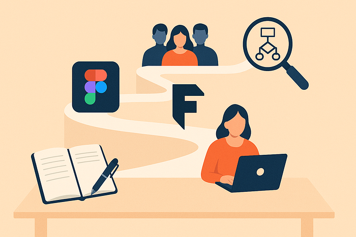
Step 3: Learn the Right Tools
Invisible UX isn't just a theory — you need to experiment. The right tools make all the difference.
- Figma Make → A new feature that lets you generate UI + front-end code from prompts. Great for testing intent-driven design.
- Framer → My go-to for building AI-first prototypes quickly.
- Rive / Blender → For adding 3D or micro-interactions that guide users subtly without text-heavy instructions.
- AI Assistants (ChatGPT, Claude, etc.) → Not just for research, but for simulating how a user might phrase intent.
The more you practice with these, the more you'll understand how to make designs feel "invisible."
Step 4: Adopt the Invisible UX Mindset
Tools are secondary. What matters is your design mindset.
When you're working on any project, ask yourself:
- How can I hide this complexity?
- What can the system do instead of the user?
- How can I guide without showing too much?
Invisible UX is about trust. If you strip away visible steps, the system must still feel reliable and understandable. That balance is what makes the design powerful.
Step 5: Resources I Found Useful
Here are some starting points that helped me learn Invisible UX:
- UX Collective & Bootcamp articles → Great for conceptual clarity.
- AI-first product teardowns → Look at how tools like Notion AI, Google Maps, or Spotify reframe interactions.
- Visual inspiration → Behance, Dribbble, and even Instagram reels are underrated goldmines.
- Practice projects → Nothing beats hands-on experimentation. Most of what I learnt came from building case studies and testing flows in Figma/Framer.
My Personal Path
When I started experimenting with Invisible UX, I didn't find a "textbook" for it. I learnt by doing:
- Writing case studies (which forced me to articulate my thought process).
- Using Figma and Framer to quickly prototype intent-driven designs.
- Following other designers experimenting with AI-first minimalism.
- Asking a simple question again and again: "Can this be done in fewer steps?"
Over time, I realized Invisible UX isn't about "removing design." It's about designing what doesn't need to be seen.
Closing Thoughts
Invisible UX is still under-explored. Most designers feel safer adding more elements — more buttons, more flows, more instructions.
But the real magic lies in designing less.
If you want to master Invisible UX:
- Start with a clear problem.
- Explore trends that reduce visible friction.
- Experiment with modern tools.
- Keep practicing minimal, intent-driven flows.
And most importantly, remember this: Invisible UX is not about hiding design. It's about designing so well that users don't even notice.
✦ I'm currently exploring AI-first design and writing case studies on Medium. If you're working on a project around Invisible UX, I'd love to connect on Linkedin and exchange notes.