

In this IT industry you might have come across different Analysis and Analytics Job titles which might be confusing. All of them deal with data, to get meaningful information, in an effective way, which helps any business to grow. There are so many ways by which you can analyze any Structured data but today, we will be focusing on Python to quickly analyze the data.
So, let's dive into one of the most powerful programming languages — Python. For this, I have used Perm Disclosure data for 2023 Q2 from their official site.
First and foremost we import Python libraries for analysis and visualization: Pandas (analysis) and plotly (visualization).
Exploring the Data
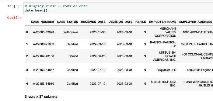
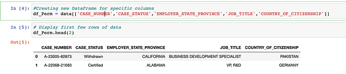
There are 37 columns in total, and we don't need all of them for analysis. So, we create a new DataFrame with only required columns.
Generating summary statistics
Understanding the data's basic characteristics will help us to make better decisions during analysis.
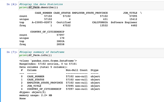
Pandas provides the describe() function to calculate the descriptive summary statistics. Here, we can figure out the following :
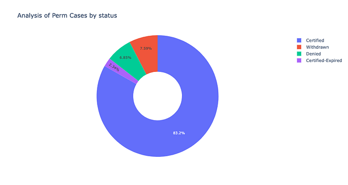
- Majority of the cases are certified.
- California has the most perm cases filed by employers.
- Top Job profile is Software Engineer.
By using the info() method, you can check number of columns and index dtype , non-null values and memory usage.
Data Cleaning
This is the most important step in any data analysis. Messy and inaccurate data can lead to wrong insights and poor decision making. So, it is crucial to ensure the accuracy of our data.
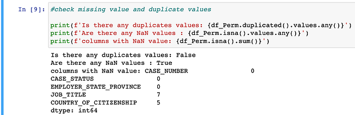
Here, we can see that there are no duplicate values. JOB_TITLE and COUNTRY_OF_CITIZENSHIP columns have some missing values, which is balanced out by other columns like CASE_NUMBER, CASE_STATUS etc , that do not have any missing values. So, we need not worry about dropping any rows with missing value.
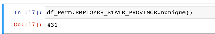
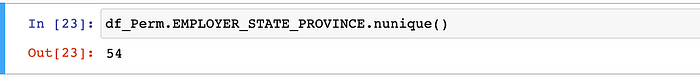
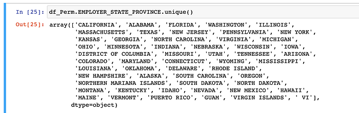
Another point to note is that EMPLOYER_STATE_PROVINCE column has 431 unique values. But, is it possible to have 431 states? 🤔
By checking some of rows we can see the employer state is appended with other information like company name etc. Check row 1556 and 1558:

To clean this data we will replace the employer state with state name only without extra information added to this.
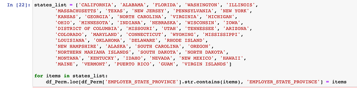
After running the above code, we will get 54 unique states as shown below.
Data Visualization
Now it's time to visualize our cleansed data in beautiful colorful charts. YAYY !!!!! 🎉
As you know it is easy to interpret meaningful information and insight with graphical representation, where you can uncover patterns and trends . We will use Plotly Express which is a built-in part of the plotly library, and is the recommended starting point for creating most common figures. More information on it is available here.
Let's DRAWWWWW !!!! 😁😁🎨
- Visualization of Perm Cases by Status
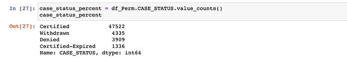
First, we will check unique value for case status. As there are only 4 unique status for Perm cases, so the suitable statistical chart type will be Pie chart for this case.

Now, to get number of cases by their status we use value_counts() function which returns a Series that contain counts of unique values.
Remember to import the plotly library.
import plotly.express as px
fig = px.pie(case_status_percent,
            names = case_status_percent.index,
            values = case_status_percent.values,
            title = 'Analysis of Perm Cases by status',
            hole = 0.4)

fig.update_traces(textposition = 'inside', textfont_size = 10, textinfo = 'percent')

fig.show()
After running the above code, we will get a Pie Chart:
2. Visualize Top 10 Job Titles
In our case we have to group the data by Job title and then count the number of unique cases for that Job title. We can accomplish this by chaining the .groupby() and the .agg() functions together. Then, we can use the .sort_values() method to get the highest value on the top and from that result we get the top 10 Job titles.
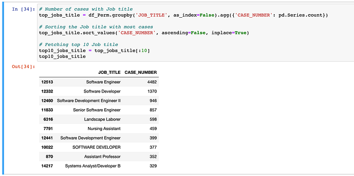
For this case we will use Bar Chart which is one of the best chart to visualize categorical data with rectangular bars.
h_bar = px.bar(x=top10_jobs_title.JOB_TITLE,
       y=top10_jobs_title.CASE_NUMBER,
       color=top10_jobs_title.CASE_NUMBER,
       color_continuous_scale='Magenta',
       title='Top 10 Jobs Title'
)

h_bar.update_layout(xaxis_title='Number of Jobs',
                    yaxis_title='Job Title',
                    coloraxis_showscale=False)
h_bar.show()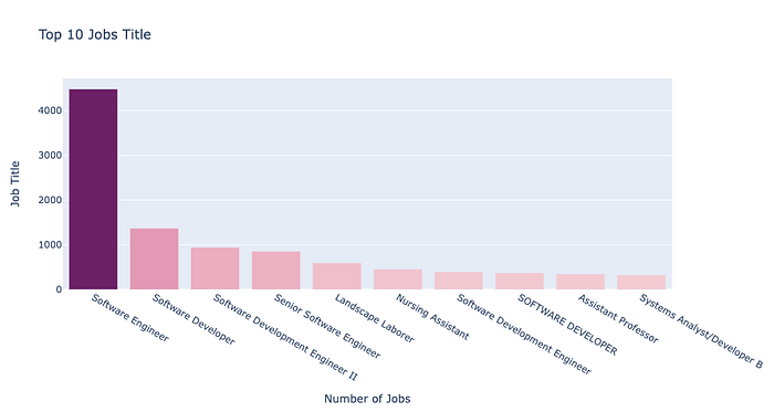
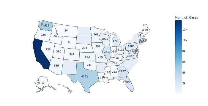
Similarly, you can create more charts using Plotly Express. For example, the below map shows state wise total Perm cases.
P.S: You might need to add State code to create the Map Chart.
I have also created the visualization with the help of Tableau Desktop.
Happy Learning !!!!