Transforming an overwhelming loan marketplace into a personalized matchmaking experience through smart recommendations and intuitive design.
The current experience
BuddyLoan operates as a marketplace connecting borrowers with lenders, but we had no smart matching in our app. We simply dumped all available lender options on users at once. Imagine walking into a room with 20+ salespeople all shouting different offers at you.
This created significant problems for people who just wanted to find the right loan.
For borrowers:
- Too many choices cause confusion and high decision time
- No proper way to compare lenders effectively
- Going through 20+ options is painful and overwhelming
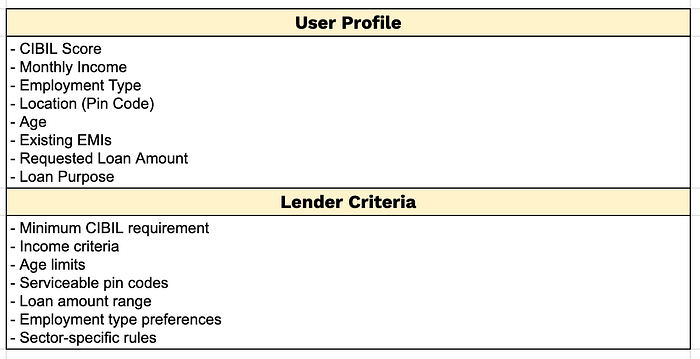
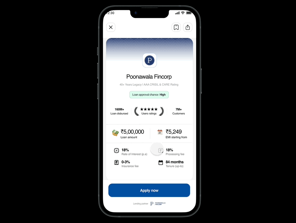
- Information overload with every lender showing 6 data points:
- Max loan amount offer
- EMI starting from
- Annual ROI
- Processing fee range
- Insurance charge
- Chance of loan approval
For lenders:
- High number of bad leads due to no borrower eligibility filtering
- High rejection rates as unqualified users can apply to anyone
- No boosting options to maximize applications for a particular lenders (missed partnership revenue)
For Business:
- Low start-to-disbursal conversion
- High customer acquisition costs
- Poor lender satisfaction affecting partnerships
The impact This created a lose-lose situation where borrowers felt overwhelmed and lenders received poor quality leads, resulting in high rejection rates and user frustration.
Goals & expected results
Goal: Enhance the lender selection experience for both borrowers and lenders using a smart matchmaking algorithm.
Expected results:
- Simple and intuitive user flow for smoother lender selection
- Reduced time spent on the lender selection screen
- Better start to disbursal conversion funnel
- Reduced rejection rates
- Higher user satisfaction (CSAT &NPS)
Our solution approach
Inspiration: Matchmaking with a twist
I took inspiration from dating app swiping algorithms but adapted them for financial services:
User type: Repeat users (good & verified data)
The flow: Start → Review details → Fetching lenders for you → X lenders found based on eligibility → Swipe between lender options and apply → Redirect to partners website
Key difference from dating apps flow
Dating apps (Tinder/Bumble/Hinge): Two way interaction
- You like them, they like you back = match
- Both people choose each other
Our loan app: One way interaction
- You apply, algorithm decides
- No "swiping back" needed
This works because lenders care about your credit score, not your personality. Their computers approve loans based on data, not feelings.
How our algorithm creates the perfect match
For every loan seeker, our system compares their profile details with lender requirements. Each factor like credit score, income, employment type, and loan preferences is checked against what lenders are looking for.
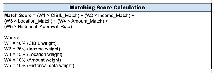
(Note: These weights are for demonstration and should be fine-tuned based on real-world validation and business logic)
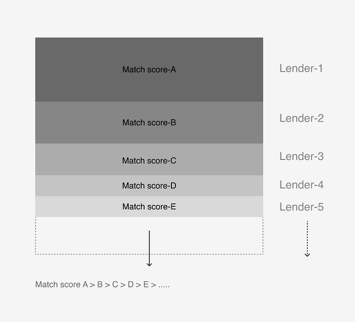
For each user profile, our backend'll creates a stack of lender options arranged in decreasing order of match score.
-
How the stacking works:
- Hard filtering: Remove lenders where user doesn't meet basic eligibility
- Score calculation: Calculate match score for remaining lenders
- Ranking: Stack lenders from highest to lowest match score
- Personalization: Top card shows best match for that specific user profile
Example: If Rajesh has a 750 CIBIL score and ₹30,000 monthly income, he'll see lenders who historically approve similar profiles at the top of his stack.
Designing the user experience
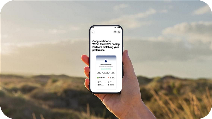
1. Loading state: Building anticipation
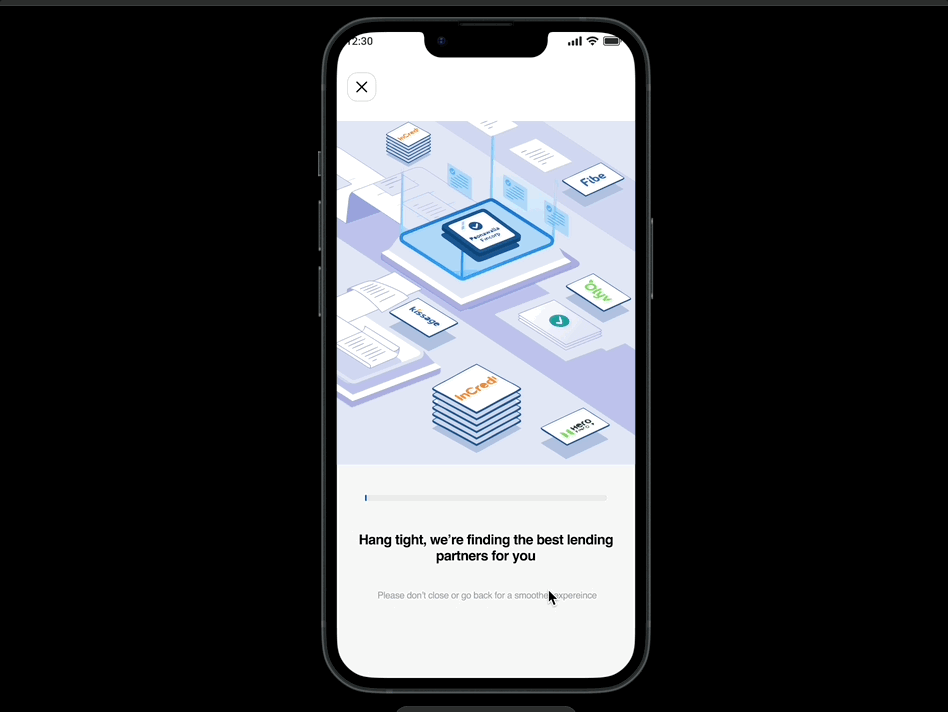
While our algorithm matches borrowers with lenders, we show engaging status updates to users:
- "Analyzing your profile…"
- "Finding your best matches…"
UX principle behind this:
Perceived performance and expectation management By showing progress and explaining what's happening, we reduce perceived waiting time and build anticipation for personalized results. This keeps users engaged rather than frustrated during the 10–30 second processing time.
-
2. Help/guide: Easing users into new interactions
Since our users might be new to swiping for financial decisions, we provide guided learning to help them adapt quickly.
- First-time tutorial overlay showing swipe directions with clear labels.
- Contextual hints appearing on the first few cards ("Swipe left to pass, right to apply")
UX principle behind this:
Progressive onboarding and scaffolding We gradually introduce users to new interaction patterns by providing just-in-time guidance without overwhelming them. This reduces the learning curve and builds confidence, ensuring users feel comfortable with the interface before making real financial decisions.
-
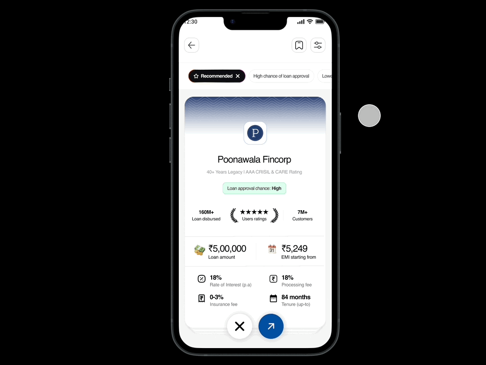
3. Lender selection page
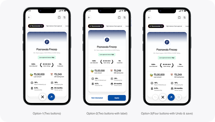
I explored multiple interaction approaches for the lender selection screen to find the optimal user experience:
- Option 1: Two buttons without labels (clean, minimal interface)
- Option 2: Two buttons with labels (easier to understand for new users)
- Option 3: Four buttons with undo and save functionality (maximum control)
I chose Option 1 for the final design because it was clear, simple, and creates a cleaner UI once users understand the interaction. For error prevention, I implemented a timed undo toast instead of a permanent undo button, achieving the same safety goal while maintaining visual simplicity.
-
UX principle behind this:
Nielsen's "User control and freedom" heuristic Users often choose system functions by mistake and need a clearly marked "emergency exit" to leave unwanted states.
-
4. Lender selection screen: Key interactions

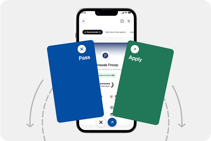
- Pass (Swipe left): User not interested in the lender
- Apply (Swipe right): User ready to proceed with this lender, Redirect the users to lender portal/website
- Know more (Tap on the card): View detailed lender information such as ROI, Loan process, documents needed, FAQs, Contact details, EMI calculator for the respective lenders (optional)
- Save for later(Tap on Bookmark button): User likes the lender but visit later or wants to compare it with other lenders(to be implemented later, not included in this submission)

Interface elements:
- Filters for customizing lender options based on preference.
- Saved for later list view with comparison feature. (Advanced features)
- Apply button for immediate redirection.
- Swipe gestures with undo option for error prevention.
- Tap on the profile card and scroll to know more details
-
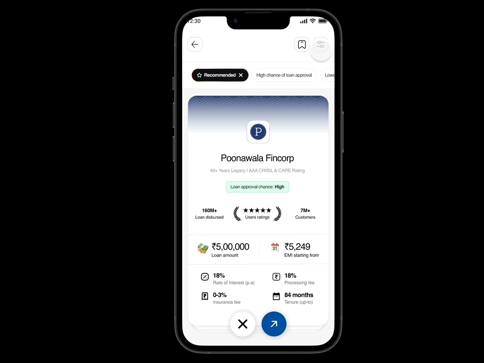
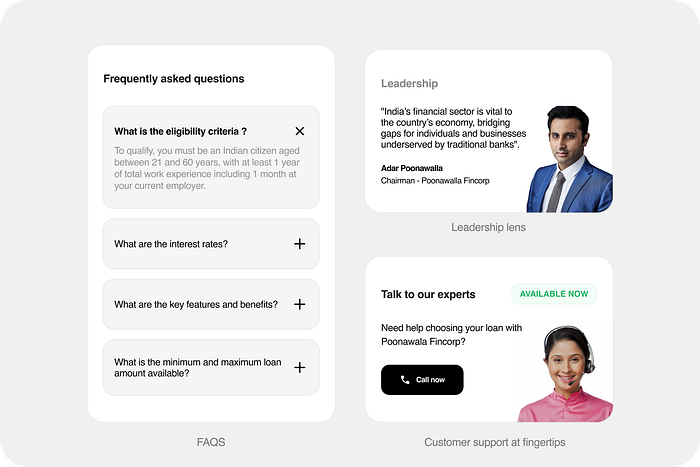
5. Lender details: Building trust through transparency
To help users make more informed decisions, we expanded the lender information available when they tap for details:
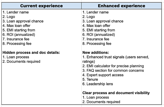
Key addition:
- EMI calculator: Users can check EMI based on their loan amount before applying
- FAQs section: Address common doubts to help users make the right decision
- Talk to expert: Direct access to customer support for additional guidance
- Enhanced trust signals: Total users served, ratings, loan disbursement history
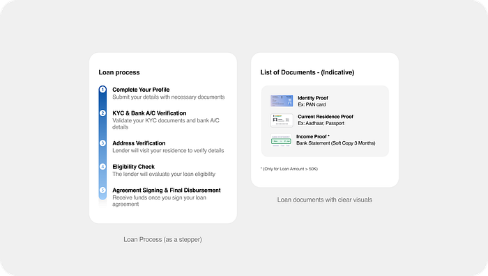
- Better discoverability: Loan process and document requirements more prominently displayed

UX principle behind this:
Transparency and informed consent Users making high-stakes financial decisions need sufficient information to feel confident in their choices. While this increases cognitive load, providing comprehensive yet well-organized information builds trust and reduces post-decision anxiety.
-
6. Redirection screen: Setting expectations for the journey ahead
In the current experience, when users click "Apply Now" and get redirected to the lender's website, there's no clear loading state or communication about what's happening. This creates confusion and breaks the user's mental model of the process.
UX principle behind this:
Continuity and expectation setting When users are handed off between systems, maintaining continuity in experience and clear communication prevents confusion and abandonment.
Looking ahead: AI powered loan bot for BuddyLoan- "Buddy"
Looking forward, there's an exciting opportunity to take this even further with conversational AI. With people increasingly turning to ChatGPT for financial advice, we could create our own AI assistant where users simply say "I need 1 lakh for my wedding" and get personalized loan recommendations through natural conversation.
This taps into a behavior shift we're already seeing, people are getting comfortable asking AI for help with complex decisions, including money matters.
~~ FOOTNOTE : Narrative over complexity
Great fintech design isn't about fancy features. It's about understanding that applying for a loan is scary and stressful, then creating experiences that make people feel confident instead of confused.
We didn't just improve our app metrics. We made one of life's most overwhelming moments a little bit easier for thousands of people. That's design that actually matters.
Thank you :)
Thanks for sticking with me through this design journey! Now if you'll excuse me, I need to go organize that Figma chaos.
Cheers! ✌️