
In an era where data is becoming a valuable asset for companies, the ability to extract deep insights from the information at hand is crucial. This article takes you into the world of robust data analysis by combining expertise in SQL, versatile Python programming skills, and the power of visualization through Looker Studio. Through this data analysis project, we will explore how these three tools can integrate with each other to transform raw data into strategic information that can provide new insights, support informed decision-making, and positively contribute to overall business growth. In this data analysis project, a series of tasks will be performed to unravel potential insights from the dataset.
Dataset
The dataset used in this project consists of 4 datasets, namely : 1. order_detail
2. sku_detail
3. customer_detail
4. payment_detail
The details of each dataset are as follows:
Next, I will explain and detail the Entity Relationship diagram (ERD) of the 4 main datasets we will use in this project. This is an important first step in understanding how data is interconnected and how we can explore the potential insights hidden within it.
SQL for Data Analysis
SQL (Structured Query Language) is a specialized programming language for managing and accessing relational databases. In data analysis, SQL is an important foundation because it allows us to perform various actions on data, such as retrieval, storage, update, and deletion.
Tools
In this project, Big Query is the tool used to run SQL queries. Big Query is a data warehouse service released by the Google Cloud Platform. It can manage, analyze, and understand data on an enormous scale quickly and efficiently.
With Big Query, we can run complex SQL queries on very large datasets, taking advantage of the advanced parallel architecture to deliver results in record time. Big Query also allows us to store raw data and query results in optimized storage so that we can easily re-access relevant data for future analysis.
Task
Task 1 : Displays the month with the most transactions (after_discount) in 2021.
SELECT
    EXTRACT(MONTH FROM order_date) AS month,
    SUM(after_discount) AS total_transaction_value
FROM
    `Tokopedia.order_detail`
WHERE
    is_valid = 1
    AND EXTRACT(YEAR FROM order_date) = 2021
GROUP BY 1
ORDER BY 2 DESC
LIMIT 1
The query retrieves data from the order_detail table to complete the given task about the month with the largest total transaction value (after_discount) during 2021. The selected data only includes customer transactions that have made payment (is_valid = 1). This query groups the data by transaction month, calculates the total transaction value of each month, and then sorts it to find the month with the largest total transaction. The result of this query will give the month with the largest total transaction value during 2021.
Result :
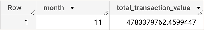
From the table, it is found that the month that has the largest transaction value in 2021 is November.
Task 2 : Displays the categories that generated the most transaction value in 2022.
SELECT
  sd.category AS Category,
  SUM(od.after_discount) AS total_transaction_value
FROM
  `Tokopedia.order_detail` od
LEFT JOIN
  `Tokopedia.sku_detail` sd ON od.sku_id = sd.id
WHERE
  is_valid = 1
  AND EXTRACT(YEAR FROM order_date) = 2022
GROUP BY 1
ORDER BY 2 DESC
The query will combine the order_detail and sku_detail tables to find product categories with the highest transaction values during 2022. The selected data includes only customer transactions who have made the payment (is_valid = 1) and occurred in 2022. This query will group the data by product category and calculate the total transaction value for each category.
The results are sorted from largest to smallest, displaying categories with the highest total transactions during 2022.
Result :
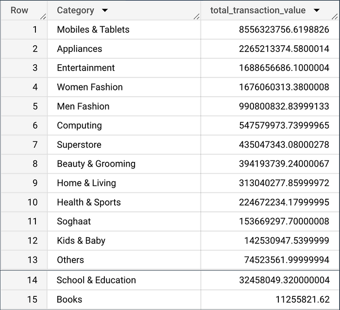
The table shows that the category that generates the most transaction value in 2022 is Mobiles and Tablets.
Task 3 : Displays a comparison of the transaction value of each category from 2021 and 2022, as well as categories that have increased and decreased.
WITH trans AS(
  SELECT
    sd.category AS Category,
    SUM(CASE WHEN EXTRACT(YEAR FROM od.order_date) = 2021 THEN od.after_discount END) AS total_transaksi_2021,
    SUM(CASE WHEN EXTRACT(YEAR FROM od.order_date) = 2022 THEN od.after_discount END) AS total_transaksi_2022,

  FROM
    `Tokopedia.order_detail` od
  LEFT JOIN
    `Tokopedia.sku_detail` sd on od.sku_id = sd.id
  WHERE
    is_valid = 1
  GROUP BY 1
)
SELECT *,
total_transaksi_2022 - total_transaksi_2021 AS selisih_transaksi
FROM trans
The query provides a comparison of transaction values for each product category between the years 2021 and 2022. This query employs a Common Table Expression (CTE) approach named trans.
First, in this CTE, data from the order_detail (od) and sku_detail (sd) tables are merged based on sku_id to obtain product category information. The selected data only includes customer transactions that have made payment(is_valid = 1).
Then, the SUM(CASE WHEN … END) function is employed to calculate the total transaction value (after_discount) for both 2021 and 2022 separately. Each product category has a total transaction amount for each year.
After the data is collected and calculated in the CTE, the main query selects all the columns in the trans-CTE. An additional column selisih_transaksi, is generated by subtracting the total transaction value from 2021 from the total the total transaction value from 2022. This gives the difference value between 2022 and 2021 for each product category.
The final result of this query is a table that displays the category name, total transactions for 2021, total transactions for 2022, and the difference between 2022 and 2021. By observing positive values in the selisih_transaksi column, we can identify product categories that have experienced an increase in transaction value from 2021 to 2022. Conversely, negative values indicate a decrease in transaction value during the same period.
Result :
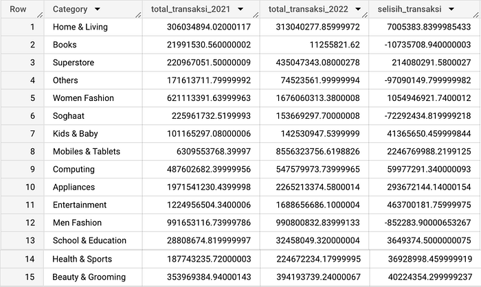
The table shows that the categories that experienced decreased transaction value occurred in the Books, Others, Soghaat, and Men Fashion categories.
Task 4: Displays the five most frequently used payment methods in 2022 (based on total unique orders).
SELECT
  pd.payment_method,
  COUNT(DISTINCT od.id) AS Total
FROM
  `Tokopedia.order_detail` od
LEFT JOIN
  `Tokopedia.payment_detail` pd ON od.payment_id = pd.id
WHERE
  is_valid = 1
  AND EXTRACT(YEAR FROM order_date) = 2022
GROUP BY 1
ORDER BY 2 DESC
LIMIT 5
The query displays the five most popular payment methods used during 2022 based on total unique orders. The query combines data from the order_detail and payment_detail tables via payment_id to get information about payment methods. The selected data only includes customer transactions that have made a payment (is_valid = 1) and occurred in 2022.
Next, this query groups the data based on the payment method and calculates the total unique orders using the COUNT(DISTINCT od.id) function. The calculation results are sorted from largest to smallest (DESC) and limited to five rows using LIMIT 5.
Result :
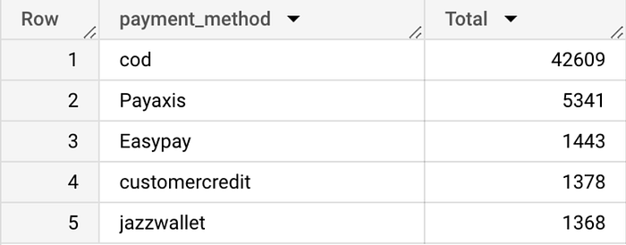
The table shows that COD is the most frequently used payment method in 2022. There were 42,609 transactions.
Task 5: Displays brands with the highest transaction value between Samsung, Apple, Sony, Huawei, and Lenovo brands.
WITH produk AS(
  SELECT
    CASE
      WHEN LOWER(sd.sku_name) LIKE '%samsung%' THEN 'Samsung'
      WHEN LOWER(sd.sku_name) LIKE '%apple%' OR LOWER(sd.sku_name) LIKE '%imac%' OR LOWER(sd.sku_name) LIKE '%iphone%' THEN 'Apple'
      WHEN LOWER(sd.sku_name) LIKE '%sony%' THEN 'Sony'
      WHEN LOWER(sd.sku_name) LIKE '%huawei%' THEN 'Huawei'
      WHEN LOWER(sd.sku_name) LIKE '%lenovo%' THEN 'Lenovo'
    END AS Brand,
  SUM(od.after_discount) AS transaksi
  FROM
    `Tokopedia.order_detail` od
  LEFT JOIN
    `Tokopedia.sku_detail` sd ON od.sku_id = sd.id
  WHERE
    is_valid = 1
    AND EXTRACT(YEAR FROM order_date) = 2022
  GROUP BY 1
  ORDER BY 2 DESC
)

SELECT * FROM produk
WHERE
  Brand IS NOT NULL
The query sorts five product brands (Samsung, Apple, Sony, Huawei, Lenovo) based on their total transaction value during 2022. The query uses CTE (Common Table Expression) to identify and calculate the total transaction value of each product brand from the order_detail and sku_detail tables.
First, a CTE with the produk name is created to group the data by product brand using a CASE statement that maps the product name to a specific brand. Next, each brand's total transaction value (after_discount) is calculated using SUM(od.after_discount).
The data in the CTE is grouped and sorted in descending order based on the total transaction. Then, the main query retrieves the produk CTE results for product brands with transaction value during 2022. The result is a list of five product brands sorted by the highest transaction value.
Result :
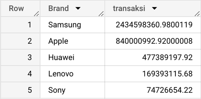
The table shows that the brand with the highest transaction value in 2022 is Samsung.
Python for Data Analysis
Python is a popular, versatile, and easy-to-learn high-level programming language. Developed in the early 1990s by Guido van Rossum, Python was designed to focus on code readability and ease of use.
Python has become a popular programming language in data analysis for many reasons, including its easy-to-understand syntax, robust library ecosystem, and flexibility in handling various analysis tasks.
Tools
In this project, the tool used to run Python is Google Colab. Google Colab has become an invaluable tool in the data analysis ecosystem using Python. Colab, which stands for Collaboratory, offers a cloud-based platform that facilitates writing and executing Python code interactively through the Jupyter Notebook environment hosted by Google.
The main advantage of Colab lies in its flexibility, which allows users to access the development environment from various devices with an internet connection. More interestingly, Colab is provided for free and is integrated with Google Drive, allowing easy storage, sharing, and management of analysis notebooks. It also integrates with Keras's machine learning framework, making it easy for users to build and evaluate models.
Another advantage is limited access to GPUs and TPUs, which speeds up the process of training complex models. With data analysis libraries installed by default, Colab provides a ready-to-use environment for data exploration, statistical analysis, and visualization. The combination of interactive capabilities, real-time collaboration potential, and easy integration makes Google Colab a useful tool for efficiently running data analysis projects.
Library
In this project, there are 3 libraries used to analyze data, namely pandas, numpy, and matplotlib pyplot. The following is an explanation of the libraries used:
- Pandas, a library used to manipulate and analyze structured data.
- Numpy, is a library used for numerical and scientific computing in Python.
- Matplotlib pyplot, is a library used to visualize data.
Task
In this analysis using Python, the 4 datasets described at the beginning have been put together and stored in the df variable.
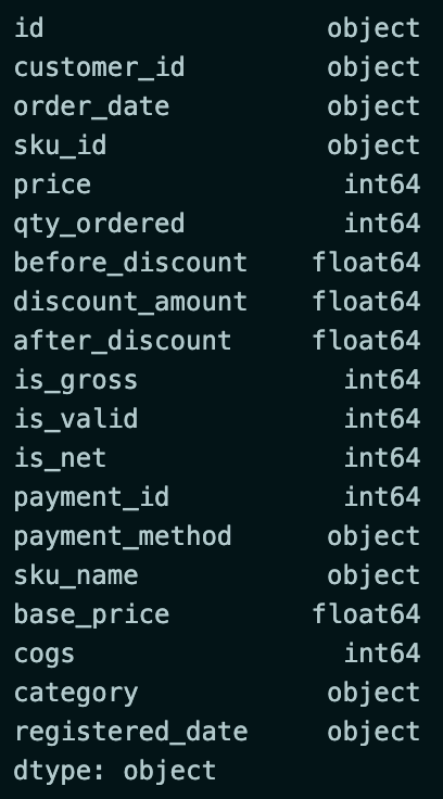
The first thing to do before analyzing is to check the dataset.
df.dtypesThe code is used to check the data type of each column in the dataset.
Result :
The next step is to change the type in columns with data types unsuitable for analysis.
df = df.astype({
    "before_discount":'int',
    "discount_amount":'int',
    "after_discount":'int',
    "base_price":'int'
    })
df['order_date']= pd.to_datetime(df['order_date'])
df['registered_date']= pd.to_datetime(df['registered_date'])
df.dtypes
The code will change the data type of the before_discount, discount_amount, after_discount, and base_price columns to int. Then, change the data type of the order_date and registered_data columns to datetime.
Result :
Task 1: Displays the top 5 products from the Mobiles & Tablets category with the most sales in 2022.
df_1 = df[
    (df['is_valid'] == 1) &
    (df['category'] == 'Mobiles & Tablets') &
    (df['order_date'].dt.year == 2022)
]
df_1 = (df_1.groupby(by=['sku_name'])['qty_ordered']
        .sum()
        .sort_values(ascending=False)
        .reset_index(name='Quantity')
        )
df_1.head(5)
The code performs data filtering according to the specified conditions. Then, the data is grouped by product name (sku_name), and the total sales quantity is calculated using the sum() method. The results are sorted by sales quantity, and the top 5 products are taken.
Result :

Task 2.1: Checking category sales data in 2021 and 2022.
data_2021 = df[
    (df['is_valid'] == 1)&
    (df['order_date'].dt.year == 2021)
]

data_2022 = df[
    (df['is_valid'] == 1)&
    (df['order_date'].dt.year == 2022)
]

data_2021 = (data_2021.groupby(by=['category'])['qty_ordered']
             .sum()
             .sort_values(ascending=False)
             .reset_index(name='Qty_2021'))
data_2022 = (data_2022.groupby(by=['category'])['qty_ordered']
             .sum()
             .sort_values(ascending=False)
             .reset_index(name='Qty_2022'))

data_penjualan = data_2021.merge(data_2022,left_on='category',right_on='category')
data_penjualan['Selisih'] = data_penjualan['Qty_2022'] - data_penjualan['Qty_2021']
data_penjualan.sort_values(by='Selisih', ascending=True, inplace=True)
data_penjualan
The code is used to check sales data in 2021 and 2022 and analyze the sales quantity in 2022 compared to 2021.
The code performs data filtering to get data on customers who have made payments (is_valid = 1) in 2021 and 2022. The data is then grouped by Category, and the quantity of products sold (qty_ordered) is calculated using the sum() method. The results are sorted in descending order and reset with the corresponding column name.
Next, the sales data from 2021 and 2022 are merged by Category using the merge() method. After that, the Selisih column is added by calculating the difference between the sales quantity of 2022 and 2021. The data is then sorted based on the Selisih column in ascending order.
Result :
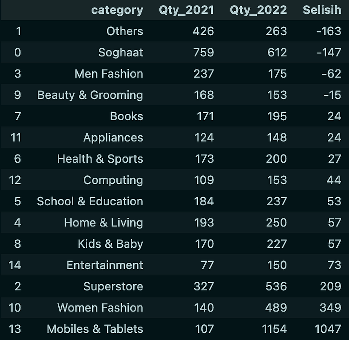
The table shows that the categories that experienced a decrease in sales occurred in the Others, Soghaat, Men Fashion, and Beauty & Grooming categories.
Task 2.2: Because the Others category has experienced the most significant decline, we will check which products have experienced a decline in sales.
data_2021_others = df[
    (df['is_valid'] == 1)&
    (df['order_date'].dt.year == 2021)&
    (df['category'] == 'Others')
]

data_2022_others = df[
    (df['is_valid'] == 1)&
    (df['order_date'].dt.year == 2022)&
    (df['category'] == 'Others')
]

data_2021_others = (data_2021_others.groupby(by=['sku_name'])['qty_ordered']
                    .sum()
                    .sort_values(ascending=False)
                    .reset_index(name='Qty_2021'))
data_2022_others = (data_2022_others.groupby(by=['sku_name'])['qty_ordered']
                    .sum()
                    .sort_values(ascending=False)
                    .reset_index(name='Qty_2022'))

data_penjualan_others = data_2021_others.merge(data_2022_others,left_on='sku_name',right_on='sku_name')
data_penjualan_others['Selisih'] = data_penjualan_others['Qty_2022'] - data_penjualan_others['Qty_2021']
data_penjualan_others.sort_values(by='Selisih', ascending=True, inplace=True)
data_penjualan_others
The code is used to check the sales data of products in the Others category from 2021 and 2022 and analyze the sales quantity of these products in 2022 compared to 2021.
The code performs data filtering to get data on customers who have made payments (is_valid = 1) in 2021 and 2022. The data is then grouped by Category (sku_name), and the quantity of products sold (qty_ordered) is calculated using the sum() method. The results are sorted in descending order and reset with the corresponding column name.
Next, product sales data in the Others category from 2021 and 2022 are merged based on sku_name using the merge() method. After that, the Selisih column is added by calculating the difference in the sales quantity of products in the Others category in 2022 and 2021. The data is then sorted based on the Selisih column in ascending order.
Result :
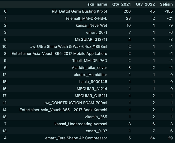
The table shows that the product that experienced the largest decrease in sales from the Others category was RB_Dettol Germ Busting Kit-bf with a decrease of 155.
Task 3: Displays customers who will get promos provided that the customer has checked out but has yet to make a payment in 2022.
df_3 = df[
    (df['is_gross'] == 1) &
    (df['is_valid'] == 0) &
    (df['is_net'] == 0) &
    (df['order_date'].dt.year == 2022)
]
df_3 = df_3[['customer_id', 'registered_date']]
df_3
The code performs filtering, which takes data on customers who have checked out but have not made payments (is_gross = 1) in 2022. Then, the data taken is only the customer_id and registered_date columns.
Result :

From the table, it is found that there are 1052 customers who will get the promo.
Task 4.1 : Displays the average sales on weekends and weekdays, to prove whether the campaign conducted on Saturdays and Sundays during October to December in 2022 had an impact on the increase in sales.
df['day'] = df['order_date'].dt.day_name()
df['month'] = df['order_date'].dt.month_name()
df['month_number'] = df['order_date'].dt.month

df_4 = df[
    (df['is_valid'] == 1) &
    (df['order_date'] >= '2022-10-01') &
    (df['order_date'] <= '2022-12-31')
]

weekends = df_4[df_4['day'].isin(['Saturday', 'Sunday'])]
weekdays = df_4[df_4['day'].isin(['Monday', 'Tuesday', 'Wednesday', 'Thursday', 'Friday'])]

average_weekends =(weekends.groupby(['month_number', 'month'])['before_discount']
                   .mean()
                   .reset_index(name='avg_weekends'))
average_weekdays =(weekdays.groupby(['month_number', 'month'])['before_discount']
                   .mean()
                   .reset_index(name='avg_weekdays'))

merged_data = pd.merge(average_weekends,
                       average_weekdays,
                       on=['month_number', 'month'])
merged_data
The code is used to analyze the impact of the campaign conducted on Saturdays and Sundays during October to December 2022 on the increase in sales.
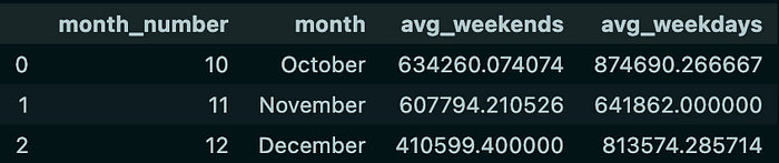
The first thing to do is to create a new column containing the day name (day), month name (month), and month number (month_number). Then perform data filtering according to the specified conditions.
The data was then divided into weekends and weekdays based on the day names in the day column. Then, the average sales value before the discount (before_discount) is calculated for each month in both groups. Then, the average sales results on weekends and weekdays are combined based on month_number and month.
Result :
Next, I will create a visualization of the table to show the comparison of average sales on weekends and weekdays in each month.
df_5 = merged_data

positions = np.arange(len(df_5))
width = 0.4
fig, ax = plt.subplots(figsize=(10, 6))

weekends_bars = ax.bar(positions, df_5['avg_weekends'], width, label='Weekends')
weekdays_bars = ax.bar(positions + width, df_5['avg_weekdays'], width, label='Weekdays')

ax.set_xticks(positions + width / 2)
ax.set_xticklabels(df_5['month'])

ax.set_ylabel('Rata-rata Penjualan')
ax.set_xlabel('Bulan')
ax.set_title('Rata-rata Penjualan Weekends vs Weekdays per Bulan')
ax.legend()
plt.show()
Result :
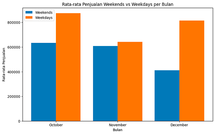
From the graph, it is found that the average sales on weekends are always lower than the average sales on weekdays in every month.
Task 4.2 : Displays the overall average sales on weekends and weekdays for the 3 months.
avg_trx_weekends = df[
    (df['is_valid']==1) &
    (df['day'].isin(['Saturday','Sunday'])) &
    (df['order_date']>='2022-10-01') &
    (df['order_date']<='2022-12-31')
    ]
avg_trx_weekdays = df[
    (df['is_valid']==1) &
    (df['day'].isin(['Monday','Tuesday','Wednesday','Thursday','Friday'])) &
    (df['order_date']>='2022-10-01') &
    (df['order_date']<='2022-12-31')
    ]

data_3bulan = {
    'Period':'Transaksi Selama 3 Bulan',\
    'Avg_Weekend_Sales':round(avg_trx_weekends['before_discount'].mean(),2),\
    'Avg_Weekdays_Sales' : round(avg_trx_weekdays['before_discount'].mean(),2),\
    'Diff (Value)' : round(avg_trx_weekends['before_discount'].mean(),2) - round(avg_trx_weekdays['before_discount'].mean(),2)
    }

data_3bulan = pd.DataFrame(data_3bulan, index=[0])
data_3bulan
The code is used to compare the overall average sales on weekends and weekdays over a three-month period from October to December 2022.
The code divides the data into 2 groups: avg_trx_weekends and avg_trx_weekdays. In both groups, data will be filtered according to predefined conditions.
Then, the data calculated above is integrated into a dictionary named data_3bulan. This dictionary contains information about the three-month period (Period), average weekend sales (Avg_Weekend_Sales), average weekday sales (Avg_Weekdays_Sales), and the difference in value between average weekend and weekday sales (Diff (Value)). Next, the data_3bulan dictionary is converted into a DataFrame that will display the information in the form of a table.
Result :

Next, I will make a visualization of the table to show the comparison of average sales on weekends and weekdays as a whole in the 3 months from October to December 2022.
avg_weekends = merged_data['avg_weekends'].mean()
avg_weekdays = merged_data['avg_weekdays'].mean()

fig, ax = plt.subplots(figsize=(6, 6))
ax.bar(['Weekends', 'Weekdays'], [avg_weekends, avg_weekdays])
ax.set_ylabel('Rata-rata Penjualan')
ax.set_xlabel('Jenis Hari')
ax.set_title('Rata-rata Penjualan Weekends vs Weekdays (Oktober-Desember 2022)')

plt.show()
Result :
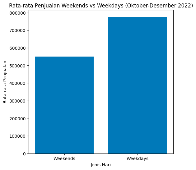
From the graph, it can be concluded that the campaign carried out on Saturdays and Sundays during October to December in 2022 has not had a significant impact on the increase in sales.
Data Visualization using Looker Studio
Looker Studio is a data analysis and visualization platform designed to help organizations dig insights from their data in a more interactive and informative way. The platform allows users, especially those without a deep technical background, to easily create engaging visualizations and provide a clear view of complex data.
Task
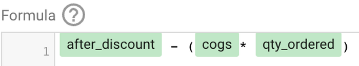
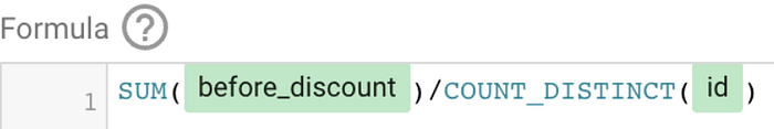
Before doing the visualization, I will create 3 new columns with the following conditions:
Net_Profit-> before discount - (cogs * qty)AOV-> before discount / Total Unique OrderValue_Transaction:
- if ('is_valid' = 1) THEN 'Valid'
- if ('is_valid' = 0) THEN 'Not Valid'
The following is the formula that has been written in looker studio:
Net_Profit :
AOV :
Value_Transaction :

Next, I will create a dashboard and perform analysis based on the visualization results.
Dashboard Relationship between Sales Value, Net Profit, and AOV (Average Order Value)
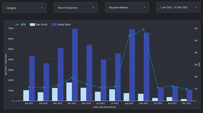
On the dashboard, I displayed Net_Profit, before_discount (Value Sales), and AOV in the time span of January 1, 2022 to December 31, 2022. The graph shows an anomaly in July and August, where August has higher Value Sales than July. However, the Net Profit generated is lower than in July. Therefore, I will analyze to get an answer regarding the anomaly.
Analysis
The first analysis I did was to look at the total sales in July and August.
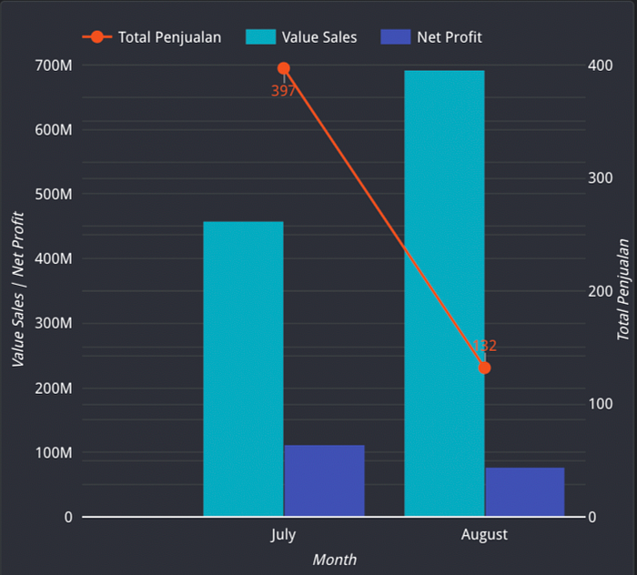
From the graph, it was found that the number of sales in July was much higher than in August. So, I can hypothesize that in July, there was a big discount which resulted in lower Value Sales because of the lower price, but it could increase the sales volume and generate higher Net Profit because there were more sales.
Therefore, I suggest to the company to optimize a more appropriate discount strategy and balance between increasing sales and profits.
The second analysis I did was to check which payment method had the greater profit.
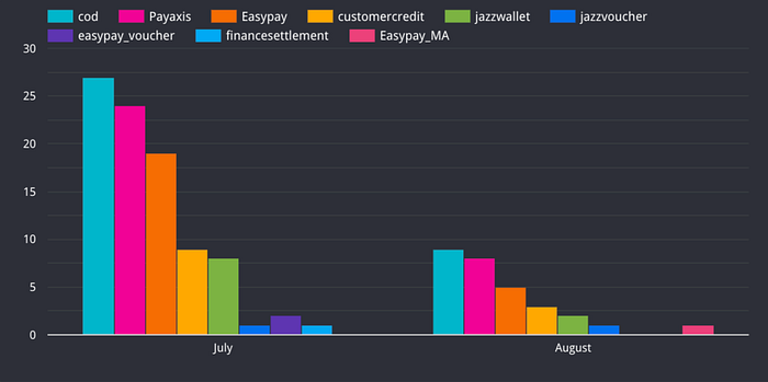
From the chart, the cod payment method is most frequently used in July and August. Then I will analyze which payment method has the greater profit.
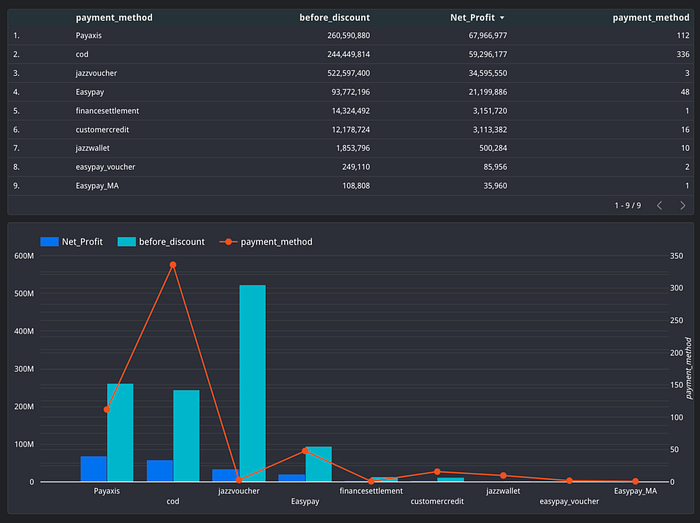
From the table and graph, it is found that the Payaxis and Jazzvoucher payment methods have greater profits based on the number of transactions made by customers.
Therefore, I suggest that the company educate customers about these payment methods. The company can provide special offers to customers who choose these payment methods.
Performance Analysis Dashboard: Product Sales, Profitability, and Customer Insights

Then, I will check Category = Mobiles & Tablets with Value Transaction = Valid and Payment Method = Jazzvoucher.

It can be seen that customers in the Mobiles & Tablets category who have made payments through Jazzvoucher are only 1 customer where the products purchased are 1000.
Conclusion
The combination of SQL for data manipulation, Python for deep analysis, and Looker Studio for visualization has proven to be a powerful combination in the world of data analysis. This combination enables deep understanding of data, discovery of valuable insights, and the ability to effectively present information to stakeholders. With these tools, data analysis becomes more efficient, informative, and empowers fact-based decision making.