

Forecasting | Python | Office Hours
Update: Many of you contacted me asking for valuable resources to learn more about time series forecasting with Python. Below I share 2 courses that I personally took and that would strongly recommend to expand your knowledge on the topic:
- Python For Time Series Analysis (using ARIMA, SARIMAX, VARMA, PROPHET) 15+ hours of content
- Predictive Analytics For Business (ETS, ARIMA) →Very high quality course!
**USE CODE JULY75 FOR A 75% DISCOUNT ON UDACITY COURSES**
Hope you'll find them useful too! Now enjoy the article :D
Introduction
Picture this: you are a data analyst or business intelligence analyst with experience building KPIs, reporting and extracting insights on these metrics, but with little to no experience working on predictive models. At the same time your company is not just willing to track performance retroactively, but also in need for a strategic or dynamic forecast, but it turns out that there are no data scientists around the corner with a similar background.
Your manager approaches you, claiming you will be perfect for the job as you have just the right background and skillset to create a simple model to forecast business KPIs, with a reminder that the forecast is due in one week…
Is this scenario unusual in fast-paced companies? Not really: for a data analyst to be required to work on predictive models is as likely as for a data scientist to cover data engineering tasks (like extraction, cleansing and manipulation) every now and then.
Should you panic? Nope, keep it together: if you are familiar with Python or R, then FB Prophet can help you and your team to implement a simpler time series modelling approach, able to produce reliable forecasts for planning and goal setting across your business.
In more detail, on its open-source projects web page, Facebook states that: "Prophet is a procedure for forecasting time series data based on an additive model where non-linear trends are fit with yearly, weekly, and daily seasonality, plus holiday effects. It works best with time series that have strong seasonal effects and several seasons of historical data. Prophet is robust to missing data and shifts in the trend, and typically handles outliers well."
It sounds like this tool is a panacea! Then, let's learn how to create value with Prophet in a real business context.
Organization Of The Tutorial
In this tutorial we will put Prophet to the test by implementing a model to predict the following two KPIs:
- Daily Sales Number: the total number of sales processed by a fictitious business on each day. I chose "sales" as KPI but you may have "orders" or "transactions" instead, depending on the type of products or services offered by your company. This metric has been selected for the forecast as it displays weekly, monthly and yearly seasonality and because other metrics can be derived from its prediction.
- Daily Sales Value (£): the value in £ of the sales processed on each day, computed as Daily Sales Number * Average Price. This metric exhibits a very similar seasonality but cannot be accurately derived by predicting the first KPI. Also, the daily sales value could be used to derive the daily revenue (£) as well as to estimate the Average Sales Value (daily sales value (£)/daily sales number).
The tutorial will be divided into three parts:
PART I(this article) is focused on how to put together an initial dataset, that will not only include the KPIs to be predicted, but also the date flags derived from business knowledge that will be used to improve the forecast in Part II. I then show how, with just a few lines of code, you can build straightforward model in Prophet. The article will also demonstrate how to visualize your predictions efficiently and neatly, by using a combination of matplotliband fbprophet built-in plotting functionalities.
PART II will be dedicated to improve the original predictive model by adding tailored seasonality, holidays and by modifying some more advanced parameters. In particular, I will show how to programmatically use date flags in the original dataset to create a "holidays" dataframe to be passed as an input for the model and elaborate on how wisely tweaking the Fourier order could enhance predictions accuracy.
PART III will be the final post of this tutorial, where I will describe how to perform a quick model evaluation using numpy or a more advanced one using the evaluation measures in statsmodels or the cross validation module natively embedded in the fbprophet package.
At the end of this series, you will have a thorough understanding of how to use Prophet to forecast any key performance indicators and these skills will help you add even more value to your business. With these premises, now is finally time to start coding!
1. Importing Packages & Dataset
The full notebook and the dataset for PART I are available here. First let's import the packages we are going to use. This assumes that fbprophet is already successfully installed in your preferred environment:
Since this article will also focus on how to properly visualize forecasts, I am going to use "seaborn" style for matplotlib, as I find it being rather neat. If you wish to use a different one, run the following command that displays the full list of available styles:
print(plt.style.available)The dataset that includes the KPIs we wish to predict, has been obtained using a SQL query to aggregate the two metrics of interest (sales_num , sales_value_gbp) at the daily level and then to generate four date flags (fl_last_working_day , fl_first_working_day , fl_last_friday and fl_new_year ). The observed metrics are available for the period 2017–01–01 to 2020–11–30 but the dataset also includes dates for the entire period we wish to forecast (that runs until 2021–12–31). Displaying the first 5 rows leads to this result:

As you can see all the four date flags are binary variables that can either get value 0 or 1. For example the fl_new_year is equal to 1 on the first day of each year and 0 elsewhere, whereas the fl_last_friday is equal to 1 on the last Friday of each month and 0 elsewhere and so on with the other flags…
These flags will be used to introduce specific seasonal effects to improve the accuracy of our model in PART II, but for now let's just plot our two KPIs and see how they look like:
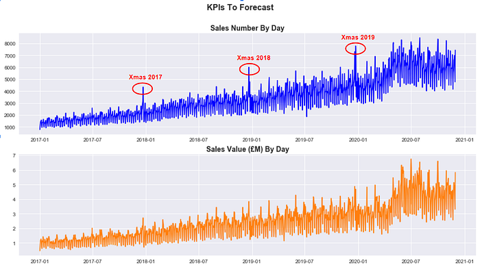
It is clear that both sales_num and sales_value_gbp have been growing steadily over the last three years and that they present a sharp seasonal effect around the Christmas period (despite it is less marked for Sales Value (£)). If we then zoom in and plot sales_num just for 2019, it appears clear that there are multiple seasonal components to take into account:

Now that we understand both metrics a little bit better, let's see how to predict their daily value until 2021–12–31.
2. Fitting a Prophet Model
First of all, it is handy to define a number of dates we are going to use extensively in our forecasting exercise:
The cutoff_date is the last date of the period that will be used to train the model ( 2017–01–01 to 2020–10–31 ), whereas the test_end_date is the last date of the period that will be used to assess the accuracy of the model (2020–11–01to 2020–11–30).
In effect, as you may have noticed, the testing period overlaps at the very beginning with the actual forecast (that will instead run between 2020–11–01 to 2021–12–31) and this will allow us to compare actual values to predicted values. One last thing to define, is the number of days in the future we wish to predict (days_to_forecast) and this can easily be achieved by passing forecast_end_date and forecast_start_date to pd.timedelta().days.
Next, it's time to include the metrics we wish to forecast in a list:
kpis = ['sales_num', 'sales_value_gbp']and then to create a dataset to train our model for each KPI in the kpis list. Note that df_train should only include two columns (the observation date and the single KPI that is selected from the list by the for loop at any given time) and that nan values should either be filtered out or replaced with zeros, depending on the specific use case. Moreover, fbprophet requires for the columns in the train dataset to be renamed according to a convention where the observation date becomes ds and the metric to model becomes y :
Everything is in place now to create our model and fit it using the training dataset. This can easily be achieved by adding the following code to the loop:
If this is the first time for you using Prophet, you may be wondering the meaning of the parameters specified in the model. To understand how they should be properly used, it's important to highlight that the Prophet() forecaster function already comes with the following default arguments (in a Jupyter Notebook, they can be displayed by placing the cursor in the middle of the parenthesis and then typing shift + tab + tab):
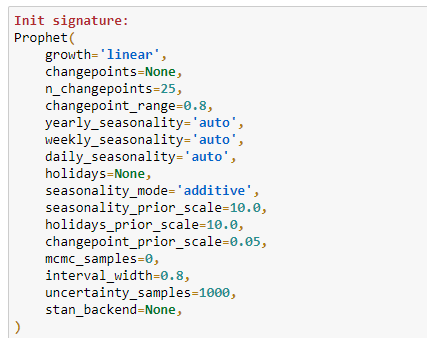
This means that using a combination of data exploration and business knowledge we were able to assess that our model should be built by taking into account:
- A linear growth of the underlying trend for both KPI: this is easy to understand by simply plotting data. If the trend keeps growing over time without any sign of saturation than you should set the parameter to "linear" (the alternative is "logistic").
- A multiplicative seasonality mode for both KPIs: the "multiplicative" should be preferred to the default "additive" parameter, when the importance of the seasonal components increases over time instead of remaining constant for the entire period.
- The presence of weekly and yearly seasonality: because data has a daily granularity,
daily_seasonalityhas been set toFalse, whereas bothweekly_seasonalityandyearly_seasonalityhave been set toTrue(default value isauto). But what if we wished to add more seasonalities (for example a monthly component)? In this case (as we will learn in PART II), the solution would be to use theadd_seasonality()method, to specify a customized component. For the time being let's stick to the default options offered by theProphet()forecaster. - An uncertainty interval width of 0.95: as we will see in a moment, the Prophet model will output a predicted value as well as the lower and upper bounds of the uncertainty (or confidence) interval. The default value for the
interval_widthis 0.80, meaning that the uncertainty interval will cover only 80% of the samples generated by the Monte Carlo simulation (1000 samples by default) . In order to increase the accuracy of the interval, it is good practice to increase the threshold to 95%. Also let's bear in mind that this interval will just track the uncertainty in the trend, then neglecting the volatility embedded in the seasonal components.
Now that we know how to tweak basic parameters, we can finally predict the future values of our KPIs. In order to do that, the first step is to create a dataset including observed data as well as future dates. In ours case days_to_forecast corresponds to a period of 426 days in the future:
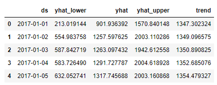
future_data = model.make_future_dataframe(periods=days_to_forecast)Then it's time to run model.predict() on future_data to obtain the final forecast. As you can see, we only select the four most relevant columns (namely observed date ds , predicted value yhat , uncertainty interval lower yhat_lower and upper yhat_upper bounds and the underlaying trend ):
forecast = model.predict(future_data)[['ds','yhat_lower', 'yhat','yhat_upper', 'trend']]
forecast.tail()
When displayed, the first and the last five rows of the forecast dataset for sales_num looks like:
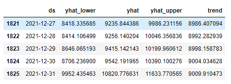
*Note that while predicting multiple KPIs with a loop, the last forecast available in this dataset will be the one computed for the last metric in the kpis list.
You may have noticed that Prophet provided estimated values for both observed dates and future dates, meaning that forecast includes a prediction for every single day from 2017–01–01 to 2021–12–31. This is a very relevant detail to keep in mind, particularly for the next section, where we will visualize the forecasts.
For the time being, we wish instead to keep the original observed value in the df dataframe and replace NaN values with predicted values. This can be achieved with this line of code:
3. Visualizing Forecast Results
In this section, I am going to present three types of visualizations I find particularly useful while assessing the performance of a model built in Prophet. In effect, plotting observed and predicted values makes comparing models (that use different parameters) much more straightforward and intuitive.
Viz 1: Trend Changepoints Over Time
While working with fbprophet, you can simply plot a forecast by running:
model.plot(forecast)Despite the plotting tool embedded in the package may work well for a very high level analysis, it is quite simplistic and difficult to tweak. These limitations make it hard to sell on the workplace. However, an interesting chart you can build directly with Prophet, is the one displaying the trend changepoints over time:
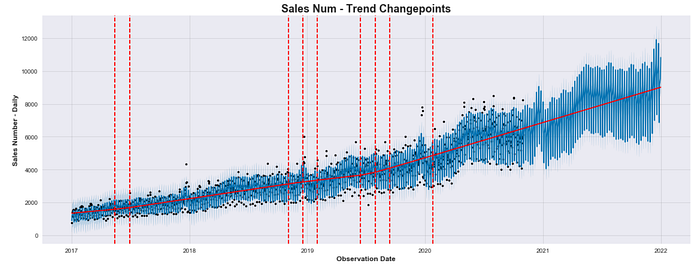
In the plot above, the black dots indicate the observed values, whereas the blue line represent the predicted values. As mentioned, predicted values are calculated for the entire dataset when model.predict(future) data is run.
The number of displayed changepoints and the shape of the piecewise underlying trend will change depending on the value assigned to the changepoint_range (default is 0.8) and changepoint_prior_scale (default is 0.05) parameters as they influence directly the flexibility of the model against trend changepoints.
Viz 2: Overlap Forecast With Actuals
A more intuitive way to compare predicted values against actual (observed) values would be to overlap both time series using different colors and opacities. To achieve that, we need a dataframe where actual and predicted values are saved in different columns:
# Join Original Dataset With Forecast
combined_df = df.join(forecast, how = 'outer')
combined_df[['observation_date', 'sales_num', 'yhat_lower' , 'yhat', 'yhat_upper' ,'trend']].tail()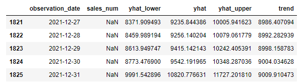
This means that combined_df should be created before replacing NaN values with forecast values for future dates in df that has previously been obtained as follows:
df.loc[(df['observation_date']>cutoff_date ),kpi]=forecast['yhat']That is because we will use matplotlibto overlap two different columns as shown below:
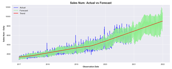
We can now clearly see that despite the current model was able to fit the underlying trend pretty well, it still behaves poorly during peak days or particular holidays (like the Christmas period). In PART II we will learn how to implement model that includes holidays to make it much more accurate.
Viz 3: Display Forecast & Actuals Separately
At some point, you may wish to present this model to your colleagues and the visualization above could still look rather confusing to a less technical audience. It would probably be better to completely separate the two time series, showing actuals first and predicted values after, including the uncertainty interval:
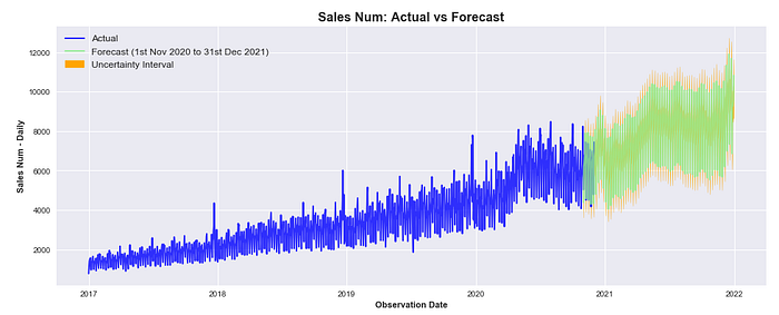
It must be highlighted that actuals and predicted values still overlap in between 2020–11–01 and 2020–11–30 that, you would remember, is the one-month period selected to test the accuracy of the model.
4. A Quick Model Evaluation
In the last section of this tutorial, we will use the Mean Absolute Percentage Error (MAPE) to compute the model performance with a single value. There are many other metrics that can be used to assess the quality of a predictive model (PART III will cover the topic in depth) but for the time being a single matric is probably more intuitive. To compute MAPE, we first create a combined_df_test that uses the combined_df as an input but just for the month of November 2020. Then we use numpy to write our own formula for mape:
Output:
MAPE: 6.73587980896684
Running the code above, we get a MAPE of 6.73% indicating that across the predicted points, the forecast is on average 6.73% off against actual values. This is already a pretty good result for a semi-out-of-the-box model, but we will try to noticeably lower MAPE in PART II.
Conclusion
This is the end of the first tutorial about business KPIs forecasting with Prophet, I hope you have enjoyed it! If you followed along, you should have enough material to start creating value for your business by building a model to predict future performance.
But we are not done here yet: in PART II you will learn how to build a more complex model using your business knowledge to pass special events or seasonal components as model variables, whereas in PART III you will learn how to employ cross validation and other evaluation metrics to choose among different models. So I see you there and keep learning!
A note for the reader: This post includes affiliate links for which I may make a small commission at no extra cost to you should, you make a purchase.