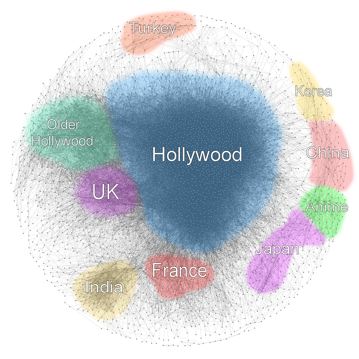

I like graphs and movies a lot, so I decided to visualize the relationships between top movies on IMDb. Each node in the graph below represents a movie. Two movies are connected if an actor has played a part in both of them. Oh, and I did the same for top TV series as well.
There are 3468 movies in the graph above. Each movie has an IMDb rating of 7.0 or higher, as well as 5000 or more votes. The overlay with the countries of origin was done by hand. I checked the labels on the nodes and looked up the countries on IMDb. I realize this is not very scientific. Some groups are more accurate than others — for example Turkey is quite isolated, while France was all over the place, mixed with other European movies for which I could not make a distinct group.
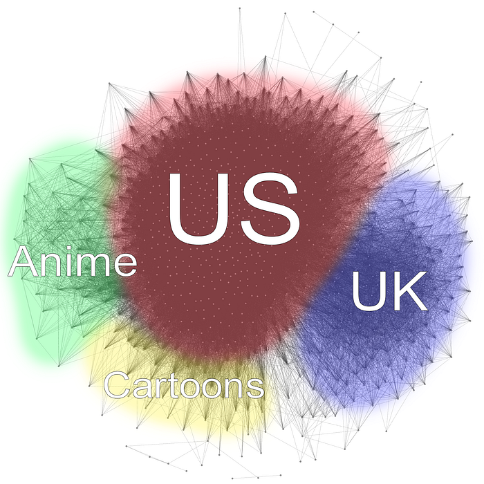
The TV graph was done with the same parameters (a score of 7.0 with 5000+ votes). There are much less (825) nodes in the graph. This is probably because foreign TV series don't get much attention on IMDb.
Here are some technical details on what I used to process all the data. IMDb provides an Alternative Interfaces page, where they provide text files of all their publicly available data. I downloaded the actors and actresses (1.5 GB combined) as well as the movie ratings. Then I used Flink to process these files after some parsing. First I created a list of actor — movie pairs, then I joined this set with itself on the actors field. After some projections, this provides all the movie — movie pairs I was interested in. I exported this to a CSV file and used Gephi to visualize the graph. The layout algorithm I used was Fruchterman Reingold.
I will certainly spend more time playing with this. Some things that come to mind are: adjusting the parameters (score and vote count) of the processed data, filtering edges where only a few people play in the same movie, or using a different layout algorithm — a custom one that considers the release year of the movie would be particularly interesting.
I will also be looking for data sets on band memberships that I could use to create a similar graph of musicians/bands. It would certainly be a lot more sparse.