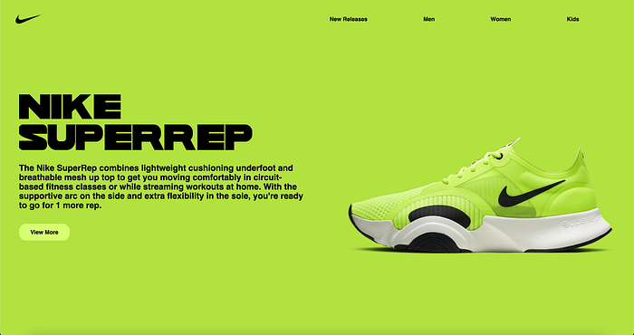

In this article, I will explore the essential CSS properties of Flexbox with examples of our code each step along the way. If you have any issues while coding along, you can find a link to the Github repo here which has all the code, as well as the bottom of this page. It is a longer article, but we will build this web page I have pictured below.
To get started I will have a boilerplate HTML file linked to a corresponding CSS file. You can find the HTML code below:
<!DOCTYPE html>
<html>
<head>
<meta charset="utf-8">
<meta name="viewport" content="width=device-width, initial-scale=1.0">
<link rel="stylesheet" type="text/css" href="Example.css" media="screen" />
<title>Learn Flexbox</title>
</head>
<body>
<div class="parent-container">
</div>
</body>
</html>
We will override the default padding, and margin for our site by setting it to 0. Any content that breaks out of our parent-container will also be hidden by setting overflow-hidden. Our corresponding CSS file to start:
*{
padding: 0;
margin: 0;
overflow: hidden;
}
1. Flex
To start, we will be applying a full viewport width, and height rectangle to the background of our parent-container. This shows us our first flexbox property which is display:flex. Setting our display property to flex, positions all elements as an inline-block, and allows us to use other flex properties which we will get to below. You can also view the Mozilla web docs page here which goes into depth about flexbox, and has helpful live examples.
.parent-container{
display: flex;
background-color: #b3e140;
height: 100vh;
width: 100vw;
}
Our web page with the .parent-container CSS added to the stylesheet:

To continue we will build a navigation, unordered list, and list items into our web page, and play around with a few different flex properties. I've added a class to our nav called "our-nav", and a class to our ul called "list-flex". With our nav, ul, and list items, our HTML will now look like this:
<!DOCTYPE html>
<html>
<head>
<meta charset="utf-8">
<meta name="viewport" content="width=device-width, initial-scale=1.0">
<link rel="stylesheet" type="text/css" href="Example.css" media="screen" />
<title>Learn Flexbox</title>
</head>
<body>
<div class="parent-container">
  <nav class="our-nav">
   <ul class="list-flex">
    <li>New Releases</li>
    <li>Men</li>
    <li>Women</li>
    <li>Kids</li>
    <li>Sale</li>
   </ul>
  </nav>
</div>
</body>
</html>
We will then add this CSS to our stylesheet:
.our-nav{
position: fixed;
top:1vh;
right: 2vw;
left: 2vw;
width: 100vw;
}
.list-flex{
display: flex;
justify-content: space-between;
width:50%;
font-family: sans-serif;
font-weight: bold;
}
We are adding two different rules to target our-nav on the nav container, and a rule to target our list with all of our list items. position:fixed will allow the top, right, and left property to work, which tacks our container to the top of our screen. By adding width:100vw we are communicating to our container that we want it to take up 100% of our viewport's width.
By adding display:flex to our list-flex container, it places our list items inline block, instead of in a column.
2. Justify-content
The CSS justify-content property defines how the browser distributes space between and around content items along the main-axis of a flex container, and the inline axis of a grid container.
By setting justify-content: space-between we are telling our container to evenly distribute our list item elements with the available space in our container. Since I set the width to 50%, it is evenly distributing our space to half of the width of our parent container which is set to 100vw.
The remaining two styles font-family: sans-serif and font-weight: bold change our font styles.
Our navigation should now be stretched halfway across our page like this:

Next we will add in the logo to our navigation. I found a link to the Nike logo here. We can download it, and add it into our nav container above our <ul>. By placing it outside of our <ul>, it places equal spacing of the entire ul as our new logo element. I added a class named "our-logo" to our img tag, and added it to the nike logo we downloaded and placed in our folder. Our HTML will now look like this:
<!DOCTYPE html>
<html>
<head>
<meta charset="utf-8">
<meta name="viewport" content="width=device-width, initial-scale=1.0">
<link rel="stylesheet" type="text/css" href="Example.css" media="screen" />
<title>Learn Flexbox</title>
</head>
<body>
<div class="parent-container">
 <nav class="our-nav">
   <img class="our-logo" src="./nike_PNG18.png" />
   <ul class="list-flex">
    <li>New Releases</li>
    <li>Men</li>
    <li>Women</li>
    <li>Kids</li>
    <li>Sale</li>
    </ul>
  </nav>
</div>
</body>
</html>
The CSS for our nav will now look like this:
.our-nav{
display: flex;
position: fixed;
top:1vh;
right: 2vw;
left: 2vw;
justify-content: space-between;
align-items: center;
width: 100vw;
}
.list-flex{
display: flex;
justify-content: space-between;
width:50%;
font-family: sans-serif;
font-weight: bold;
}
li:hover{
cursor: pointer;
opacity: 80%;
}
.our-logo{
width: clamp(44px, 5vw, 120px);
}
We've added display: flex ,justify-content: space-between , and align-items: center to our-nav.
3. Align-items
The CSS align-items property sets the align-self value on all direct children as a group. In Flexbox, it controls the alignment of items on the Cross Axis. In Grid Layout, it controls the alignment of items on the Block Axis within their grid area.
By adding align-items: center to our-nav it centers our logo, and our unordered list on the x-axis.
I've added additional hover styles to our list item elements that triggers our cursor to the pointer, and also adds transparency on hover. I've added the clamp function to our-logo to ensure it doesn't drop below 44px, or grow larger than 120px.
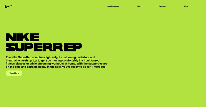
The next steps to completing our site is to add in our paragraph section. We've added a section tag container with a class of "paragraph-flex", an h1 with a class of "header-styling", a p with a class of "paragraph-styling", and a button with a class of "button". Here is our HTML so far:
<!DOCTYPE html>
<html>
<head>
<meta charset="utf-8">
<meta name="viewport" content="width=device-width, initial-scale=1.0">
<link rel="stylesheet" type="text/css" href="Example.css" media="screen" />
<title>Learn Flexbox</title>
</head>
<body>
<div class="parent-container">
<nav class="our-nav">
<img class="our-logo" src="./nike_PNG18.png" />
<ul class="list-flex">
<li>New Releases</li>
<li>Men</li>
<li>Women</li>
<li>Kids</li>
<li>Sale</li>
</ul>
</nav>
<section class="paragraph-flex">
<h1 class="header-styling">NIKE <br/>
SUPERREP</h1>
<p class="paragraph-styling">The Nike SuperRep combines lightweight cushioning underfoot and breathable mesh up top to get you moving comfortably in circuit-based fitness classes or while streaming workouts at home.
With the supportive arc on the side and extra flexibility in the sole, you're ready to go for 1 more rep. </p>
<button class="button">View More</button>
</section>
</div>
</body>
</html>
We have added in the styles for our custom font Wild World. You can download Wild World here, and add the otf file to our folder and link it through our CSS. I've added align-items: center to our .parent-container to center our text section in the middle of our page. We have added in CSS rules for our paragraph-flex, header-styling, paragraph-styling, and our button. These styles change the font-size, color, width, padding, and layout of our page. Our CSS now looks like this:
*{
padding: 0;
margin: 0;
overflow: hidden;
}
@font-face {
font-family: Wildworld;
src: url(WILD\ WORLD.otf);
}
.parent-container{
display: flex;
align-items: center;
background-color: #b3e140;
height: 100vh;
width: 100vw;
}
.our-nav{
display: flex;
position: fixed;
top:1vh;
right: 2vw;
left: 2vw;
justify-content: space-between;
align-items: center;
width: 100vw;
}
.list-flex{
display: flex;
justify-content: space-between;
width:50%;
font-family: sans-serif;
font-weight: bold;
}
li:hover{
cursor: pointer;
opacity: 80%;
}
.our-logo{
width: clamp(44px, 5vw, 120px);
}
.paragraph-flex{
width: 50vw;
padding-left: 3vw;
}
.header-styling{
line-height: 1.1;
font-size: 5em;
color: black;
width: 90vw;
font-family: Wildworld, sans-serif;
left: 4vw;
}
.paragraph-styling{
font-size: 1.5rem;
color: black;
width: 100%;
font-family: sans-serif;
font-weight: bold;
padding-top: 2vh;
padding-bottom: 2vh;
}
.button{
background-color: #d7ff71;
border: none;
border-radius: 20px;
height: 5vh;
width: 8vw;
font-size: 1rem;
font-family: sans-serif;
font-weight: bold;
}
.button:hover{
cursor: pointer;
opacity: 80%;
}
Our page now looks like this:
Our last section to add is our photo. I've downloaded a photo you can find here, from the photographer Usama Akram. We drop this into our folder, add an img tag to our HTML, and a couple of lines of CSS to finish our project. I've renamed my photo to make it easier to drop into my HTML src tag.
Our finished HTML:
<!DOCTYPE html>
<html>
<head>
<meta charset="utf-8">
<meta name="viewport" content="width=device-width, initial-scale=1.0">
<link rel="stylesheet" type="text/css" href="Example.css" media="screen" />
<title>Learn Flexbox</title>
</head>
<body>
<div class="parent-container">
<nav class="our-nav">
<img class="our-logo" src="./nike_PNG18.png" />
<ul class="list-flex">
<li>New Releases</li>
<li>Men</li>
<li>Women</li>
<li>Kids</li>
<li>Sale</li>
</ul>
</nav>
<div class="paragraph-flex">
<h1 class="header-styling">NIKE <br/>
SUPERREP</h1>
<p class="paragraph-styling">The Nike SuperRep combines lightweight cushioning underfoot and breathable mesh up top to get you moving comfortably in circuit-based fitness classes or while streaming workouts at home.
With the supportive arc on the side and extra flexibility in the sole, you're ready to go for 1 more rep. </p>
<button class="button">View More</button>
</div>
<img class="our-image" src="./usama-akram.jpg" />
</div>
</body>
</html>
Our final CSS:
*{
padding: 0;
margin: 0;
overflow: hidden;
}
@font-face {
font-family: Wildworld;
src: url(WILD\ WORLD.otf);
}
.parent-container{
display: flex;
align-items: center;
justify-content: flex-end;
background-color: #b3e140;
height: 100vh;
width: 100vw;
}
.our-nav{
display: flex;
position: fixed;
top:1vh;
right: 2vw;
left: 2vw;
justify-content: space-between;
align-items: center;
width: 100vw;
}
.list-flex{
display: flex;
justify-content: space-between;
width:50%;
font-family: sans-serif;
font-weight: bold;
}
li:hover{
cursor: pointer;
opacity: 80%;
}
.our-logo{
width: clamp(44px, 5vw, 120px);
}
.paragraph-flex{
width: 50vw;
padding-left: 3vw;
}
.header-styling{
line-height: 1.1;
font-size: 5em;
color: black;
width: 100%;
font-family: Wildworld, sans-serif;
left: 4vw;
}
.paragraph-styling{
font-size: 1.5rem;
color: black;
width: 100%;
font-family: sans-serif;
padding-top: 2vh;
padding-bottom: 2vh;
}
.button{
background-color: #d7ff71;
border: none;
border-radius: 20px;
height: 5vh;
width: 8vw;
font-size: 1rem;
font-family: sans-serif;
font-weight: bold;
}
.button:hover{
cursor: pointer;
opacity: 80%;
}
.our-image{
width: 50vw;
height: auto;
}
Thanks for reading this far! Keep following along as I will be further exploring gap, flex-grow, flex-shrink, flex-wrap, and other flexbox use cases for web pages. Stay tuned, and thanks again!