

Introduction
In many real-world ML competitions, the most valuable contributions aren't in the model architecture or hyperparameter tuning, but in capturing the relationships between data points.
This article shares how I applied graph-inspired feature engineering in a private Kaggle competition to improve XGBoost predictions for employee turnover. This is my first Medium post — I hope you find it useful!
Key Takeaways:
- Improved F1-macro-score from 0.53 to 0.60 for high performers by adding graph-inspired features
- Increased recall from 61% to 72%, catching more at-risk employees
- Revealed interpretable patterns about team dynamics and leadership impact on turnover
The Challenge: Predicting Undesired Turnover
The competition centered on predicting which employees would leave the company within their first six months, a problem known as "undesired turnover" in people analytics.
I analyzed a dataset with a "performance_score" variable that classified employees into high performers (> 80) and others. The key challenge: identify high performers at risk of leaving.
This matters because losing productive employees early impacts costs, morale, and team stability. Retaining top talent is essential for maintaining a competitive advantage.
Now, let's dive into the dataset and the solution process.
The Dataset: 2K rows is all you get
The provided dataset contained 2,152 employee records containing 16 columns, which included features like "age", "recruitment_channel", "distance_from_home", "performance_score", and "seniority". The seniority feature caught my attention; it indicates whether an employee has direct reports. The binary target variable was "left_within_6_months" (1 = left, 0 = stayed). The submission dataset included only high performers.
Even though predictions were required only for high-performance employees, we were allowed (and encouraged) to use the entire dataset during training, due to the data size (only 2K rows), to improve generalization and encourage the model (in the case of tree-based) to define better decision regions.
left_within_6_months  False  True
high_performer
False                   664    791
True                    485    212
Here is a detailed description of the features:
Numerical Features:
- age: Age of the employee.
- office_distance: Distance from home to office (in km).
- sick_days: Number of sick days taken.
- average_tenure: Average tenure of the employee in his previous jobs.
- salary: Monthly salary of the employee.
- performance_score: Last trimestral performance evaluation score obtained.
- psi_score: Psychometric test score obtained during recruitment.
Categorical Features:
- has_team: Binary variable indicating if the employee has a team (1) or not (0) (also denoted as seniority).
- recruitment_channel: Channel through which the employee was recruited (e.g., referral, job portal, LinkedIn, etc).
- gender: Gender of the employee.
- marital_status: Marital status of the employee (e.g., single, married, divorced).
- work_mode: Work mode of the employee (e.g., remote, hybrid, onsite).
Other Features:
- birth_date: Date of birth of the employee.
- hire_date: Date when the employee joined the company.
- collaborator_id: Unique identifier for each employee.
- team_lead_id: Unique identifier for the leader of the employee (if applicable).
Target Variable:
- left_within_6months: Binary variable indicating if the employee left within six months (1) or not (0).
Feature Engineering: The Key to Predictive Success
I started by exploring and cleaning the dataset: fixing data types, checking missing values, removing duplicates, and creating visualizations.
I then created derived features such as ratios and time-based attributes (e.g., "hire_month", "hire_quarter") to capture hiring period patterns.
categorical_variables = df.select_dtypes("category").columns.tolist()
numerical_variables = df.select_dtypes("number").columns.tolist()
other_variables = df.select_dtypes(exclude=["number", "category"]).columns.tolist()
print(f'categorical variables:\n\t{categorical_variables}')
print(f'numerical variables:\n\t{numerical_variables}')
print(f'other variables:\n\t{other_variables}')
categorical variables:
 ['has_team', 'work_mode', 'gender', 'recruitment_channel', 'marital_status', 'hire_year', 'hire_month', 'hire_quarter', 'high_performer']
numerical variables:
 ['office_distance', 'sick_days', 'average_tenure', 'salary', 'performance_score', 'psi_score', 'left_within_6_months', 'salary_to_distance_ratio', 'salary_to_psi_ratio', 'age_at_hire']
other variables:
 ['collaborator_id', 'team_lead_id', 'birth_date', 'hire_date', 'hire_month_name']
To uncover relationship patterns, I explored the structure between employees and their leaders using "collaborator_id" and "team_lead_id" fields. These connections became the key columns for graph-inspired features.
df[['collaborator_id', 'team_lead_id']].isna().value_counts()
collaborator_id  team_lead_id
False            False           2061
                 True              91
Name: count, dtype: int64
With only 91 missing team-lead relationships (4.5% of data), I chose leverage on XGBoost's native handling of NaN values.
Then, I constructed a graph visualization using pyvis and networkX based on the "collaborator_id" and "team_lead_id" relationships:
valid_edges = df.dropna(subset=['collaborator_id', 'team_lead_id'])

G = nx.from_pandas_edgelist(valid_edges, source='collaborator_id', target='team_lead_id')

degree_dict = dict(G.degree())
df_degree = pd.DataFrame(list(degree_dict.items()), columns=['collaborator_id', 'degree'])

df_graph = df.merge(df_degree, on='collaborator_id', how='right')

nt = Network("750px", "1500px", notebook=True)
nt.force_atlas_2based(gravity=-50)

for key in G.nodes():
    if key not in degree_dict:
        continue
    value = degree_dict[key]
    colaborator = df.loc[lambda df: df['collaborator_id'] == key]
    # You can color the nodes based on any attribute you like
    color = '#bfbfbf'
    nt.add_node(key, title=key, size=value*5, color=color)

for src, dst in G.edges():
    nt.add_edge(src, dst, title=f"{src} -> {dst}")

nt.show_buttons(filter_=['physics'])
nt.show('nx.html')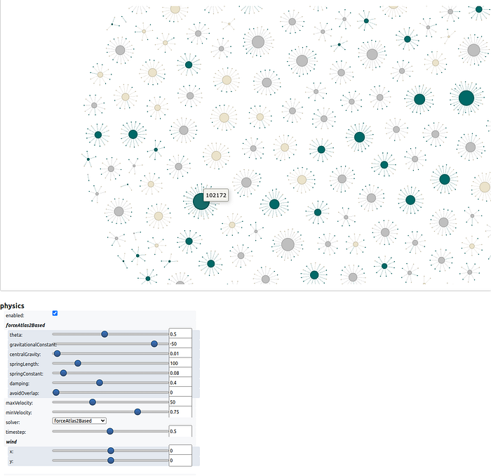
The visualization revealed the employee-lead network structure. I then created graph-inspired features:
- Node degree: The total number of connections an employee has (as a lead or direct report). This is the most intuitive graph feature.
- Leader-Collaborator Dynamics: Features quantifying the relationship between employee and leader, such as differences in "age" or "salary", and whether their "work_mode" aligns. These capture hierarchical and interpersonal dynamics that may influence turnover risk.
# Counting target distribution for employees without leaders
print(df[df['team_lead_id'].isna()]['left_within_6_months'].value_counts())
left_within_6_months
1 71
0 20
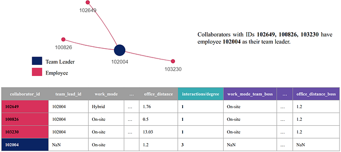
Name: count, dtype: int64We can also extend the dataset of employees who have leaders, by aggregating information from their direct leaders, as the following image illustrates:
We hypothesize that this approach could strengthen the underlying decision trees inside the XGBoost model by enabling splits based on both employee and leader features. For instance, a rule like "performance_score_team_lead < 85 AND employee_salary < 3000" could capture a meaningful pattern: an employee receiving low compensation within a low-performing team or management structure may face organizational or cultural pressures that increase turnover risk.
XGBoost handles NaN values natively for employees without leaders, so missing data isn't a concern.
Experiments: From Baseline to Enhanced Model
The competition used F1-macro-score as the evaluation metric to balance precision and recall. While the dataset wasn't highly imbalanced, this metric ensures both false positives and false negatives receive appropriate weight.
After saving processed datasets as parquet files, I removed the "gender" variable to mitigate potential bias. Given the dataset size, I configured XGBoost with non-default settings for the baseline model.
model = XGBClassifier(
    n_estimators=100,   # Default, but specified for clarity
    max_depth=4,        # Prevent overfitting
    scale_pos_weight=(y == 0).sum() / (y == 1).sum(),   # Handle class imbalance
    objective='binary:logistic',
    tree_method='hist', # Faster training
    eval_metric='logloss',
    grow_policy='lossguide', # Split nodes with highest loss change
    importance_type='total_gain', # For feature selection
    random_state=SEED,
    device='cuda:0',    # GPU used for faster experimentation workflow
)
I configured XGBoost to cap maximum depth at 4 (preventing overfitting), use "hist" tree method (faster training), and apply "lossguide" growth policy (prioritizing high-loss nodes). The model runs on GPU (cuda:0) and uses "total_gain" for feature importance.
To evaluate feature configurations, I built a pipeline with One-Hot Encoding and Recursive Feature Elimination with Cross-Validation (RFECV). This systematically identified relevant features by optimizing F1-macro score, reducing dimensionality and filtering out noise.
I trained and evaluated XGBoost using Stratified 5-Fold cross-validation. The final model used an 80%-10%-10% train-validation-test split, stratified by both "high_performer" and "left_within_6_months" to maintain balanced representation.
I optimized the classification threshold by maximizing F1-macro score on the validation set's high performers subset. This tuned predictions for the most critical group. I then reported classification metrics across all splits, focusing on high performers.
Finally, I calculated SHAP values and generated a beeswarm plot to visualize feature impacts on predictions.
I experimented with three feature sets:
- Baseline: Derived features (ratios, time-based attributes, node degree from graph).
- + Leader Attributes: Added leader attributes to each employee row (e.g., "average_tenure_leader", "salary_leader"), while excluding time-sensitive variables like "performance_score" and "sick_days", as these are recorded at different points for leaders and employees based on the "hire_date" column.
- + Leader-Collaborator Dynamics: Added calculated differences and ratios between employee and leader (e.g., "age_diff", "age_salary_diff_ratio").
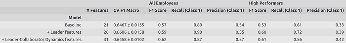
The baseline achieves F1-macro 0.53 on high performers in the test set, identifying 61% of at-risk high performers (recall). However, precision is low at 0.33, meaning many false positives.
The second model shows modest improvement (F1-macro 0.60 on high performers), with recall on positive class increasing to 0.72 and precision to 0.39. It identifies more at-risk high performers while reducing false alarms compared to baseline.
The final model achieves F1-macro 0.61 on high performers, offering higher precision (0.42) but lower recall (0.56). This represents a trade-off: fewer false positives but more missed at-risk employees.
Based on these results, I selected the second model (+ leader Attributes). Due to it achieves the highest F1-score (0.60) on high performers while maximizing recall (0.72) and maintaining reasonable precision (0.39). This balance is critical when the cost of missing an at-risk high performer outweighs the cost of false alarms.
Insights: What the Model Learned About Turnover
SHAP (SHapley Additive exPlanations) values provide insights into the features influencing the model's predictions. Note: These reflect associations learned by the model, not causal relationships.

Key patterns identified by the model include:
- Lower performance scores are associated with a higher predicted probability of leaving within six months.
- More sick days are linked with higher early turnover predictions — possibly indicating dissatisfaction or burnout.
- Being married is associated with slightly lower turnover predictions, potentially reflecting job stability preferences.
- Referred candidates show lower predicted turnover. Internal referrals may signal stronger commitment or cultural fit.
- Onsite employees have lower predicted turnover compared to remote/hybrid workers. Physical presence may strengthen workplace relationships.
- High network connectivity (higher node degree) is associated with increased early turnover predictions. Highly connected employees may face more demands or cross-team pressures.
- Leaders with shorter tenure history correlate with higher turnover predictions for their team members, suggesting leadership stability matters.
These are patterns the model found predictive in the data, not proven causal factors. To establish causality, we would need controlled experiments or causal inference techniques beyond the scope of this analysis.
Closing Thoughts & Next Steps
Graph-inspired feature engineering improved performance on this real-world ML problem. While the dataset was small and hierarchies shallow, the results demonstrate the power of leveraging relationships within data to uncover meaningful patterns.
There's room for exploration: deeper graph structures, advanced hyperparameter tuning, and richer relational patterns could further improve performance and interpretability. The key insight: when your data contains relationships, your features should reflect them.
If you have ideas for new features or strategies to enhance this model, I'd love to hear your thoughts! Feel free to share feedback or leave a comment below.
You can also explore the full implementation in this Colab Notebook